

What Is Contrast In An Image?
Contrast is the difference in luminance or colour that makes the object (or its depiction in pictures or display) distinguishable. In the visual experience of the natural world, contrast is determined by the disparity in hue and light of the target and other objects within the same field of view. The human visual system is more susceptible to contrast than absolute luminance; we will see the world in the same manner, regardless of the tremendous variations in light during the day or from location to place. The larger the disparity between the elements, the better they are to compare and appreciate, and that is why they are said to have contrasted with each other.
Importance of Contrast
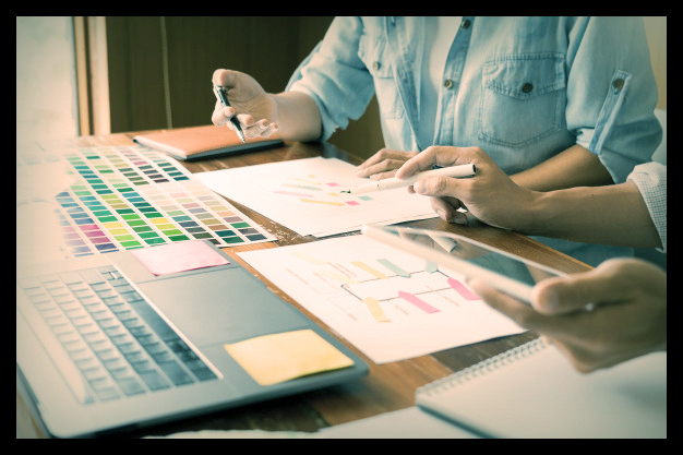
If you are working on a brochure project or designing a band poster, contrast is one of the most critical items to remember. Contrast is something people are attracted to, but it is one of the items that should not be seen when handled correctly. Done poorly, however, and it stands out like a sore thumb. That is why it is so essential for you, as a graphic designer, to pay particular attention to the contrast of your designs.
Importance of Contrast
Contrast draws the eye, brings artistic appeal to the composition, which may take several different forms. Your first thought could be colour contrasts such as warm vs cold and dark vs light. Although the colour is a critical theory of contrast, there are also things like the contrast of form, orientation and scale. These concepts all play a critical role in whether or not you have a good concept that is attractive and easy to adopt. To get a better understanding of these very critical principles, let us take a closer look at each one so that you can start applying them confidently in your next project.
Contrast in Size
Our eyes are naturally drawn to something huge. It feels natural; something big next to something small suggests that the big thing is much more important. Getting a scale contrast brings visual appeal to the composition and lets you set the key elements of the style to make sure that the spectator is on the correct page
The contrast in size is not only applicable to the text; it may also be the pictures in the design. You need to identify the places of the design that you want the spectator to focus on. Aim to direct the viewer’s eye by changing in height. If the entire layout is made up of text and other precisely the same scale items, it would most certainly be very uninteresting. This theory is very important if you are dealing with a minimal palette, so you would not be able to rely on colour to differentiate your design or style.
Contrast in Colour
The contrast in colour is probably one of the main design concepts, and, as described earlier, it is probably one that you are familiar with. If you take a white backdrop and drop black text on it, you will get a very clear explanation of this principle. The distinction between white and black ideals is very obvious. You are going to work with a much wider palate in colour than just black and white.
Establishing the correct colour contrast will make or break your design. You do not want colours to clash with each other in such a way that it is frustrating and irritating to look at them.
Contrast in Shape
Using contrast in the form with the projects will help make things stand out. It will help you to make the key elements of your design stand out by making a visible difference in form compared to the rest of the layout elements. Depending on how deep you take this, you can establish a very intense degree of contrast to draw more interest to the location.
Contrast in Shape
For example, if you have a layout where all the elements are made up of rectangles, but there is a circle right in the centre, the viewer’s eye is going to go straight to the circle since it is different from the rest of the elements.
Contrast in Style
No matter what kind of font you make, chances are, you will be dealing with another type of font. When it comes to typefaces, all other contrast elements may be added, whether colour, scale or form. You never want to use the same font used for the whole display when dealing with a layout. Instead, locate locations where you can build differences, such as fields that are of the highest value. You may use the same typeface, for example, but have one bold and the other light or regular. This offers you a comparison, but it also retains the unification in your style, so you do not want to use a new typeface for any body of the text.

Influence and Style
There are a number of different design trends that artists can choose from, and any successful artist or designer would have experience and mastery of more than one. Like scale and form and colour contrast, the blending of style and effect will produce a genuinely visually interesting and bold design. Token colours and shapes in well-defined types may be manipulated to produce contrasting results, to draw an eye to particular features, or to create a meaning that communicates on more than one dimension.
Depth & Shadow
Creating depth and shadow in your work might not be something that many clients want for a logo, but these examples illustrate how quickly a simple gradient or a colour overlay and offset layer repeat will produce a deep and bold image. Although this may not be the most popular style these days, like anything else, it may well come back. So, learning your way around the gradient tool will help you get your artwork out of the crowd. Using gradients to help merge strongly contrasting colours or to create a lighter effect than bright coloured blocks that populate most contemporary designs.
Lastly, contrast does not necessarily equal opposites, only distinction. Large or tiny, it does not matter, as long as there are cause and meaning there, and, of course, you adhere to the laws that we have laid down here. Consider any factor in the ways we have mentioned, and you are going to do well. Blue Sky Graphics can help you learn graphic design and all these principles in great detail so join now!


