Office
Phone-alt
Envelope
Free
lessons
How to make a good logo?
A significant part of the graphic design centres around ‘logo design’ as logos establishes the image of a product. Blue Sky Graphics is here to show you some of the best ways to design your logo in the UK, all from the comfort of your home. We provide premium graphic design education through one to one online lessons delivered by expert tutors and so that anyone can easily sign up to start their journey as a graphic designer. It is possible to learn graphic design (both theory and practice) and to professional standards as a graphic or web designer, all without leaving the boundaries of your home. Logo design is an important aspect of graphic design due to its numerous uses in the branding of any business.
Testimonials
Companies need new logo designs everyday especially in the era of start-ups.; you are likely to make logos in your career for many companies. Do you design a totally different logo, or do you tweak the logo design that you already have? Anyway, you may be wondering: what makes a good logo design? And how do you build a logo that captures the spirit of a business, a person or a brand?
We are here to answer some of your burning questions about logo design.
Why is the design aspect of the logo important?

Your emblem is the first point of contact for you or your business with the outside world. If people connect to your branding, they are likely to be more open to whatever they are offered. Great logo design requires a complex mix of design skills, creative theory and skilful application.
Any designer who is worth their salt creates a fit-for – purpose logo, but really mastering both aspects of fashion requires time. Of course, logo design is just one small subset of branding, but the logo or brand name remains the centrepiece of most branding schemes. And we all know that this is often the part of a new identity that is most popular among the public.
Rules to make the perfect logo:
When you think of a person who has had an impact on your life, it is almost certain that you visualise in your head what he or she looks like. This visual identification is also the same for items, product, and companies. We can quickly visualise a logo only by talking to a commodity, organisation, or service about our history.
Once there were only a handful of companies operating in a particular market or niche, there might now be hundreds, perhaps thousands, all competing for attention, all wanting us to look at them first. This creates an increasing need for brands to distinguish themselves visually so that they are not confused with competitors.
Such distinction is accomplished by the creation of the logo of the company – a set of components that together function together to build a recognisable face in our minds. Depending on the client, the branding may involve uniforms, automobile logos, business cards, merchandise labelling, photography design, coffee mugs, advertisement ads and a variety of other products, right up to the option of the font on the website.
It is necessary to note that we do not read it first when we look at it. We see colour before anything else, and if that is enough to keep our attention, we are going to read. In every case, regardless of the commodity, the logo is a tiny but essential item in the identification of the company. Our job as designers is to distil the essence of a product into the form and colour that is more likely to endure because graphic appearance plays a crucial role in forming a connexion in our minds between what we see and how we meet (a product). In a number of respects, the business emblem is identical to the expressions of our loved ones.

When the correct emblem or logo is matched with an outstanding product and has been in place for a significant period of time, it will gradually become a valuable commodity for any business. The Nike swoosh, McDonald’s golden arches, the Michelin man, Mercedes’ three-pointed star, the Wool mark symbol – these are just a few of the most prominent examples. Yet in addition to their ubiquitous nature, how do you give the target the best probability of reaching a comparable status? There are common features of any good logo project, and I have highlighted some of them here to help improve the consistency of the marks you make.
01. Lay down the groundwork
One of the most fascinating aspects of becoming a designer is that you experience different things for each new project. Every consumer is different, and even in the same sector, people do their job in a variety of ways.

In order to make it easier to reach a consensus on your design idea, you need to ask your client the right questions from the outset: why are you here? What do you do, and how do you do it? What makes you different from that? Who are you here for? Why do you trust regardless of all that? These queries can sound very simple, but they can be challenging to address, so they may contribute to more concerns regarding the company of your clients. What you find at this point of the project can help to decide the best possible course of design.
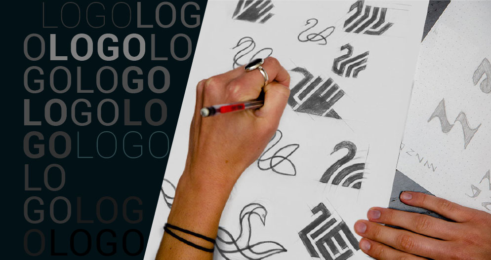
02. Make a template on a sketchpad
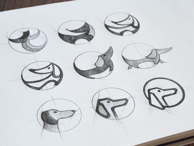
Using a sketchpad is a chance to remove our eyes from the haze of brightly coloured pixels that appear to overtake our lives. Most importantly, understanding various ideas would be a lot simpler, as there is no actual device between our hands and minds. And if you wake up at night with the feeling that you do not want to sacrifice, the pen and paper on your pillow is the best place to recall. When explaining concept concepts to clients before digitising an image, it might be useful to share a drawing or two, making it simpler for them to imagine the effect without distracting from the typefaces and colours. Do not share too much, however, only the best ideas.
03. Work in white and black.
Leaving colour right near the end lets you keep your mind on the fundamentals of the design rather than on anything that is far more difficult to change. Poor design will not be rescued by an appealing comparison, but a good design will still be pleasant regardless of the hue. Picture a well-known symbol. Just think about it now. It is the form that we recognise in front of the palette. There are the patterns, the forms, the picture, whether it is an apple snap, three parallel bars, four horizontal circles, or anything else.
04. Keep it appropriate
A logo must be relevant to the ideas and activities that it represents. The sophisticated typeface is the best fit for a high-end restaurant than a classroom. A palette of pink and yellow fluorescents does not help the task of drawing male pensioners.
The development of a sign that has a resemblance to a swastika, irrespective of the company, is not going to succeed. You are studying all these things. We are really open to you. This is going a little faster, however. The more appropriate the justification for a commercial product, the better it is to sell the idea to the consumer. And that could also be the most difficult aspect of a mission. It is not about building designers. They are moving there, too.
05. Purpose of fast retrieval

Simplicity improves exposure, particularly when so many businesses are competing for our attention. You want to give viewers a chance to recall a mark after a quick glance, and it is not practical for an unnecessarily complicated GUI. A trademark must be conceptualised – have a straightforward ‘storey’ – and must, in certain instances, be uncomplicated in design. This is how it needs to function in a multitude of sizes and operations, from the page logo in the search bar to the building signs.
06. Be a bit more different
If buyers’ competitors do use a common typographic pattern, or a palette of the same type, or a label on the left side of the brand name, they do it differently. This offers you the perfect chance to set your customers apart rather than throw them in.
But too much rivalry in the market does not necessarily mean the research has become easier because it needs a brave consumer to overcome the sea. By showing the imagination in the portfolio, you are going to attract the kind of consumer you desire.
07. Allow broader heritage
This is unusual to have a logo on its own, without a website or business card background. This is why a client presentation needs to include a variety of relevant touchpoints to show how a logo appears when viewed by potential customers. It is sort of like you are trapped in a rut — it will make you move back, look at a bigger view, see where you are, what you are surrounded by. As long as the design is concerned, the broader picture is every potential entity on which the business logo can appear. Notice, though, how identity operates when the symbol is not available, even although it is important, the logo may only provide an identity so far. One approach to accomplish cohesive graphics is to develop a personalised typeface that is not only included in the emblem but is often seen in the advertisement headlines.
08. Don’t be too simple
A logo does not have to show what the company does, it is actually better if it doesn’t, because the more abstract the mark, the more durable it can become. Historically, if it was a family-run company, you might show a corporation, or maybe a heraldic badge, but logos do not imply what you are doing. Then, they make it obvious who you are. The significance in the minds of the people is then introduced as comparisons may be created between what the organisation performs and the shape and colour of the logo.
https://youtu.be/jQ2K8ncq6DU
09. Remember that symbols are not essential
Custom wordmarks also do a job, particularly if the company name is unusual, such as Facebook, Twitter, or Pirelli. Nevertheless, the version of the symbol, which suits in tiny areas, may also be sponsored. It can be as simple as removing a letter from a name with the same hue, or it may include a symbol that can be used as a secondary label (first wordmark, second symbol) instead of a logo lock where all the pieces are seen side by side. Should not be inclined to overdo the style flourish merely because the emphasis is on the message. Readability is the secret of every wordmark, so the demonstrations will demonstrate how the projects work in all formats, big so tiny.
10. Make people smile
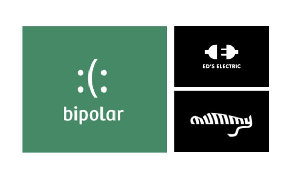
Injecting some humour into your work cannot just make your job more enjoyable, it will also allow your customer to be more effective. It will not be suitable for every industry, such as arms manufacturers and tobacco companies, but whether you choose to partner with those businesses is something else. Less controversial legal and financial sectors are packed with companies identified by stuffy and bland signage, placing a sense of humour in the identification of such clients is one way to separate them.
What is a Decent Logo: Dos and Don’ts

The role behind the logo goes way beyond being a nice graphic that you can apply to your website. At the core of your promotional activities, your logo will represent the centre of the company’s identity. But would that mean that you need to employ a skilled designer to produce this result? Thankfully not that. Nowadays, making a logo has become even more affordable to small business owners, due to the multitude of DIY online logo makers available – such as Wix Logo Builder, the local small company.
Being able to create your little gem with your own money does not mean you are going to have to be completely adventurous. There are a few basic, but essential design rules that you need to keep in mind. From the unwritten principles of using handwritten fonts to match the name and tagline, below are the guidelines to be observed to create a decent logo:
Explore the concept logos

Throughout the illustration of the emblem, the symbol is a simple graphic that reflects the essence of the company. A popular misunderstanding is that the symbol would simply be a picture of what the product or service looks like. Although others will profit from this, it may not have to be the case with all companies. You can explore more conceptual (or even abstract) logos to emphasize what your company is doing. Browse various logo style suggestions for some motivation. And remember, for example, Adidas. The logo of the “swoosh” logo evokes a sense of movement and speed. Very well suited to the sportswear brand. Think of your logo as a sign instead of an image. This has to be really visible and readily identifiable. The advantage of a more graphical logo is that it can often carry more visual weight. Ideally, the logo would be clear enough for clients to recall right after a brief glance.
Create an appeal with lower and upper case letters:
Often it is the little things that create a difference. Anything as simple as messing about with caps and lowercase could carry your trademark to a whole new stage. Traditionally, the upper case logos offer a clear impression of legitimacy, while the usage of the lower case exudes a more approachable, relaxed environment. This is not to suggest you should not use the upper case text thus softening the look with your preference of colours. It is all about harmony.
Allow ample room to your logo

Just like the Mona Lisa, some of the logos look best when surrounded by a beautiful frame. If you decide to move in this direction, be sure to leave enough space between your chosen frame and the logo. Essentially, let your logo have a breathing room. When things seem a little crowded, easily expand the frame or reduce the font size.
Ensuring user-friendliness
The creation will turn up in all manner of ways, from the header to the website to the business cards. No matter where it happens, the document will still be readable. To maintain that, take care of the text size and font you use and review the final results on various sites (Facebook, Twitter, etc.) and on specific computers (desktop, mobile, laptop, etc.). If the logo is too hard to understand, what was the point of creating it in the first place? So guarantee that the logo serves its whole function, make sure that it is visible to every future client in any case.
https://youtu.be/_hFyJb9jJgo
Give the contrast to your background
Following the visibility theme, another way to ensure that your logo is always ‘seen’ is by selecting a background colour that gives enough contrast to your text. If the colour of your text is white, go to a darker background colour, such as black. This is so small, yet so effective.
Align both of the components
We refuse to feel like a broken record, but this style tip of the emblem goes straight to the basic law of fashion. When all of the components (name, tag and logo) are available, it is important that they are well integrated as a whole. Although there is no collection of stone laws to stay on the safe side, we recommend that you coordinate all of the components in the same direction: left, middle, or right. Note, the concept and content will be one (a very happy family).
Scale up the logo
The height of your logo influences the positioning of a variety of other components in your logo. Your logo will never be lower in height than your document. To fix this, you can size your logo to the same height as your text, or even make it slightly larger.
https://youtu.be/HKINBp1TgV8
Professional logo design benefits
Someone beginning a company should have had a recommendation to invest in making a logo even if certain people may not know that creating the logo is only the first phase toward developing a recognisable brand name.
A logo is a keystone to the company, and no matter what form to brand or business you run, it is important to have a professional logo. Without one, your audience will not be able to identify your company, let alone allow you to outperform your competitors.
(a) The emblem is the identity (identifier) of the company

We prefer to represent a particular brand with its emblem, which is linked to your experience and your interaction with the business. Whenever you see a logo of a company you have always worked with, you cannot help but recall the experiences you have had with that specific brand.
(b) Trademarks guide customer decision-making

We can make a judgment on the products and services of the brand, from a single glance at the logo. It is due to our prior interactions of the company, as well as the visual perception of the brand itself. If the logo matches your perception of the type of company you think it is, it can influence the decisions you make and the expectations you have of them.
(c) Logos allow for rapid recognition of the brand
Words are not enough to convey what a brand has to offer, and words are hard to remember. As the old age saying goes, a picture is worth 1000 words. The visual identity of a company needs to be unique so that the brand can be quickly and easily recognised.
d) Logos should help you stand out from the rivals.
The emblem is explicitly related to the company and what the programs or goods are. Countless businesses may sell the same services as yours, but what sets you apart from the others is only your logo & name. This offers you the chance to come up with a template that makes a memorable first impression.
Things to consider before designing a logo:
We are living in an age that relies on digitisation. Because conventional news channels are being replaced by new outlets, it is becoming extremely challenging for companies and individuals alike to create a recognisable brand.
Branding strategies are no longer restricted to business cards and stationery, but a ton is required to achieve a respectable place in the market. Social networking sites play a crucial role in creating brand awareness, and on many of these channels, the emblem is the only thing that is still available.
However, before you start designing a logo, there are some basic rules that you need to comply with.
Here are some important things that every designer and the client should consider before starting the logo design process.
1. Study and evaluate the requirements and priorities of the client
Once you create a logo, you will carry out a thorough research on the goals of your company. Another method of achieving so is with a company questionnaire or a research request. The brand identity you are developing will represent the brand’s mission and objectives.
2. Do not focus on patterns

Style patterns come and go, and they are a phenomenon. Some phenomena have been going on for a long time although others continue as sporadic fads. Although it is important to stay up with the current trends, you cannot focus exclusively on them because they contribute to the logo and brand being dated easily
There is nothing wrong with getting up to date with what is actually on the bandwagon and what has to be stopped, so that is yet another story based on patterns. It is easier to practice your creative ability and conceive about a concept that is special than what everybody else has accomplished. Consider the branding immortal now.
3.Appropriate use of black and white
The choice of the right colour palette may be daunting for designers and clients at the beginning of the project, as the option of certain colours is endless. For this purpose, it may be helpful to design in black and white at the start of the project and then switch to colour.
4. Pay consideration to scalability.

The concept of scalability plays a significant part in the creation of a logo. You will add your logo to promotional items such as social media posts, business cards, posters, and even billboards, so your logo needs to work in all these sizes.
Scalability is almost as critical as the flexibility of the logo design, i.e. how the logo adapts or adjusts to various sizes and directions. In that point, certain companies also activate their logo, and that should be held in mind when creating the logo as well.
In order to suit any dimension of conventional and modern branding, you need to ensure that the logo looks nice in any conceivable and appropriate format. For this purpose, you need to check the logo in both small and wide formats and/or build several variations of the logo with specific usage in case scenarios.
5. Think outside the box
The aim of your finished logo should be to make it unforgettable and connected to the ideals and aesthetics of your company. Be creative and think creatively so you can come up with something that is completely unique. Experiment with a variety of styles, such as negative space, and design something that is truly innovative. Suggest telling a tale or hiding elements inside the design, such as those described above.
6. Strive for the streamline
Having a unique emblem does not mean that it should be visually complex. Complexity is what needs to be prevented, and for that, you need to rely on the principle of minimalism. Define your designs and only add or remove design elements that make the logo design easier. Remove extra items when in question.
Using a simple colour palette and select forms, labels, font types and symbols that do not render the visual messaging too difficult to grasp. Understand why something is better than that. The more you apply to the image, the more dynamic it is.
7. Check the branding on a range of outlets
Although the scalability criterion plays a significant role in the popularity of the brand, you will always make careful to check the scalability on a range of platforms. A logo on a business card or a brochure will appear different from the one on the website.
As there is a big gap between online, internet and print-based formats, check the website presence, electronic, digital advertising, and other marketing collateral. The logo must look good no matter what format it is: digital, printed or even as an app or fav logo.
https://www.youtube.com/watch?v=9LuiVltozuE
8. The branding ought to include a central meaning
What makes the logo powerful is the meaning that it conveys. A logo should be able to convey the message, values and vision that certain brands uphold. The design of the logo should be distinctive and unforgettable, done by providing a core concept with a simple message, even if you do not fall into the trap of simply showcasing what your company is doing. You do not have to have a vehicle with your picture if you are a car salesman.
9. Learn from others
You should also gain ideas from the work of other artists and companies, but it is never acceptable to imitate the work of others explicitly, because that just is not a way to stand out. It is useful to learn from people who are good so that you can imitate them, and develop what they have achieved. Inspiration is crucial to brainstorming new ideas, but if inspiration is the key, creativity is the key.
Conclusion
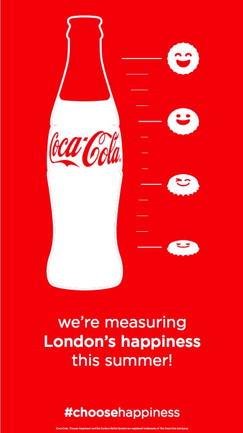
Good branding and promotional strategies are not set up immediately. These points are critical when designing a logo that functions not just to create the brand’s visual identity, but also to help you operate a profitable company.
A well-designed logo has the ability to generate more sales (indirectly), boost customer retention rates and allow people to trust you as a trustworthy brand. Working with attention to detail definitely helps, and by implementing these key tips, you will be able to create a great logo that helps your brand to expand.
Find more interesting topics

