
Lights, camera, action! Ace Adobe After Effects without leaving home
Lights, camera, action! Ace Adobe After Effects without leaving home Lights, camera, action! Adobe After Effects is a powerhouse tool for video editing and motion
Table of Contents
A company’s logo stands for more than a mere visual identifier in that the logo is a concept than can make or break its business chances on the commercial market. A perfectly-created logo can create a strong partnership with the customer or consumer that an organisation and its corporation are seeking to accomplish. In other words, the logo is to communicate with the business’s customers in a way that portrays the business’s own values and goals also known as a ‘z’.
But the wrong logo which does not communicate a business message can ultimately harm a company’s business.
Testimonials
https://www.youtube.com/watch?v=uqiTgSy7EKY
New companies depend strongly on good communication ties with their future customers. Marketers are developing strategies to ensure that people can engage in business in a variety of ways. Business owners also expend a lot of time developing multimedia resources to communicate and connect with customers. Today, the logo or emblem is not only a corporate mark that distinguishes an organisation and its goods or services but instead serves to establish a clear brand image. Even logos created with an automated logo creator will be filled with connotations and meanings just in the same way that a logo is produced by graphic designers, but the key is knowing the subliminal meanings and connotations which through graphic design theory can be learnt. At Blue Sky Graphics students learn logo and theory together in the online graphic design course.
The logo clearly plays a variety of fundamental roles in the global corporate environment. You should give the correct company message to the target market. A beautifully made emblem has the ability to turn individuals into lifelong customers. There are several ways that a well-designed logo will represent the brand and the market.
Here are 9 powerful tips for efficient logo design
Before you set out to develop the logo, make sure you have some visibility into the company and its values, ethos, and business goals. Bear in mind the brand will hit a certain demographic or target audience or prospective consumers. So, it may be researching the business, brand, and the business market before making the logo. Find out what the company vision is and what motivation it has for the future.
Get to know the personality of the brand, too. Is it a softer brand or a tough brand in terms of tone? What is the way it wants to project itself during its market and its customers?
All such details must be ready in advance so that when you design the logo you are thinking in the back of your head about colour, shape, subliminal meaning etc. This information will serve as a guide to the design of your logo. You will choose the logo elements when considering the information about your brand.
Make sure your logo is fully capable of representing your business. The colours and images used in your logo should be consistent and in line with the business you run and the products or services you provide.
Targeted consumers will often infer meanings and messages from a well thought out logo with the correct graphic design if it represents the company and its principles or attributes.
For designers that are new to creating or redesigning a company logo, it may be useful to find three main tips to set up the firm in a competitive environment.
Your logo concept will leave a lasting impact on the market and on consumers. Only a glimpse at the logo is enough to make viewers feel captivated. The logo functions successfully for a company by attracting customers again and again with a lasting impression of the design.
To create an impression, make sure your logo is unique, which means that the design of your logo should be based on a new concept or look different from competitors. It should stand out in the crowd of logos on the market, but the key is the make the logo better designed than your competitors.

Colours have a crucial role to play in determining the brand’s message. For e.g., if you use red as the key colour in the logo, it will send a message that the brand is offensive, enthusiastic, fiery, and energetic. This may mean that the company plans to attract younger consumers. If the main colour is blue, it will evoke feelings of intelligence and unity. That is why most social channels, such as Facebook, have blue logos. If you want to create a social media page, think of having blue as the main colour in your design, but it should also stand out from the current big players.
Use bright and bold colours to catch people’s attention. Such colours will also think about the company personality. Note that any colour evokes an emotion that is a sign to audiences or consumers. There is a theory behind colours that modern graphic designers use successfully which is taught on the BlueSky Graphics graphic design course. See the course syllabus here.
Most designers will neglect fonts over vector, graphics and shapes and do not pay full attention to the typeface range and will have selected it blindly. The fact is that the typefaces are talking about the personality of a brand. For example, the typeface used for the logo of a toy company is most likely to be a handwritten typeface. This is because children are the target customers, and you want to design your brand to relate to children as a child-friendly business.
Similarly, if you create a logo for a rock band, choose bold fonts that create a strong personality for your band. So, make sure there is no mismatch between the typeface you have chosen and the personality of your brand. If you do not pick a typeface for your company, the logo would give the wrong messages to your future customers.
Often, it is better to stop using a gimmicky script. If appropriate, using the own fonts that should be specifically developed for the logo. You may also dream about utilising really high-quality fonts that are now accessible for free on the internet. Logos such as Coca-Cola are known for their unique fonts. In selecting the correct colours, you build both the emblem and the brand name.

Will you like a logo that has the name of the business as its key feature? Ok, it could be the perfect logo concept. This logo is known as a logo. Famous examples of logotypes include Harrods, Ray-Ban, HP, CK, IBM, and Coca-Cola logos. When you want to get a badge, the brand name would be instantly available to the clients. This means that your logo will also become an advertisement for your brand. You are not going to spend a lot on generating publicity about your brand. The logo should say to the consumer the name of the business. Small businesses with a small marketing budget benefit from logotypes.
Even if you want to use an icon as a mark, you would need to invest a lot of time on increasing publicity of the brand name. Famous businesses that use icons as trademarks have the Apple emblem that features a half-byte apple as a company mark.
You may also think of a hybrid logo that includes both the emblem and the name of the product. This logo will display your company name along with a business message from the symbol.
This advice tends to be given by any professional logo designer and almost every experienced graphic designer. All of them put a special focus on developing a basic logo template through their graphic design services. When we talk about a simple logo, it means that one or two colours, fonts and other elements should be used.
Consumers and viewers alike will be offered the meaning at the first sight of the emblem. But if there are too many confusing colours and fonts or a complex shape of the logo, a mixed-signal will be sent to the consumer.
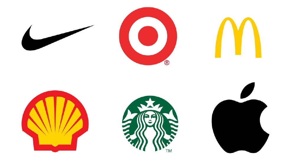
A basic logo is a memorable one too. Most of the global business is represented by simple logos. Take the Nike logo, for example. This is nothing other than a basic swoosh design. The Coke emblem is composed up just two colours. The Samsung logo just has a single colour. The Apple logo has a function as a sign of the company’s success. The simplicity of the design is not limited to the logos. All your graphic designed market collateral and stationery, as well as products, should also be simple, neat and clean.
Many companies have their name in the logo, while others have only a few illustrations. These two types of simple logos are capable of capturing the full attention of the customer. The logo can have colours and pictures, but the target market will be able to recognize the style. This would be too difficult to prevent making a dynamic emblem with a multitude of colours or fonts or a network of lines as well. You can see the Google logo here. The Google logo is the simplest logo in the world.
Note that a basic symbol quickly is part of the past, so the viewer does not have to try to recognize the brand and the industry under the logo again. Therefore, the simplicity of a logo goes a fair way in establishing a brand name, because consumers can quickly identify the product and its products. That is why most companies around the world use logo design contest sites to create simple and minimal logos for their brand.
Another benefit of a successful logo design is that it can be quickly scaled. Bear in mind that the logo can display a range of commercials. It is supposed to look like an impressive logo on all the media. This means that the logo should look impressive when scaled up to larger proportions on a large advert board or billboard. It is expected to be part of the billboard concept.
Even if the logo lacks its sense of proportion and any of the design elements appear strange on a billboard, the logo is a poor one. Similarly, if a logo needs to be printed on a smaller surface, such as a promotional product like a pen, the logo details must still be visible.

Another successful idea for making a strong logo style is to ensure it is equally spectacular in black and white. There are many instances where a logo appears in greyscale or without colours. These could be on papers, faxed papers, newspaper advertisements, stationery, among several other things. For example, many newspaper ads are usually in black and white. This ensures that the logo will create a long-lasting impact on audiences of the commercial.
One of the tricks to create logos that are stunning black and white designs is to make sure they look great at the sketching stage. Do not rely on colours when you draw a pencil sketch. Most artists assume that after filling the colours, the logo would look spectacular. A better way is to fill colours only if the logo is a memorable colourless design.
Business is like dating — you are seeking to draw the right clients and make them fall head-to-head in love with your company. It is worthwhile to think of your logo as an image about your dating profile. This is what helps people take an interest in you and want to know more about you (or move aside if you are not for them). And you want to look your best, and not get swiped do you not?
Your logo will have a huge impact on the first impression that your business is going to make: it will give your customers information about your brand and let them know if it is right for them.
Since your logo is such a vital aspect of your name, you want to make sure it is presented properly. Each of the promotional products should have a mark on them. It is going to look back at your customers from your website, your packaging, and your business cards or indeed anywhere else it is placed. Just make sure it has an impact or statement! A great, professional logo design does not just have the power to communicate what you stand for. It is also going to make a good first impression and help you stand out from the competition.
You want your logo to communicate the personality of your brand. And to do that, first, you need to understand what your brand’s core personality is. Think about what your business goals are, its philosophy, aims and what it stands for? Once you have a clear idea of what makes you unique and what your brand is all about, it will be much easier for you to make design choices that complement and complete the picture.
The toughest aspect of the design process may be a logo inspiration quest. Luckily, we at Blue Sky Graphics have some tips for you that will make things very efficient when preparing for a logo.
You may be a philosophical individual, so you want to start gathering verbal ideas. A good brainstorming session will be exactly what you need to nail down. This is the first step in the right direction that you are attempting to make things work. Here are three measures that will help you come up with the latest innovative logo ideas:
When it comes to brainstorming the design, do not be scared to step out of the box and be a little special.
This is a method that is sometimes used by graphic designers who enjoy experimenting with new technologies, skills, and techniques. And instead of using the same fonts, colours, graphics, or software on whatever product you are dealing with, spice it up a bit and try something new that maybe breaks the conventional rules.
Fall into a new and inconsistent typeface. Think of 3D instead of 2D. Take a couple of new design tools. Sketch uses a carbon or ballpoint pen instead of a pencil. Break the rule; see what is going on. Ask yourself: How are you going to treat this style in the past?

One opportunistic thing a designer will learn is to network and interact with several other designers. Although even this can be difficult. You may be the only artist in big business, a freelancer working away from home, or you may be worked in a two-or three-person workshop.
But these are all merely interpretations. There are several easy ways to go out and talk with other creatives. Go to seminars, conventions, and take part in graphic design activities. Have a look at events set up by popular graphic design community the dots and also interact with social media. Working collaboratively can prove successful and address the obstacles, hurdles, and problems that can arise in graphic design briefs.
When you are a visual person from a learning perspective, a mood board may be the best device to inspire you. You may build an actual board by cutting and pinning printed photographs or make a digital version (Pinterest will be the obvious option here). Simply collect all the images you feel drawn to — they can be other logos, colour combinations, illustrations or graphics, go wild! You should be able to recognise that your mood board represents the style and interface features you are gravitating to in no time.
Dream about how to picture your company in your logo. Joe &The Juice (a chain of stylish juice bars) is all about fresh health-conscious cash rice time-poor consumers, and their retro logo beautifully represents that with a sketched silhouette with a man in a suit sat down with a coffee. If you are searching for a similar style, your mood board may contain photographs of retro signs, painted drawings and organic shapes and colours. Or take a look at how the Rugged logo visualizes their “rugged” brand identity in a bold and rough looking word mark, but still includes a luxurious vibration with a reflective golden effect. The mood board offers you the chance to put all these things together.
The safest spot to take things from you. It is your competition! Find out what is out there, what is going great for the crowd, and what you are expected to compete with and come out on top. When watching other firms and their respective logos, think of what makes them distinct from you and how you should highlight such variations your logo.
Be sure to set yourself apart from your competition. When all the other firms in your business are going monochrome, you may want to pick a colour to stand out. If anyone else is traditional, a pleasant and modern logo could attract attention.
Now that you have a good picture of your company and feel motivated, it is time to start turning it into production. There are several specific things that come into play here, from colours, forms, and textures to typographic fonts. Isolating each part and what it can do with your logo can help you handle it step by step, rather than being distracted with the whole concept at once.
The first thing you want to do when you think about your logo is to pick the best graphic aesthetics for your company. There is no design that is perfect for everybody, only what is appropriate for your company.
Trendy logos may be enjoyable and entertaining, but they also easily appear out of date. A classic style gives you better power to stay and can help you reach a wider audience. This aesthetic keeps it simple and does not venture into crazy colour palettes, graphics or fonts. A traditional look shows people you are trustworthy and down to earth even timeless.
There is an explanation of why antique and futuristic fashion houses have been on the bandwagon for some time now. They immediately remind you of the past and invoke a nostalgic feeling of nostalgia. A retro logo shows consumers that tradition is important to you and that everything you offer is accurate. Worn and hand-illustrated logos in brown and beige paint palettes suit this elegance perfectly.

Brands also prefer a sleek, streamlined look to convey how new and innovative they are. This design utilises a lot of whitespace, sparse detail and clear shapes, mostly culminating in elegant, walled back logos. A sleek, contemporary look tells the consumers that the brand is up-to-date, trendy and understands what counts.

This is a popular choice for brands with young (or young at heart) target customers. Pleasant and humorous types appear to be colourful and adorable, and also use icons or drawings to create an optimistic and welcoming environment. Go for a whimsical logo or a nice illustration to let the friendly character of your company come through.
The handcrafted design conveys a simple message: this company is individualistic and advocates for handmade excellence. The style works well in combination with other aesthetics, such as vintage, to really get the message home. But it can be combined with minimal and fun styles for a simple and sophisticated look, or a bright and youthful look.
In addition to the overall theme, there are 7 key styles of logos that you can pick from when you design your logo. You can choose the one that best suits your company name or overall aesthetics, or combine it to create something unique.

Letter mark logos can be perfect for streamlining your company logo, particularly if your name is long or hard to recall. Many companies choose to follow their initials, just think of HP, CNN or H&M. Such monograms can be perfect for sleek icons, but note that they are not really effective for explaining what the company is all about.

Wordmarks are a very easy way to use your company name as a logo. To give them individuality and respect meaning, they are all about typography—just look at the ONE wordmark logo. If you have a fantastic reputation for your business, this might be the best opportunity to place it in the forefront.
Pictorial markings or emblem icons are what we consider when we hear the term “emblem” They are iconographic icons that are readily identifiable that reflect the company with a picture. You may pick something simplistic or more complicated, so make sure you select a symbol that provides a special relation to your company. They are often paired with a wordmark (you know, so customers know your name … at least until you are on par with Apple and Target in terms of brand recognition).
Instead of a recognizable symbol, abstract logo marks are geometric shapes that do not establish an immediate connection to an existing image but create something entirely new for your brand. An abstract logo will condense your business into a symbol that is totally unique to you. If you want to create a certain mood or feel for your abstract logo, find out the meanings of different geometric shapes of the logo.
Mascot logos are a nice way to give the company a personality. They are often colourful, cartoon characters that represent your business in a family-friendly and approachable way, like the cheerful Gadget Mole above.
A hybrid label is just as it says on the tin: it blends an icon with a wordmark to produce a clearly identifiable emblem. The brand name is either put next to the emblem or inserted into the graphic features. Customers can equate all components with your name, which helps you to include them either individually or together.
Similar to combination marks, emblem logos are often also a combination of word and pictorial elements. They usually consist of text embodied in a symbol or icon, such as badges, seals, or crests.
Colours could have a ton of different meanings behind each hue. The psychology behind colour is complicated and there is an entire module dedicated to colour that gets taught in most graphic design schools called Colour Theory (It is also on the Blue Sky Graphics design course) so in order to make things simple, colours have many feelings and thoughts connected to them. To read all about paint philosophy, check out this in-depth guide to the emblem shades and their definitions.
Red: Red stands for anticipation, zeal, frustration. This is a perfect option if the company is big, youthful and needs to stick out.
Orange: Orange is a lot less used than red, but it is just as energetic. It is a vivid, invigorating, fun bright colour.
Yellow: If you want to be accessible and friendly, yellow is the right choice. It gives off a cheerful, affordable, youthful energy.
Green: Green is extremely versatile and can really work for any brand. It is especially perfect for anyone who wants to make a connection to nature and the enviroment.
Blue: Blue is a rather traditional and growing alternative. It is soothing and sweet, symbolizing trustworthiness and maturity.
Purple: Purple will be your luxury-looking fare. Based on the colour, purple can be mystical, colourful, or feminine.
White: If you are aiming to be more gender biased in favour of female nuances, nothing goes better than white. Even this is not all of it! With shades like pastel rose, millennial pink or neon magenta, pink will offer your logo a mature, chic, but still youthful, feminine feel.
Brown: Brown may seem like a peculiar choice of paint at first, but it fits well with gritty and masculine retro logos. It will offer a crafted, exclusive and aged look to your company.
Black: When you are searching for an elegant, chic and comfortable feel, black is going to be a perfect option. A minimalist black and white logo is the right way to go if you want to keep it simple.
White: Do you want your logo to look tidy, sleek and minimalist? Using a lot of white on the branding. It works in combination with all other colours as a neutral colour, but adds a clean, youthful and economical touch.
Grey: Grey is the perfect hue if you choose to go for a polished, customary and intense feel. Darker shades are more enigmatic, whereas lighter shades are more available.
Of example, you do not need to stick to a single colour monochrome logo, however you may mix multiple colour logos to convey the complete colour tale of the company. For choose shades that fit together well, take a peek at the paint wheel.
Find more interesting topics
Lights, camera, action! Ace Adobe After Effects without leaving home Lights, camera, action! Adobe After Effects is a powerhouse tool for video editing and motion

Transform your videos with these easy home lessons in After Effects Are you a video creator looking to take your projects to the next level?

Learn Adobe After Effects From Home Introduction If you’ve ever dreamed of creating visually stunning motion graphics, animation, and visual effects for your projects, Adobe

Unlock your creative potential: Learn Adobe After Effects online! Unleashing your creative potential through Adobe After Effects is like opening a door to endless possibilities

How to learn Adobe After Effects at home To master Adobe After Effects from the comfort of your home, begin by exploring online tutorials on

Master Adobe After Effects from the comfort of your home! Mastering Adobe After Effects from the comfort of your home is not just a possibility

Become a digital design wizard with remote Adobe XD classes Embark on an exciting journey to become a digital design wizard with remote Adobe XD

Get creative from home: Dive into Adobe XD training With the rise of remote work, learning Adobe XD has become more accessible than ever. Get
UK Blue Sky Graphics – Online Graphic Design College
8th floor, Metro Building 1 Butterwick, London, W6 8DL (UK)
Copyright 2024 – UK BLUE SKY GRAPHICS LIMITED – ONLINE GRAPHIC DESIGN COURSES
London – Birmingham – Glasgow – Liverpool – Bristol – Manchester – Sheffield – Leeds – Edinburgh – Leicester – Coventry – Bradford – Cardiff – Belfast