
Can A Logo Be Just Words?
There are seven different types of logos. Each style has specific benefits, so it is worth taking the time to decide what kind of logo you want before you even start creating your own logo. To learn logo design, it is better to start off with the graphic design. Blue Sky Graphics offers an online course in graphic design that can teach you the basics of graphic design and also cover logo design.
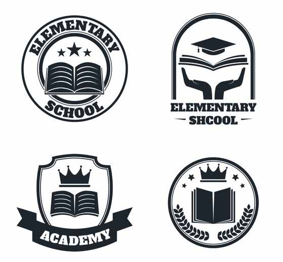
Emblems:
Emblems are the oldest version of a logo. Sometimes known as seals or crests, they have been used by humans since at least the middle ages, if not earlier.
The icon is the kind of logo that contains text within the mark. It is a classic look that gives the logo a traditional look. That is why you always see them used by schools and government agencies—they help it sound good and official.
Can A Logo Be Just Words?
Emblems are also more complex than other forms of logos, which contain fine linear and thin, detailed images. However, this is not a hard and fast rule.
When to use an emblem?
Your brand would like to express a feeling of heritage and/or continuity.
When to avoid an emblem?
Your logo has to be scaled. Emblems do not appear very tiny (like favicon scale on a website) and do not read well from far out (like on a billboard).

Logotypes:
Often known as a wordmark, logotypes are icons that are made up of words or phrases that make up the name of the brand. The key subject here, apparently, is typography. This logo design is a close link between the visual identification of the brand and the name of the business.
Because of this, you would have to carefully select or make your font. The form, design, and colour of the terms express just as much significance as the words themselves. This is much more critical if the company’s name is a nonsense term, as too many of these days—Google, for a very popular illustration.
The Google logo is powerful since the font is plain and elegant—like its products—but made up of several colours. The various colours reflect the multitude of results you get while searching Google and the variety of their product portfolio. The bright colours are cheerful and open, which makes sense when you realise that Google needs its goods to be widely used and not to intimidate new people.
When to use a logotype?
You are a young business that needs to bring its reputation out of there.
Your brand has a short name that would not sound confusing as it is embossed like a sign anywhere.
Your name is your brand (e.g., you are a photographer). Logotypes help to strengthen the connection between visual memory and name recognition.
You are a young business that needs to bring its reputation out of there.
When to avoid a logo?
You do not want to change the branding on a daily basis. Fonts are following patterns. Helvetica might be all the rage these days, but in a couple of years, it may sound as old as the fluorescent bubble letters of the 80s.
Monogram Logos
Again, typography and font are the secrets to monograms (also known as letter marks). You may get much more imaginative with the styling of texts since readability is less of a problem than with logotypes. The less letters there are, the less often anyone can interpret them wrong. Many luxury designers use the monogram logo and it is an instantly identifiable emblem of their company.
When to use a monogram?
You want a connection between your name and your visual identification, but you have a really long name.
You operate in an industry where it is popular to shorten your name to initials (see you, law firms!)
When to avoid a monogram?
You are a young organisation, and you are not yet known. In this scenario, you may also use a letter type. However, you might want to add your full name below before you have credibility.
Brand marks
When we move on to this collection of logo styles, you may find that we are moving more and further away from the usage of terms. You can think of this as an ever-increasing challenge in a video game—the more you get away from the overt text, the more weight the real picture would have to bear.
This takes us to the mark (also called the “pictorial label”). The imagery you chose for your business identity must be extremely familiar for the typical person to remember and identify it. These logos also develop over time from one of the above types. Think about how the Starbucks logo started as a symbol, but now it is just a mermaid painting.
That is why it may be a challenge for a new business to solely use a brand name. Just bear in mind that you may require a wordmark associated with your picture for a while before you can lose it completely.
When to use a pictorial mark?
Your brand identity lends itself to being simply drawn. For eg, the Apple logo is a simple example of a brand name is simply drawn. It makes more sense for their brand to use a visual mark than a wordmark or symbol.
You want to build a sense of brand personality with an image that you will not be willing to use only your name otherwise.
When to avoid a pictorial mark?
You are trying to be perceived as conservative and extreme. It is not difficult to use a pictogram if you do, but choosing the correct one is more of a difficulty.
Abstract logo marks
Sticking with images but getting away from a literal representation, we have got an abstract emblem. This logo style is used when you want to use an illustration, but you do not want to be restricted by a literal depiction. You may construct an abstract logo that evokes a feeling rather than just a thought. These may be tough since not all can perceive the picture in the same way.
What is unique with these kinds of logos is that after you have put the name out there, no one really (hopefully) has a logo like yours. You would be well on the way from the outset to distinguish your brand from the majority of the industry.
The Nike Swoosh: it is swift, dynamic, and it conveys a sense of movement and energy. You should not have to see the term Nike to identify the name behind the product or commercial. And even though you are unfamiliar with the company, you get a fairly clear sense of what it is all about. Here is where abstract logos thrive—immediate and distinct identification.
Why choose to use an abstract mark?
You want your logo to have a pictorial aspect; however, you want to establish a more serious atmosphere than most literal pictorial logos do.
When to avoid an abstract mark?
You have not solidified the brand name yet. Because abstract marks express thoughts, you need to know what kind of emotions you are attempting to produce in your customers before you build imagery.


