
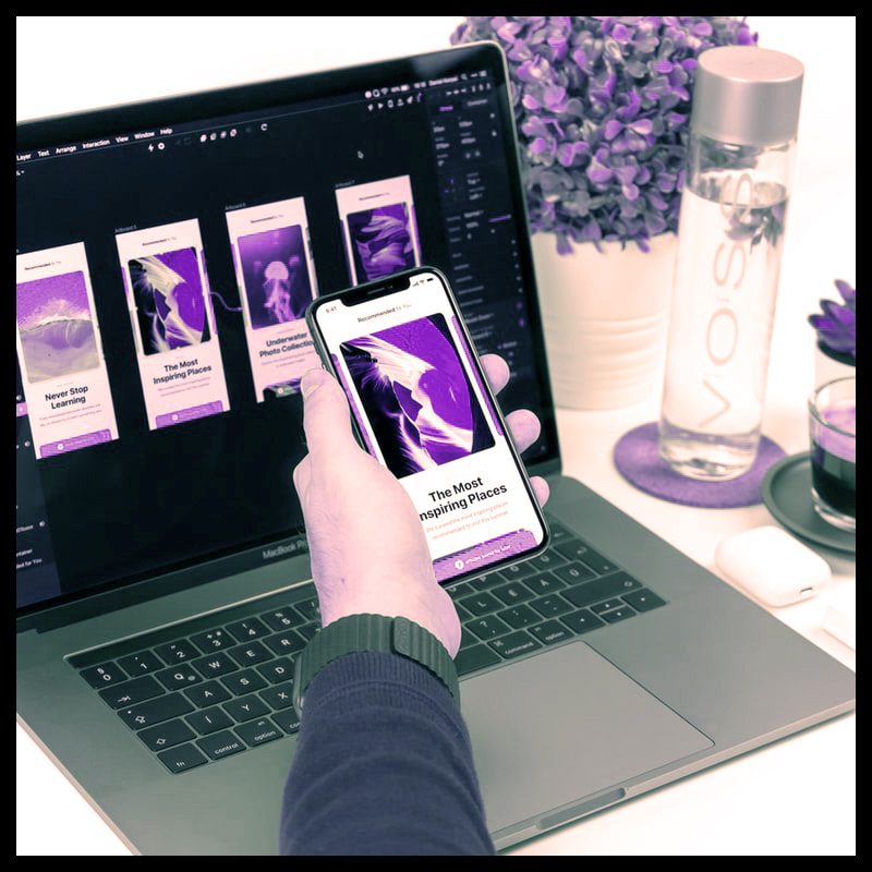
What Are Your Tips For Learning Graphic Design?
Graphic design seems to be attractive to students or novices with no prior expertise. They should not expect to become an experienced designer after just a month of trial and error. They may either seek professional assistance from established graphic designers or do a 4-6 month internship in an advertising firm. They need to practise more designing and eventually get a full grasp on it. You can learn graphic design online through Blue Sky Graphics online graphic design course.
Here are some of the most useful graphic design ideas for beginners!
1. Choose the Correct Fonts:
The importance of design clarity and readability cannot be overstated. Make careful not to limit your creations to a single typeface. Experiment with various font styles and adhere to a distinct font style for the current project you are working on. Instead of using those boring default fonts, look into other options.
What Are Your Tips For Learning Graphic Design
2. Make your colours stand out:
You may use a colour pop method to catch your viewer’s attention at first glance, particularly if your content is brief and you want to make the most of it. High-contrast palettes such as yellow and white or black, red and black, and vibrant backdrop colours perform well. Check the coherence of your design as well, and strive to make the best impression possible. To choose a pleasing palette for your design, you may use the Adobe Colour CC online tool.
3. White Space Is Strong and Valuable:
White space is important in current graphic designs that emphasise minimalism, with Apple being the greatest example. When executing text on a large canvas, choose a high-quality font and then centre your type, leaving the rest of the canvas white. Overall, the canvas would look great.
4. Choose Images That Are Consistent:
Make certain that the picture quality is constant throughout your design. The components’ quality, frame, style, dimensions, and lighting should remain consistent throughout the design. The graphics, diagrams, pictures, and drawings you employ should perfectly complement the message of your project.
5. Scanning your Drawing:
If you are drawing your design, be sure to scan it on your PC; utilise a smartphone camera to do so, and then upload the scanned sketch straight into Illustrator or Photoshop. You may now proceed with your design as usual but remember to keep the scan as a backdrop reference.
6. A Little Flat Design Can Go a Long Way:
Flat design has grown in popularity throughout the years as its aesthetic has evolved from somewhat colourful to classier. You should also have a strong understanding of alignment and spacing when utilising flat design methods to get an exceptional appearance.

7. Make use of character and paragraph styles:
Choose your header with care and design it. Headers are in somewhat varied locations, with varying font sizes and line heights. InDesign and Photoshop, for example, offer built-in features to ensure that your characters and paragraphs are perfectly balanced. Such tools will undoubtedly save you time from constantly navigating between pages, highlighting and verifying to ensure that your designs are properly positioned.
8. Use italics sparingly:
You should also utilise italics in some of your projects for a great impact. They should be used with caution since they may effectively balance your headers and sub-headers. Italics should only be used in short phrases. Avoid them for lengthy phrases since they will ruin your effort.
9. Maintain Page Balance:
If you want to be a great graphic designer, you must understand about symmetry and balance throughout the process. Ensure that the balance is steady, since it has a significant effect on your design. The document you are working on should be equally loaded on the left and right, or, in certain cases, upwards and below.
10. Style and Impact Separation Lines:
Using line separation for an accurate piece may bring a small item up to scratch if you work hard to make it seem complete. Try employing half lines on each side of a tiny text thread instead of a solid line. Using a 3-pixel line below the header and above the sub-header, or between the picture and the title, can enhance your work and go a long way.
The aforementioned efficient graphic design guidelines should provide novices a decent concept of what they may do with their website designs.
Focus on composition
If you only do one thing well, make it the composition.
The arrangement of your design components is referred to as composition. Because the aim of design is to tell a narrative using pictures, how these images are arranged is critical to the overall effectiveness of your design.
Most excellent designs feature a clear line or route for the eye to follow from the focal point. This focal point may be created in a variety of ways, but here are some of the most common:
Make use of colour. Colours that are warm or bright tend to catch the eye. High-contrast regions also entice onlookers. To add interest, use complimentary hues (red/green, blue/orange, yellow/violet) or black-and-white.
Make use of typography. Because larger type attracts the attention more than smaller print, use headers and headings in the same way you would for written content to establish order and structure.
Make use of lines and forms.
Lines with arrows entice viewers to follow them, and various kinds of lines (horizontal, vertical, diagonal, wavy, etc.) may elicit a variety of emotions. Shapes may also provide visual appeal and help a person better absorb what they are looking at.
Use the “rule of thirds” to place essential information. Consider dividing your design space into thirds both horizontally and vertically (you will end up with a grid of nine squares). To add visual interest, place items along those lines or at their intersections.
Be deliberate in your alignment. Nowadays, most design tools include a function that allows you to easily “snap” to align with various horizontal or vertical regions. Aligning headers with paragraphs of text on the right, left, or centre has various impacts — but do not combine them or your design will appear crowded or haphazard.


