
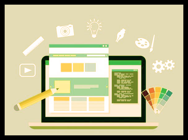
What Are The Latest UI Technologies?
The title “UX/UI Designer” appears so often that you may believe that “UX” and “UI” signify the same thing. In reality, though, they are two very different ways of approaching architecture. User Interface (UX) Architecture is about validating the usability and viability of obtaining a user from point A to point B. For this to work, user testing and analysis are needed.
A UX Designer offers a proof of concept, not a polished model. User Interface (UI) Design is about making the “proof of concept” look and sound awesome. Knowledge of the principles of UI Design is expected for this purpose. A UI Designer offers a refined, high-fidelity specification that is ready for production. UX Design and UI Design are, as you can see, two separate skill sets. They are independent of each other, but they use each other to build an optimal user experience. You can study graphic design along with UI design at Blue Sky Graphics so contact us today!
What Are The Latest UI Technolo?
UI Design without UX
If you just concentrate on UI Design, you are likely to skim over essential UX Design guidance. For example, replacing labels with placeholder text could tend to be a simpler and more balanced design. In fact, however, these labels are very important for the rate of completion and usability of the form.

The two of the form input labels
In this situation, attempting to make the “look better” UI simply results in a bad user experience. By relying on the placeholder text to identify the data, the mark will vanish as soon as the user clicks on the input. Hiding the input mark when used is a bad UX Design.
UI vs. UX Design 2021: Harmonisation of two separate fields to improve user engagement
While UI and UX design deal with various facets of web design, they are an important part of each other’s success. A beautiful architecture can also be challenging to use if the code is cluttered. In the other hand, a genius user experience will make the programme boring and physically horrible due to a poor graphic interface design. Both UX UI design methods need to be executed flawlessly to build an outstanding user interface/experience. And when these stars align, the effects can be astounding.
UX architecture is primarily a method of experimentation. Instead of just drawing flashy windows, most product teams have their own way of discovering customer desires, prototyping, usability checking, and collaborating with UI UX developers. When they talk about their concept methods, you can feel like they know what they are talking about. Bear in mind, however, how each commodity varies from each other.
What a decent user interface template looks like
A decent user interface design is essentially one that looks good and simple to use. Best interfaces tend to be very simple, as too much material or too many photos and buttons just contribute to frustrated users. A frustrating interface causes the user to dig through the screen while attempting to locate the bits that are important to them, while a decent one helps the user to go ‘arrow like’ to the parts of the web they need. A perfect way to simplify the interface is to use whitespace, as it breaks down the text and helps the user to focus on crucial areas.
One way to make it easier is to make buttons and choices more readily recognisable by using the icons that people ‘wait’ to see. The ‘trash can’ is a clear example, since most people can grasp what it does without further clarification.
Such logos have not improved over time because they are so ‘iconic’ and recognisable that everyone immediately recognises what they are doing. This is a key feature of strong user interface design. So, make sure you make it intuitive by using the symbols you want to use, since these are the ones they are looking for. It is just not a smart thing to have a wacky symbol in place of the conventional, plain and reliable ones, no matter how well made they might be.
User interface and search engine 2022
Although the bounce rate of the pages on your website may not have a major impact on the search engine rankings of your site, the time on the site (also known as ‘dwell time’) will. This is naturally correlated with the Bounce Rate, since when users leave the web easily (and therefore may not look around) they are bound to have spent such a brief time on the site.
User interface and search engine 2022
Often, if people are looking for an expression, then go to the site and leave it immediately, this ‘tells’ to Google, etc., that the site is not applicable to that phrase, at least if it occurs enough times. This is another justification to make sure the guests remain on site.
Too much clutter may also cause slow loading times
Another impact of making pages cluttered with too much material will cause the page to load more slowly. Slow load times can have an adverse impact on search engine optimisation, particularly on mobile devices.
Responsive design
Creating a user interface that suits a variety of screen sizes is a must. Nowadays, handheld smartphones and laptops come with a variety of screen sizes. You will need to take care of optimising the user interface that supports viewing in any orientation.
Contents
It is advisable for programmers to allow primary content to be displayed without users needing to scroll or zoom in. The primary material on your web page should remain a focal point on the browser. Adjusting the configuration to suit the screen size correctly and preventing graphic displays that create disruptions is also required.
Display
A decent user interface does not distract or draw the user. It simply simplifies the whole user interface with a minimalist style. Designers need to be vigilant when using colour schemes, themes, font types, text sizes, graphics, buttons, icons and other graphic features.
Innovative design
There are a number of new UI architecture developments in the sector. Google’s content design recommendations allow use of highlights, lighting, depth effects, transparent backgrounds and other visual effects to have a consistent and interactive visual appeal to the website. It is necessary to stay up-to-date with any new functionality that might be included on your website.
Alignment
The alignment of the different sections of your website allows people to understand how the material relates to each other. Marketing or reviews content should be included in the related pages of the website. This idea can be adopted by placing ads and posters, showing pop-up screens, displaying text or sign-up dialogue boxes, or tapping on social media share buttons and more.
Customisation options for users
A decent user interface design allows the user to have full control of the browsing operation. This involves moving sidebars and being able to filter post by date or blogger. It also requires the provision of tools for customising colour schemes, sidebars, backgrounds and more.


