Top Font Styles Of All Time
For decades, typefaces have been an important component of the ‘reading-writing civilisation. They have developed into the digital era of typography and design when fonts count much more than any previous period.
Fonts significantly impact how typographic information appears and feels to the audience; therefore, it is critical to pick the right font for printing, publishing, web design, and other jobs. Graphic designers use fonts in almost all their designs. Blue Sky Graphics can teach you graphic design and how to use these fonts in the best possible way!
Serif Fonts
When it comes to creating a clean and attractive visual for a business, many designers find that including a Serif font into their designs adds a touch of flair and refinement to the brand.
A serif font is immediately identifiable by the “small feet” at the extremities of the letters. With all of the possibilities available, searching for serif fonts might take you down the proverbial rabbit hole, but here are the top best serif fonts.
Top Font Styles Of All Time
If you are creating with a clean, minimalist aesthetic in mind, a basic approach to typography is critical to achieving that appearance, which a sans-seif font may assist.
Slab Serif Fonts
A slab serif font is a serif font that has had the serifs removed, giving it a powerful, robust aspect rather than the polished appearance of a typical serif. Compared to other serifs, a slab serif font has less contrast overall, contributing to the font’s hefty, dramatic effect.
Rockwell is one of the most well-known slab serif typefaces, with strong, angular serifs and powerful geometric forms. Rockwell was created in 1934 by the Monotype foundry’s in-house design group. It is generally used as a display typeface, although it is recognised to bring beauty to any piece of design.
Display Fonts
Display fonts are fonts that fall within a broad category. These are often used for short-form or large-format applications like billboards or posters. Additionally, these typefaces may create logotypes, headlines, and headers for websites, magazines, and book covers. These typefaces might be serif, slab serif, script, or sans serif. Certain typefaces offer a display version that enhances or exaggerates the original design for a bigger scale.
Script Fonts
A script typeface is created to evoke the creativity and elegance associated with calligraphy and traditional hand lettering. They can be ornamental, and the majority are used in the same way as to display fonts, creating a statement rather than conveying a predetermined message.
These typefaces are frequently used in branding, logotypes, stationery, and poster design. When used with a variety of other font types, they aid in the creation of distinct moods.
Luxury Fonts
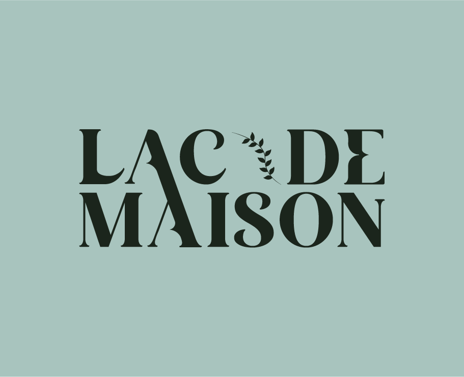
Luxury typefaces provide an air of refinement, luxury, and status. Now, not every font qualifies as a luxury font since the font you select for your project is essential to its success. While the appropriate pictures can undoubtedly assist, if your project’s theme is not supported by the typeface, it may be doomed to fail.
Vintage Fonts
A vintage typeface has the inherent power to transfer you and your work to another period and infuse it with the necessary nostalgic and timeless vibe.
No other font style can replicate this well. They are being able to take your audience or customer back to times like Prohibition or the 1960s in order to infuse their business with new life while keeping adhering to its beliefs and goals.
Fonts in the Handwritten Style
As the name implies, handwritten fonts are meant to appear as though they were written by hand with a pen or marker. While the stylistic range of this design is rather vast, it accurately depicts the minor variances and variations inherent in genuine handwriting.
While some may equate the handwritten font to the script typeface, the distinction is that script fonts are more ornamental or even have a hint of calligraphy, but a handwritten font resembles the handwriting used to write a letter.
Helvetica
Helvetica continues to be the most widely used font in the world. It is primarily recognised for signs and commercial documents such as invoices and receipts. It is easy to read due to its high x-height, which makes it appear larger than it is. This makes it an excellent alternative for clients that want an extremely fine print. The most often levelled criticism against Helvetica is that it lacks personality. That is OK if your goal is to give a neutral impression, but adopting a unique typeface might elicit a response from your readers.
Calibri
Our runner-up is likewise a sans serif typeface. It does, however, have more personality than Helvetica. The set-width is more condensed, and the letterforms are more rounded and imaginative. Calibri was created by Microsoft and is now the default typeface in Microsoft Office. Its contemporary and “business casual” appearance makes it an ideal choice for the majority of business papers.
Futura
The following is another example of a classic sans serif typeface. If you notice a pattern, you are not alone. Sans serif fonts are trendy right now because they encapsulate the atmosphere of our postmodern period. Futura is the most widely used geometric font today. Its characters are entirely composed of circles, squares, and triangles. If your customer wants readers to perceive it as ultramodern or futuristic, this is a common choice.
Garamond
Garamond is our first serif typeface. Garamond is a classic font type that dates all the way back to seventeenth-century France. It is one of the most beautiful fonts available. Garamond is primarily known as a book printing typeface. You may use it if you wish to communicate an air of elegance and traditional taste.
New Times Roman
The world’s most popular serif typeface has lately fallen slightly behind Garamond in popularity. In 1931, the Times of London commissioned the typeface. It remained faithful to the font for forty years. It will always be associated with journalism, and publishers use it on a daily basis for books and general printing. Due to its reputation, it is the ideal typeface for companies seeking to communicate a strong, trustworthy image.


