

Online Graphic Designer Course Certification Classes
Several Graphic Design classes, such as Blue Sky Graphics, may be accessible online, which would be beneficial and would help you improve your abilities on multiple platforms, not just one. There cannot be a single graphic design course that can assist you in achieving all your desired goals and objectives. However, you can pursue both degree and diploma programmes, depending on your preferences. Several projects have been selected that will give you with the greatest experiences. Each course is structured in such a manner that it may adequately refine a specific ability.
What Is the Best Way to Learn Graphic Design for Beginners?
Learning Graphic Design is not a tough process. They may either enrol in professional graphic designing courses or learn online through online courses. Learning to be a graphic designer takes a great deal of patience. It allows you to comprehend and learn a lot of things that will most likely assist you in the future.
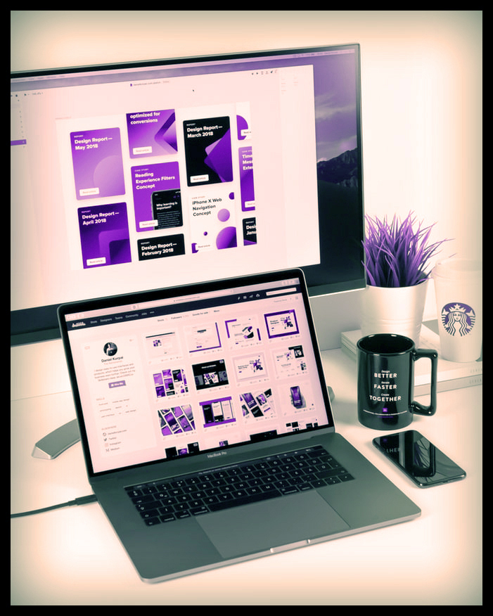
Online Graphic Designer Course Certification Classes
Tips for Beginners
Given the vast number of techniques and technologies available, graphic design might appear to be a difficult undertaking. When it comes to professional software like Adobe Illustrator or Photoshop, what started off as a fun creative endeavour may rapidly turn into a dreadful chore that must be completed. Fortunately, with the ever-increasing usage of technology, more and more software are being produced to assist graphic designers, from expert to beginner. Here are crucial graphic design hints to help you complete your next design job.
Select contrasting hues
Colour may be challenging. Your design’s objective is to catch the attention of your target audience and elicit a certain feeling. The colours you pick will have a big impact on how your audience reacts to your design. Keeping your brand’s identity in mind, consider using high-contrast colour palettes to make it stand out. High contrast hues, such as red and green, are opposite each other on the colour wheel.
To achieve a unified design, consider matching the colour of your typeface or other graphic components to the colour of your backdrop picture.
Adobe Colour CC is a wonderful online resource for creating coherent colour schemes, with hundreds of colour selections and hex codes that specify the levels of the component colours. Make a note of these to ensure that your colours are consistent throughout designs.
Keep the typeface as basic as possible
The importance of readability in design cannot be overstated. You are not needed to use only one font, but try not to use more than two and keep them in the same font family. If you utilise two fonts, use one for the header text and another for the body text.
Experiment with different typefaces that come preinstalled in your design programme, or look into obtaining free fonts from internet resources. The more stylized a typeface, the more difficult it is to read. Because the primary function of text in a design is to transmit information, choosing difficult-to-read typefaces may jeopardise the message you are attempting to convey.
Keep in mind that not all fonts are free for commercial use, so double-check the licencing before utilising them in your work.

Make use of white space
Keeping with the colour theme, employing white space is an excellent graphic design advice, especially for people with less expertise. By focusing on a single aspect with nothing to distract from it, this serves to demonstrate simplicity. You will not have to worry about a slew of additional factors. Apple is well-known for its use of white space and the simplicity it evokes.
Drawing and sketching designs
If you are drawing your design by hand, make sure to scan it to your computer. You may quickly capture a photo with your smartphone camera and upload the scan immediately into Illustrator or Photoshop. Use your scan as a starting point for digitally creating your design.
Make use of the flat design style
Flat design is your ally! This design style has grown in popularity over the years, making it ideal for both novice and expert designers. Flat design, which has taken on a more refined appearance, provides for a better feeling of alignment and spacing, resulting in a beautiful design end with a simple procedure!
Consistent components are essential
When selecting design components such as background pictures, keep quality and style in mind. Graphics, diagrams, pictures, and illustrations should all have a function in your design and follow a consistent style, frame, style, proportion, and lighting.
Organise your text
Throughout your project, keep the alignment and structure of each piece in mind. Adobe provides built-in capabilities to assure uniformity across the board without the need to manually check each piece. Apply the header style to each header and you will be good to go!
If you include a body of text (e.g., a paragraph), each line should be no more than 30-40 characters long, including spaces. Anything longer than this may be difficult for readers to read. Maintaining consistency with your line characters can assist you avoid writing a paragraph that appears like a Tetris game.
Effects of typography
The knockout effect is a common typographic effect. This effect is particularly effective with logos, but it may be used in any design.
Placing it over a picture is another excellent typographic effect. Placing text over a backdrop image does not always work and often results in difficult-to-read text. This is easily corrected by adding a dark colour layer just over your image. Set the blending mode of this layer to “multiply,” and your text will stand out without interfering with the image.
Make use of iconography
Icons can be used to attract attention to a certain section of a design. If you want people to follow you on social media, use the instantly recognised symbols for each site so that your audience can quickly identify your username. If your design is on the basic side, icons may be a wonderful way to liven things up without adding too much.









