

Online Course Graphic Design Software
Graphic design is the process of integrating pictures, text, and ideas to produce works that engage the spectator and communicate a message. Because graphic designers are always experimenting with new ways to structure and produce work, they have developed a range of ideas and techniques for organising and producing work. You can learn Adobe Photoshop, Illustrator and InDesign graphic design softwares through Blue Sky Graphics online graphic design courses.
Components of design
Components of design are best seen as the foundation of any endeavour. Even the most sophisticated graphic design portfolio may be deconstructed into its basic components, such as lines, curves, and typefaces. Meanwhile, design principles—alternatively called “art principles”—are rules that assist in defining and regulating how those components interact with one another, with their surroundings, and with their audience. Join us at Blue Sky Graphics and learn graphic design from the comfort of your own home with our online graphic design course.
While both design elements and design principles are important ideas to understand, this article will concentrate only on design components, which are the most fundamental components of any graphic design endeavour.
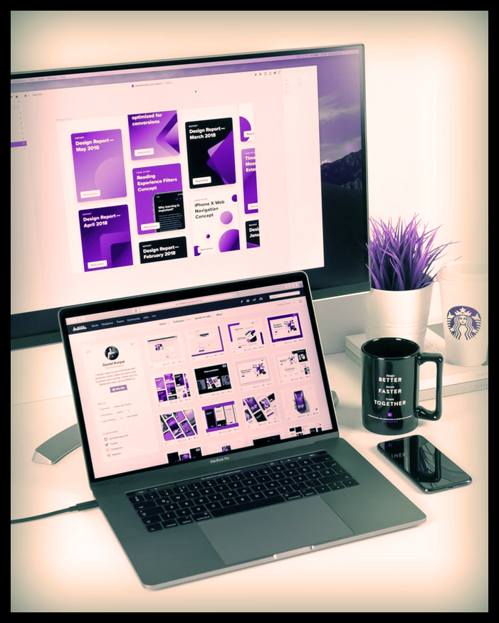
Online Course Graphic Design Software
Line
Lines are never just a collection of connected points. Lines, depending on their shape, weight, length, and context, may aid in the organisation of data, the definition of forms, the indication of movement, and the expression of emotions.
Grids in print design
Grids in print design serve as guidelines, adding structure and direction to projects. Meanwhile, visible lines of varied weight and shape may be utilised to communicate a range of moods and feelings throughout a designer’s work.
Consider the lines you encounter in your daily life and the messages they convey. Heavier black lines may either give a feeling of security or attract attention to a danger, depending on their context. Lines scribbled on a piece of paper may convey enthusiasm, bewilderment, or chaos. While wavy lines may elicit emotions of fragility, elegance, ambiguity, or beauty, zigzagged lines may elicit feelings of vitality or wrath.
Shape
Shapes are best described in graphic design as regions, forms, or figures contained inside a border or closed boundary. Each graphic designer should be familiar with two distinct kinds of shapes: geometric and organic (or “free-flowing”).
Geometric shapes may be two-dimensional or three-dimensional in nature. Often abstract and simple in character, they are composed of a grid of dots connected by straight or curved lines. Triangles, pyramids, squares, cubes, rectangles, pentagons, hexagons, octagons, decagons, circles, ellipses, and spheres are all geometric forms.

Organic shapes are much less consistent, proportionate, and defined than manufactured shapes. Their nature may be symmetrical or asymmetrical. They may be natural things like leaves, crystals, and vines or abstract forms like blobs and squiggles.
Colour
Colour can be a very effective tool for conveying a message to your audience or eliciting an emotional reaction from them. Colour theory and the colour wheel are useful tools for graphic designers who want to mix a single colour or a range of colours harmoniously — or purposefully discordantly. Certain colours are classified differently in graphic design.
The primary colours
The primary colours (red, yellow, and blue) are the pigments from which all other colours are created. There is no method to create red, yellow, or blue by combining them with other colours. When they are joined, however, a rainbow of colours emerges.
Secondary colours
Secondary colours (violet, green, and orange) are created by combining two main colours: red and yellow generate orange; blue and red produce purple; and yellow and blue produce green.
Tertiary colours
Tertiary colours (red-orange, yellow-orange, yellow-green, blue-green, blue-violet, and red-violet) are the six hues created when a primary colour and a secondary colour are combined. Colour harmonies are produced by combining two or more colours based on their colour wheel locations.
Colour schemes
When choosing colour schemes, keep in mind the tint and shade that are most suitable for your project. While pastel tones may convey a sense of serenity or insecurity, bright colours can inspire emotions of joy and happiness—or, in the wrong setting, might look cheap. While darker colours communicate seriousness and competence, when used incorrectly, they may also come off as gloomy or dull.
Texture
The texture of a surface dictates how it feels; it may be hairy, smooth, rough, soft, sticky, or shiny. The majority of graphic designers are needed to visually convey texture via the use of illusions to simulate how their work would feel in the hands of visitors. Texture is important in making designs seem polished and professional.
Texture may be used into your design work in a variety of ways. If nature serves as your inspiration, you may want to work with organic textures such as leaves, tree bark, stones, fur, flowers, grass, and dirt.
Type
Regardless of whether you use a typeface or develop your own typography for a graphic design project, it is critical that the type be readable and suitable for the topic. Because type has a major impact on a design’s overall tone, consider whether your letters should be printed or scripted, and if their angles should be sharp or rounded.
Space
Spacing is a vital component of every designer’s toolkit. It may give a design more breathing space, boost its visual impact, balance off heavier visual components, and attract readers’ attention to pictures or phrases they should remember. Without space, your design risks becoming too visually cluttered for your audience to understand.
Spacing may be used to divide or connect items. A small gap between visual components suggests a strong relationship, while a large distance indicates a weak association. While surrounding a visual object with space emphasises its significance, space may also symbolise loneliness and isolation.
Image
Whether they utilise photos or drawings, graphic designers depend on visuals to capture their audience’s attention and convey certain ideas. A picture serves many purposes: it contextualises a designer’s message, it adds essential drama or action, and it establishes an overall atmosphere.
Conclusion
From posters and billboards to brochures and packaging, design components may be incorporated into any shape or layout that utilises text, pictures, and ideas to communicate a message. Once you’ve mastered the skill of carefully choosing and implementing each idea, you’ll be well on your way to producing unique, communicative, and aesthetically appealing graphic designs.









