

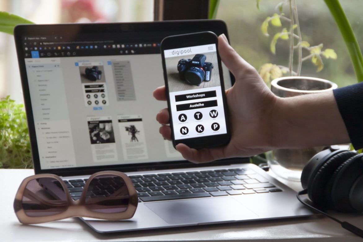
What is user experience and what is the user interface?
User experience and user interface are often confused and used interchangeably. User experience is the overall experience that a person has when using a product or service. This can include the complete experience from beginning to end, as well as different parts of the experience. The user interface is how a person interacts with a product or service. It includes everything from the buttons on a screen to how information is displayed. Both user experience and user interface are important for creating a successful product or service.
Aesthetic considerations in user experience vs user interface design
User experience and user interface design are two important considerations in creating a beautiful and easy-to-use product. However, oftentimes, the two are not aligned, with user experience taking a backseat to more utilitarian concerns like functionality. A new study by The Nielsen Company attempts to quantify how different design elements affect user satisfaction.
According to the study, an intuitive interface that is visually appealing also leads to increased satisfaction. The results showed that users who rated the visuals as being very good or excellent were more than three times as likely to be satisfied with the product as those who rated them only good or fair. Moreover, users who rated their overall experience as excellent were more than four times as likely to be satisfied with it than those who rated it only good or fair. These findings suggest that aesthetics can have a significant impact on user satisfaction and should be considered in product design decisions.
Principles of good graphic design: hierarchy, balance, simplicity, legibility
The principles of good graphic design are hierarchy, balance, simplicity, and legibility. These principles guide the selection of typography, colour, and layout. They help create an effective user experience and a visually appealing interface. Design principles can be divided into four main groups: hierarchy, balance, simplicity, and legibility. Each principle has its own set of guidelines that should be followed when creating graphics.
Hierarchy is the first principle and dictates the order in which content is presented on a page. The goal is to create a logical and easy-to-follow layout. Elements that are higher up in the hierarchy are generally more important than those at the bottom, and elements near the top of the hierarchy should be more visible than those further down.
Balance is crucial when it comes to creating layouts because it ensures that all content on a page is equally important. One way to achieve balance is by ensuring that there are equal numbers of large and small elements on a page. Another method is to use focal points or anchor points to help draw attention to specific areas of a page.
Guidelines for creating a more effective user experience:
Designing user interfaces that are effective and appealing is a difficult task. The goal is to create an experience that is both efficient and engaging for the user. There are many factors to consider, such as how the interface looks, how it functions, and how it feels.
The following guidelines can help you create an effective user experience:
1. Keep your design simple. Don’t overcomplicate or hide important information with unnecessary visuals. Users want to be able to quickly understand what you’re presenting them and move on to the next task.
2. Make sure your interface responds accurately to user input. If a user tries to perform an action that isn’t supported by your interface, it should respond in a way that makes sense (for example, displaying an error message). In order to create a more effective user experience, it is important to have a clear understanding of how the user interface (UI) and user experience (UX) are related. UI is the look and feel of the interface, while UX is the overall effectiveness and usability of the interface. A good way to achieve a better UX is by following some guidelines.
One key guideline for creating a better UX is to make sure all elements of the interface are well-designed and easy to use. This means simplifying the design so that it is easy for users to understand and navigate, as well as making sure all buttons and menus are clearly labelled. In addition, it can be helpful to include professional images or videos that explain how to use the interface features instead of just relying on text labels.
Use intuitive icons and design patterns to make navigation easier.
There is no single right or wrong way to design a user interface, but there are some popular design patterns and intuitive icons that can make navigation easier for users. One common design pattern is the accordion, which expands and contracts to show more or less content. Users can also access commonly used menu items by clicking on related icons that resemble popular objects or tools. Another helpful shortcut is the use of tabs, which divide a screen into multiple equal sections that can be navigated using keyboard shortcuts or mouse clicks. By using these simple techniques, designers can create an interface that is both visually appealing and easy to use.
Use feedback mechanisms to ensure users are aware of their actions.
The effectiveness of feedback mechanisms can be greatly enhanced when the user interface (UI) and user experience (UX) are integrated. The goal of this paper is to provide a review of the literature on UI/UX feedback mechanisms and their effects on satisfaction, task completion, and learning. We find that feedback mechanisms can positively impact users’ satisfaction with the system but that it is important to consider the design goals in order to ensure that feedback is effective. In addition, we discuss how feedback can help instil learning habits in users and improve their task completion rates. Users are more likely to take action if they are aware of their actions. Feedback mechanisms can help users be aware of their actions by displaying feedback on the screen or through other means. Feedback mechanisms can also help users learn from their mistakes and improve their user experience.
Use white space and negative space to improve the aesthetic appeal of your website or application.
When designing a website or application, it is important to take into consideration the aesthetics of the design. One way to improve the visual appeal of your site or application is by using white space and negative space.
White space can be used to create a clean and organized look for your site or application. By using whitespace between elements, you can create a more appealing layout. Additionally, adding a whitespace around text and images can help to emphasize these elements and make them easier to read.
Negative space can also be used effectively in web design to create a more appealing appearance. By filling in areas with negative space, you can add depth and dimension to your designs. This technique can be used to improve the overall look of an image or text area. Additionally, negative space can be used as a way to separate different sections of an application or site.
Check your work against the principles of good graphic design to ensure that your user’s experience is as positive as possible.
Every designer has a personal style that they use to communicate their ideas. If you want your users to feel positive about the experience they’re having with your design, it’s important to use principles of good graphic design. Here are tips for creating a user interface that is both effective and pleasing:
1. Make sure all elements are organized and easy to find.
2. Use clear and concise text labels, buttons, and menus.
3. Use typography that is legible in different sizes and on different devices.
4. Avoid unnecessary decoration or visual noise.
5. Follow common design principles such as hierarchy, focal points, balance, contrast, and repetition.
What is user experience?
User experience is the totality of a person’s experience with a product or service, encompassing both the external (visible) aspects and the internal (unseen) components. External elements include the design and layout of the user interface, how well it responds to user input, and how easy it is to find what you’re looking for. Internal factors include how intuitive the controls are and how well the system supports your goals.
The goal of good user experience is to make users feel comfortable using a product or service, whether they’re novices or experts. Poor user experiences can result in lost customers, lower morale within an organization, and even reduced productivity.
User interface design: The basics
User interface design is the process of designing the look and feel of a computer program’s user interface. User interfaces can be divided into two categories: graphical and text-based. Graphic user interfaces use images, graphics, and icons to represent different commands and functions. Text-based user interfaces use text instead of visuals to communicate with users. The two most common types of user interfaces are desktop applications and web applications. Desktop applications are installed on a computer’s hard drive, while web applications are accessed through a browser on a computer or mobile device.
Users interact with user interfaces by using input devices such as keyboards and mice or touch screens. Some user interfaces allow users to control multiple computers from one location using networked computers.
A look at the “golden rule.”
The “golden rule” is the principle that states that users should be given the same degree of feedback and satisfaction with the interface, regardless of their level of expertise. User experience (UX) designers take this guideline to heart when designing an interface, striving to create an experience that is both easy to use and pleasing to look at. Here are tips for improving your user interface’s appearance:
1. Use a consistent design style across all your interfaces. This will help users feel more comfortable browsing and using your site or app.
2. Keep things simple! Oversimplifying your UI can make it easier for users to understand and navigate while still providing enough information to complete tasks successfully.
3. Take advantage of typography and layout techniques to add personality and intrigue to your pages.
The importance of feedback
The importance of feedback cannot be overstated. In order for a system to be effective and efficient, it is imperative that users are able to provide feedback about their experiences with the system. This feedback can take many forms, but the most important type of feedback is the feedback that helps improve the usability of a system. User experience (UX) designers are responsible for creating systems that are both effective and efficient, and one of the best ways to achieve this is through the use of user feedback.
User experience design relies heavily on feedback to help improve the quality of a product. Without user feedback, it would be difficult to determine whether or not a product is meeting users’ needs. UX designers use various methods in order to collect user feedback, including surveys, interviews, and focus groups. By using user feedback throughout the design process, they can ensure that products are both effective and efficient.
Guidelines for improving user experience
User experience is the overall impression a person has of their interaction with a system or web page. User interface design is the visual presentation of that system or web page. The two should be designed in concert to create an optimal user experience. Here are guidelines for improving user experience:
1. Put users first: User experience starts with understanding who your users are and what they need from your system or web page. This will help you design features that are relevant and helpful while minimizing the user’s effort.
2. Use familiar metaphors and icons: People tend to understand and use familiar metaphors and icons when interacting with systems and web pages. This makes it easier for them to find what they need and reduces the cognitive load involved in using your system or web page.
3. Use simple, consistent design: The user experience is greatly influenced by the visual style and design of your system or web page. Make sure that you have a consistent look and feel throughout all your systems or website s pages. 4.
Tips for design teams to create better user interfaces.
Designing user interfaces is an essential part of any software development project. However, many novice and experienced developers alike struggle with creating user interfaces that are both effective and pleasing to the eye. This article offers a few tips for design teams to create better user interfaces.
First, it is important to understand that different users will have different expectations when using a software application. Therefore, it is important to tailor the user interface to meet the specific needs of each individual user. Additionally, it is essential to consider the overall layout of the interface and how various elements interact with one another.
Another key factor in designing effective user interfaces is attention to detail. Every element of a UI should be purposeful and designed with care in order to create a polished product. In addition, it is important to take into account usability issues when creating a new UI or improving an existing one.
WordPress for Designers
WordPress is a popular content management system (CMS) that many designers use to build their websites. WordPress is free and easy to use, making it an ideal platform for designers who want to create websites quickly and easily. However, there are some important considerations that must be taken into account when designing with WordPress.
First, the layout of a WordPress website should be designed with the user experience in mind. Make sure that all elements of the website are easy to navigate and understand. Second, keep in mind the graphical design of your website when choosing a theme or creating your own custom template. Third, consider using plugins to make your workflow easier and faster. Finally, make sure that your website is optimized for search engine optimization (SEO). By following these tips, you can create great websites using WordPress without sacrificing quality or usability.
WordPress Elementor for Designers
WordPress Elementor is a powerful and user-friendly WordPress design tool that has quickly become one of the most popular and commonly used tools for creating beautiful, well-organized websites. With Elementor, designers can easily create custom designs, customize existing templates, and add their own flair to make their websites look unique.
While there are many similar design tools available online, what sets Elementor apart is its intuitive user interface and the wide range of features it offers. Whether you’re a novice designer looking for an easy way to get started or an experienced professional looking for new creative ideas, Elementor has something for you.
Whether you’re a beginner or a seasoned pro, WordPress Elementor is worth checking out – it has everything you need to create stunning visuals without any of the hassles.
Figma
Figma is software for designing user interfaces and user experiences. It is similar to Adobe Photoshop but with a focus on design flexibility and speed. In this article, we will explore the user interface vs user experience similarities between Figma and Adobe Photoshop.
Adobe XD
Adobe XD is a new graphic design software that has been making waves in the industry. It offers users a wide variety of features and tools, making it an attractive option for those looking for a powerful and versatile toolset. However, one of the main criticisms of Adobe XD is that its user experience (UX) is inferior to that of other popular graphic design software options.
Visual Communication
Visual communication has come to play an increasingly important role in user experience. Gone are the days when designs were solely based on text or graphics that were divorced from one another. Today, effective visual communication must be integrated into both the design and interface of a product. This is where graphic design comes into play, as it can create appealing and user-friendly interfaces while also enhancing the overall user experience.
One way graphic designers can help improve user experience is by using visuals to simplify complex tasks or processes. For example, imagine you are trying to book a flight online, but the website is too difficult to navigate. A designer could create a simple but attractive interface that uses icons and simple colours to represent different parts of the booking process. This would make it easy for users to find what they’re looking for and wouldn’t require them to learn a new set of navigation commands. The use of graphics in communication has become increasingly popular over the years. Whether it’s for webpages, presentations, or advertisements, graphics can help convey a message more effectively. However, when it comes to user experience vs user interface graphic design, there is often a trade-off to be made. In this article, we will explore the different factors that go into creating a successful user experience vs user interface graphic design.
What is Visual communication in graphic design?
Visual communication is the process of creating messages that are relayed through visuals. Graphic designers use visual communication to create Messages that evoke an emotional response, Inform or entertain, or simply communicate information. Visual communication can be used in a variety of different mediums, including print, web, and mobile design. There are three main components to effective visual communication: content, form, and context.
Content is the information that is being communicated. It can be anything from headlines to paragraphs to images.
The form is how the content is presented. This includes the size, shape, colour, and layout of the text and images. The form can also include elements like typography and layout patterns.
Context is the environment in which the content is being delivered.
Application of Graphic Design: Adobe Photoshop, Adobe Illustrator, Adobe InDesign
Graphic design is an application where the use of graphics and typography can create a visually appealing and effective piece of work. With software such as Adobe Photoshop, Adobe Illustrator, and Adobe InDesign, graphic designers have a wide range of tools at their disposal to create graphics that are both aesthetically pleasing and functional. However, it is important to note that user experience (UX) and user interface (UI) are two separate aspects of graphic design. UX refers to how easy a product or service is to use, while UI deals with how well the interface resembles what users would expect on their computer or device. It is important for graphic designers to understand these two concepts in order to create an effective user experience for their clients or customers.
User experience is important because it ensures that users feel comfortable using a product or service.
Adobe Photoshop
Adobe Photoshop is one of the most popular graphic design software programs on the market. It has a wide range of features and options that make it perfect for many different types of graphic design tasks. However, it can be difficult to determine which features are the most important to use when working with Photoshop. The user experience (UX) vs user interface (UI) distinction is an important way to understand how different aspects of the program work together.
The UX focus looks at how users interact with the program and what they find helpful. This includes things like how easy it is to find what you need, how well the menus are organized, and whether there are any hidden features that you can use. The UI focus looks at how everything looks and works onscreen. This includes things like the layout of panels and buttons, colour schemes, and font choices.
Adobe Illustrator
Adobe Illustrator is a powerful vector graphic design software. It has an intuitive user interface and a large number of features. However, some users experience difficulty using it. This paper will examine user experience vs user interface in graphic design and compare Illustrator to other popular programs.
Adobe InDesign
Adobe InDesign is a powerful graphics designing software that allows users to create professional-grade documents. The software offers an intuitive user interface, but some users experience problems with its functionality. A recent study looked at the user experiences of two groups of people: those who used InDesign and those who used another graphic design program. The study found that the two groups had different opinions about the usability of the user interface and the speed and quality of their work. Those who used InDesign felt that it was more efficient and produced better-looking documents than those who used another program. However, those using InDesign did not like that it took longer to learn the software than other programs.
Web Design
Web design is a process of planning, designing, and creating a website. The goal of web design is to create an effective and attractive online presence for a business or individual. There are many factors that go into creating a successful web design, including the user experience and the graphical design. User experience refers to how easy it is for people to use the website. Graphics design focuses on how well the website looks and how well it functions.
A well-designed website should be easy to navigate and look good on all types of devices. It should also be responsive so that it looks good on different devices, including phones and tablets. In order to create a successful web design, it is important to understand both user experience and graphical design.
Design websites
User experience, or how a website feels to use, is more important than ever. Designers need to focus on creating a smooth and intuitive experience for users, regardless of the interface they are using. Graphic designers can help by creating attractive, user-friendly designs that improve the overall user experience.
While there are many different types of user interfaces, graphic designers should always keep in mind the goal of making the site easy to understand and navigate. The following tips will help you create an effective user interface:
-Keep buttons big and clear. Make it easy for people to know what action they need to take next.
-Use icons where possible. Icons make it easier for people to identify different elements on a page without having to read text descriptions.
-Create a consistent layout and design throughout your website.
Typography
When it comes to user interface design and graphical design, typography can often play a big role. When it comes to user experience, however, typography may not be as important. This is because a good user interface will communicate the necessary information in an easily-understood way without having to resort to typefaces that are difficult on the eyes. In fact, some studies have found that users actually prefer interfaces with less text as long as the information is easy to find.
This means that while typography definitely plays a role in user interface design, it’s not always necessary or even desirable for graphical designs. However, if you want your interfaces to stand out, using well-designed typefaces can definitely help!
Theory
Different theories have been put forth to explain how people interact with digital devices. Some researchers believe that people use visual cues to understand how to use a device and make decisions accordingly. Others believe that people learn best through tactile feedback and try to replicate that experience when using a digital device. A recent study investigated the effects of user interface graphic design on user experience. The study found that users who used graphic designs that were simple, direct and engaging experienced a higher level of satisfaction with their device usage.
Colour Theory
A study of user experience vs user interface graphic design has shown that a colour palette that is pleasing to the eye can make a difference in how users feel about a product or website. In 2010, Vitaliy Burtsev and Tanya Kachan found that the use of mainly blue, green, and brown colours helped improve the perceived quality of websites by making them more aesthetically pleasing. The study also found that these colours are associated with trustworthiness and intelligence.
In 2013, Matteo Bittanti and Davide Fabbri studied how different colour palettes affect user engagement on social media platforms like Facebook and Twitter. They found that using warmer colours, such as peach and yellow, increases positive emotions, while cooler colours, like blue and black, promote feelings of security. Colour theory is the study of how colours affect emotions and perceptions. Different colours can create different feelings, which can influence how people interact with digital interfaces. In order to create a user experience that is pleasing to everyone, it is important to understand colour theory.
Graphic design is in demand.
According to a study by the career website Glassdoor, graphic design is in high demand among employers. Graphic designers are in high demand because they are responsible for creating Interface and User Experience (UX) designs that make users happy. Good graphic design can create a positive user experience and increase loyalty among customers. Employers are looking for designers with skills in typography, layout, colour theory, and composition. Graphic design is in high demand by employers, and with good reason. Graphic designers can create beautiful, user-friendly designs that help people interact with a product or service more effectively. In addition to creating attractive visuals, graphic designers must also be familiar with various user interface design principles. This knowledge can help them create interfaces that are both user-friendly and aesthetically pleasing.
Wireframes
Wireframes are versatile tools that can be used to create a variety of user experiences. They can be used to help designers better understand how users will interact with the design and to create a more realistic representation of the final product.
User interface graphic design is all about creating an appealing and intuitive design for your users. This type of design focuses on the overall look, feel, and structure of your app or website. By using wireframes as part of your process, you can create a clear and concise vision for the finished product. Wireframes can also be helpful in evaluating different designs and finding those that work best for your users.
UX/UI Design Strategies
User experience (UX) professionals are tasked with creating an overall user interface that is easy to use and attractive. User interface (UI) designers must take into account the entire user experience when creating a design, from the layout of the page to the colour palette. In this article, we will explore some UX UI design strategies.
Before starting any design project, it is important to understand your audience. Who are you designing for? What do they need or want from your product? Once you have an idea of who your users are, it is time to start sketching out ideas. Take into account what features and functions are most important to your users, and focus on these first. Remember that not everyone will want or need the same thing, so be sure to be flexible in your designs.
UX/UI Design Principles
Designing user interfaces and user experiences is an important task for any business. There are a number of principles that designers should keep in mind when working on these projects. Some of these principles include keeping the interface easy to use, using intuitive graphics, and designing for different screen sizes.
It’s important to keep in mind how users will interact with the interface. This can be done by observing how people use similar interfaces or by conducting user research. Additionally, it’s important to consider the target audience when designing the interface. For example, if a company is targeting users who are over the age of 55, they may want to design their user interface accordingly.
Another principle that designers should keep in mind is usability. This means that the interface should be easy to understand and use from start to finish.
UX/UI Design Techniques
User experience design is all about making sure that the user has an enjoyable experience while using a product. User interface (UI) design, on the other hand, focuses on the look and feel of a product. There are many different techniques that can be used to create a good UI, and this article will explore some of the most common ones.
One important aspect of UI design is making sure that all the elements of the product are consistent. This means that the font size, colour, and layout of menus should be similar across all parts of the product. It also helps to avoid confusion for users by ensuring that everything looks familiar.
Another common technique is to use Sparks. Sparks is software that can help you create mockups for your products.
What is design language?
The design language is a set of design conventions that help designers communicate the look and feel of their designs. It can be used in both graphical and non-graphic design contexts and can be simple or complex. It can include specific font types, colours, shapes, and patterns, as well as general concepts like hierarchy, typography, and layout.
There are many different design languages out there, but some of the most popular ones include Arial, Helvetica Neue, Gotham, and Ubuntu. Each one has its own set of rules and guidelines that a designer should follow in order to create effective designs.
Designers should always experiment with different design languages to find the one that best suits their project. By using a variety of techniques and resources – from online tutorials to reference materials – they’ll be able to create high-quality designs quickly and efficiently.
What is the difference between a design language and a software interface?
Design languages are used in software interfaces to help designers better communicate their ideas. They are similar to interface design principles, but they focus on the language and structure of a program’s user interface. Interface design principles, on the other hand, focus on the graphical elements of a program. Design languages can help designers create more consistent and user-friendly interfaces, while interface design principles can improve the look and feel of an application.
What are some of the major design languages in the market?
Major design languages in the market today are HTML, CSS, and JavaScript. Each has its own strengths and weaknesses, which is why it’s important to choose the right one for the project at hand. When creating a website or app, you’ll want to use an appropriate design language that will be effective for your target audience.
HTML: HTML is the foundation of all web pages and forms. It’s what allows you to structure your content and create unique pages. Because HTML is so versatile, it can be used for everything from blogs to e-commerce sites.
CSS: CSS provides the formatting and layout of a site or app. It gives your pages a uniform look and makes it easy to tweak individual elements. Because CSS is so flexible, you can use it for anything from basic typography to complex animations and designs.
How does a design language work?
Designing user interfaces and user experiences can be a challenging task. How do you create a design language that is easily recognizable by your users while still keeping your design cohesive? In this article, we will explore the concept of a design language and how it can help improve the user experience.
A design language is a set of specific guidelines that helps designers create cohesive and visually appealing designs. By following a set of standardized rules, you can ensure that all your designs look consistent and are easy to understand for your users.
There are many different aspects to consider when creating a design language. You need to decide on which elements are most important to you and focus on implementing them in as consistent a way as possible. This will help make your designs easier to navigate and understand, making them more effective for your users.
What are the benefits of using a design language?
With the increasing popularity of mobile devices and apps, it is more important than ever to create user interfaces that look good and feel good. User experience (UX) is a critical aspect of any design, but it is also important to consider the user interface (UI) in terms of its graphic design. A well-created UI can not only make your app or website look great but can also improve its usability.
Here are some benefits of using a design language:
1. A design language creates consistency across an entire product or website. This can help reduce the amount of time needed to learn and use an interface, making it easier for users to become invested in your product or site.
2. Design languages can help you communicate your brand’s values and intentions to customers and users.
What are the drawbacks of using a design language?
Design languages have become increasingly popular in recent years as a way to improve the user experience and increase consistency across different applications. However, there are many drawbacks to using a design language. First, design languages can be difficult to learn and use. Second, they can lead to inconsistency in the appearance of applications. Third, they can be time-consuming to create and maintain. Fourth, they can be difficult to translate into other languages. Fifth, they can be expensive to develop and implement. Sixth, they can be difficult to scale up or down. Seventh, they can be difficult to adopt by non-designers. Eighth, they can lead to less creativity in the design process.
Is there a “right” or “wrong” way to use a design language?
Design languages are a type of graphic design that can be used in order to create user interfaces and user experiences. They come in a variety of forms, and there is no one “right” way to use them. Some designers believe that using a design language helps to create a more unified and cohesive user experience, while others say that it can lead to an overcrowded or cluttered interface. Ultimately, the best way to use a design language depends on the specific project requirements. Design languages are all about creating a consistent approach to designing user interfaces. Different design languages have different advantages, but there isn’t necessarily a “right” or “wrong” way to use them. Ultimately, the goal is to create an interface that is easy to use and looks good.
Some popular design languages include Material Design, iOS Human Interface Guidelines, and Android Design. Each has its own strengths and weaknesses, but they all share some common principles. For example, Material Design emphasizes flow and simplicity while iOS Human Interface Guidelines emphasize feedback and usability.
Ultimately, the best way to find out which design language is right for your project is to try out several different ones and see what works best for your specific project.
What are some examples of design languages?
Design languages refer to specific ways of communicating with users. Some examples include:
-UX design language: Used to communicate the design goals and objectives of a product or website to the user experience team.
-UI/UX design language: Used to communicate the design goals and objectives of a product or website to the user interface/user experience team.
-App development language: Used by app developers when they create and code applications.
-Web development language: Used by web developers when they create and code websites.
-Graphic design language: Used in graphic design to communicate visual concepts, messages, or designs. Design languages are a way to communicate design ideas and principles to developers. They can be used in both graphical and non-graphical interfaces. Some common design languages include BRANDING, LAYOUT, INTERFACE DESIGN, and STRATEGY.
Designing a user interface is an essential part of any brand’s marketing strategy. It should be attractive, informative, and easy to use. But how do you go about creating a user experience that matches the design? A study published in the journal “Journal of Interactive Marketing” found that graphical design (i.e., use of colours, fonts, and graphics) has a stronger impact on user experience than user interface design. In other words, a well-designed graphic will create a better user experience than a poorly designed interface. This suggests that you don’t need to focus as much on the design of your user interface as you do on the design of your graphics. However, it’s important to keep in mind the goals of your brand when designing graphics. If your goal is to attract new customers, for example, make sure your graphics are eye-catching and easy to understand.
What are the limitations of design languages?
Design languages are popular because they simplify the process of creating a user interface. However, they have limitations that must be considered when designing a user interface.
Some of the limitations of design languages include the following:
-They can be restrictive and difficult to use in complex designs.
-They can be inflexible, which can lead to inconsistency in the user interface.
-They may not be well suited for certain types of interfaces, such as dialogue boxes or menus.
-They can limit creativity and innovation in design.
There is a growing trend of companies limiting the creativity and innovation that can take place in design. A study was done by Interaction Design Institute (IDI) at Georgia Tech, which found that user experience (UX) is more important than user interface (UI) graphic design when it comes to creating a successful product.
The study looked at 15 different products across various industries and found that while UI graphics can still have an impact, it’s not as crucial as UX when it comes to overall product success. The study says that “clearly communicating what the product does and how it works” is far more important than designing a pretty interface.
This trend of companies favouring UX over UI graphic design is likely due to the increasing popularity of apps and websites that are designed for mobile devices.









