

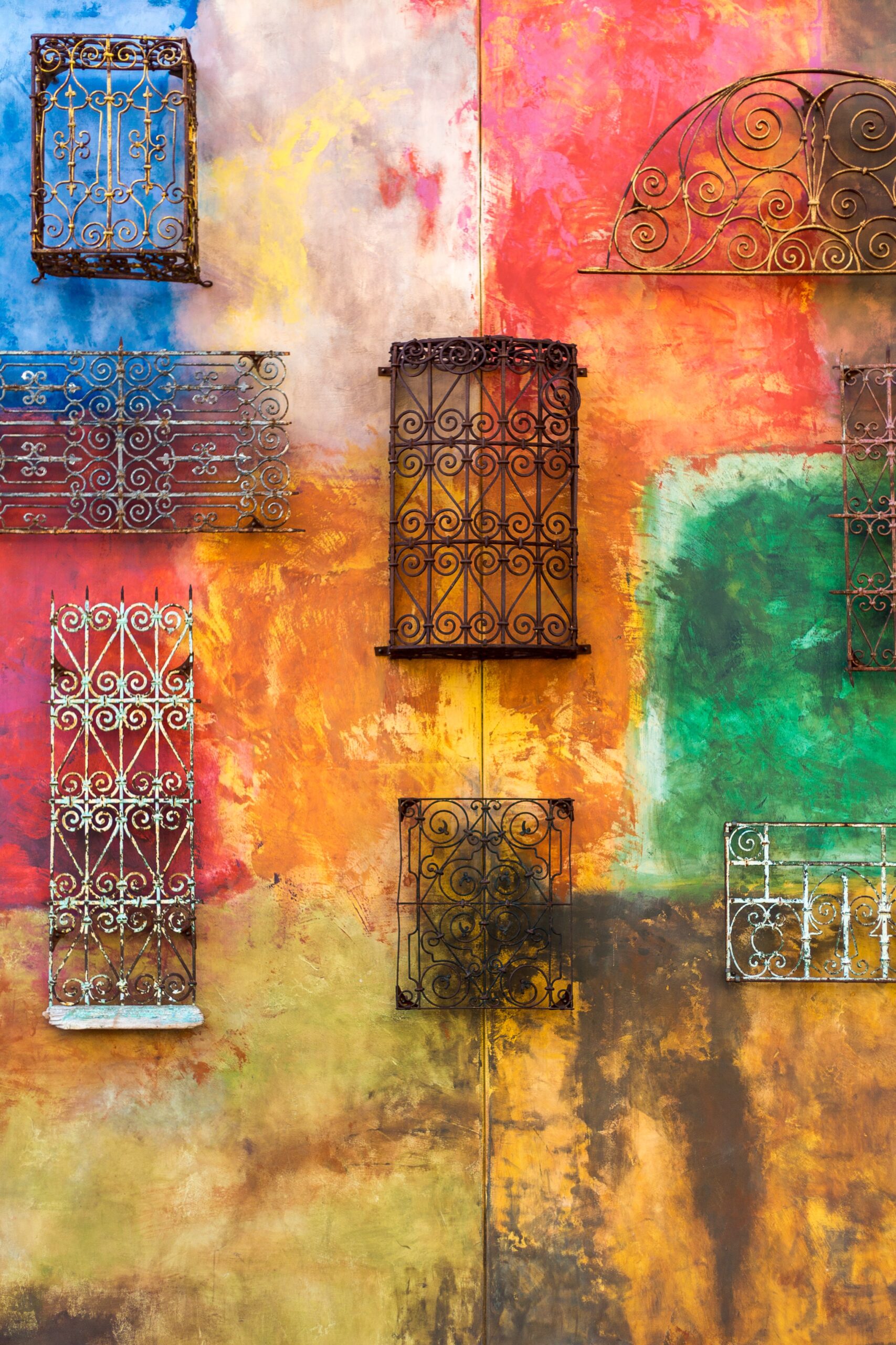
Create Palette From Images Tutorial – Adobe Photoshop
If you have ever struggled to find the perfect colours for your project, or wanted to create a custom colour palette, this tutorial is for you! In Adobe Photoshop, there is a built in tool that allows you to do just that – create a palette from images. Follow the steps below and you’ll be on your way to creating the perfect colour palette for your next project.
Introduction: What is a colour palette?
A colour palette is a set of colours that can be used together in design. It can be created from scratch or pulled from an existing image. Creating a colour palette from an image can be done in Photoshop with the help of the Colour Picker and the Eyedropper Tool.
The Colour Picker tool allows you to select a colour by its numeric value, while the Eyedropper tool lets you sample a colour directly from an image. To create a colour palette, first open an image in Photoshop. Then, use the colour Picker tool to select a light, medium, and dark colour. Next, use the Eyedropper tool to sample additional colours from the image. Finally, add these colours to your palette and save it for future use.
How to create a colour palette from an image in Adobe Photoshop
When working with images, one of the first things you’ll need to do is create a colour palette. This can be done in Photoshop by using the “Colour Picker” tool.
To create a colour palette from an image in Photoshop:
- Open your image in Photoshop.
- Click on the “eyedropper” icon in the toolbar and select the “Colour Picker” tool.
- Click on any area of the image to sample the colour. The colour will be added to your palette automatically.
- Repeat this process until you have a desired number of colours in your palette.
5 Steps to creating a perfect colour palette for your brand
When it comes to creating a colour palette for your brand, there are a few key steps to follow to ensure perfection. First, take some time to consider the overall tone and feel of your brand. What are your core values? What kind of message are you trying to communicate? Once you have a good understanding of this, you can begin to narrow down your colour options.
Next, take a look at the images that represent your brand. Do you have a logo? Any product photos? Your website? These will all be important factors in determining the right colours for your palette. If you have trouble finding inspiration, try looking at other brands in your industry and see what colours they are using.
Finally, once you have a few colours in mind, it’s time to start playing around with different combinations until you find the perfect one.
How to use Adobe Photoshop like a pro
Adobe Photoshop is a widely used programme for creating and editing images. It has many features that can be used to create professional looking images. In this tutorial, we will show you how to use some of the more advanced features in Adobe Photoshop to create a custom palette from images.
To begin, open up the image you want to create a palette from in Adobe Photoshop. Next, go to the “Window” menu and select “colour” to open up the colour panel. In the colour panel, select the “Swatches” tab and click on the “New Swatch Group” button. This will open up a new dialog box where you can name your swatch group. For this tutorial, we will name our group “Custom Palette”.
6 Graphic design trends that will dominate 2023
- Personas
- Good use of typography
- More focus on web standards
- Greater use of illustrations and graphics
- User experience design
- More focus on flat design
4 Tips for choosing the perfect colour scheme for your brand
When representing your brand with colours, it is important to create a colour scheme that is both aesthetically pleasing and unique to your company. Below are four tips to help you choose the perfect colour scheme for your brand:
- First, consider what colours represent your company’s values. For example, if your brand is eco-friendly, you may want to use green or brown tones in your colour
- Second, take into account the different meanings of colours in different cultures. For example, while white represents purity in the Western world, it is associated with death and mourning in many Eastern cultures.
- Third, think about which colours will stand out most against your competitors’ branding. You want potential customers to be able to easily identify your brand amongst others in your industry.
- Finally, consider how you want customers to feel when they see your brand. For example, yellow is often used to evoke cheerfulness and happiness, while black is often associated with sophistication and elegance.
How to use Adobe Photoshop like a pro graphic designer
Adobe Photoshop is a powerful graphics programme that allows users to create stunning images. While it may seem daunting at first, with a little practice, anyone can learn to use Photoshop like a pro.
Here are a few tips to help you get started:
- Familiarise yourself with the interface. Take some time to explore the different tools and panels in Photoshop. Get to know where everything is located so you can quickly find the features you need when you need them.
- Play around with the different features and tools. Don’t be afraid to experiment! Try out different techniques and see what results you can achieve.
- Use layers. Layers are one of the most powerful features in Photoshop and they can really help you bring your vision to life.
The ultimate guide to creating stunning graphics with limited colours
When it comes to graphics, there are a lot of factors to consider. But one of the most important is colour. The right colours can make or break a design. But what if you only have a limited number of colours to work with?
Fortunately, there are ways to create stunning graphics with limited colours. By using the right colour palette and following some simple tips, you can create beautiful designs that stand out from the rest.
Here are some tips for creating stunning graphics with limited colours:
- Use a limited colour palette: When working with a limited number of colours, it’s important to carefully select your palette. Choose colours that complement each other and work well together. Avoid using too many similar colours, as this can make your design look flat and boring.
- Keep your colours consistent in value and intensity Changes in colour can make a design look flat and unprofessional. Use the same or similar values of the same colour throughout your design. If you have to use different colours, change their hue instead of their value.
- Avoid using pure black and white. Pure black and white can look flat, which is why many designers use a dark grey instead of pure black. The same applies for white. If you have to use them, make sure you add enough contrast to your design. Adding contrast also helps with readability.
Defining Adobe Photoshop
Adobe Photoshop is a software programme for editing and creating images. Photoshop can be used to create graphics for web pages, logos, and illustrations. It is also frequently used to edit photographs.
Photoshop was originally developed by Thomas and John Knoll in 1988. The programme was purchased by Adobe Systems in September of that year. Photoshop is now a household name, with many people using it for both personal and professional purposes.
Photoshop offers users a wide variety of features and tools. Some of the most popular include layers, which allow different parts of an image to be edited separately; brushes, which can be used to apply paint, colour, or texture to an image; and filters, which can be used to change the appearance of an image.
What are the benefits of using Adobe Photoshop?
Adobe Photoshop is a widely used programme for crafting digital images. The software has many features that allow users to edit photos and create graphics. Some of the benefits of using Adobe Photoshop include:
The ability to edit photos quickly and easily: Adobe Photoshop can be used to make small edits to photos, such as cropping, as well as more complex changes, such as removing objects or changing colours.
A wide range of features: In addition to basic editing tools, Adobe Photoshop also offers a variety of features for more advanced users, such as layers, filters, and brushes.
Compatibility with other programmes: Adobe Photoshop files can be opened in other Adobe programmes like Illustrator and After Effects, making it easy to create cohesive projects.
Defining graphic design
Graphic design is the process of creating visual content to communicate messages. Designers use a combination of typography, visual arts and page layout techniques to create a visual representation of ideas and messages.
Design has existed for centuries, in one form or another. But it wasn’t until the invention of the printing press that graphic design as we know it today began to take shape. The first real graphic designer was probably William Caxton, who established a printing press in England in 1476. Since then, the field of graphic design has continued to evolve and grow, with new technologies and techniques emerging all the time.
Today, graphic designers are using computers to create their designs, but they still rely on many of the same principles that Caxton did all those years ago. The basic elements of design – line, shape, colour, texture, etc.
How to create a colour palette in Adobe Photoshop
Creating a colour palette in Adobe Photoshop is a great way to get started with your design project. There are a few different ways to create a colour palette, but we’ll show you one of the easiest methods using the Colour Picker tool.
First, open up the image you want to use to create your colour palette in Photoshop. Then, go to the Tools panel and select the Colour Picker tool. With the Colour Picker tool selected, click on any area of the image to sample a colour. The Colour Picker will display the sampled colour’s RGB values.
To add the sampled colour to your palette, click on the “Add To Swatches” button at the bottom of the Colour Picker window. Repeat this process until you have enough colours for your palette.
Graphic design: Tips for using colour
Graphic design is all about creating a visually appealing and cohesive composition. Colour is one of the most important elements in graphic design and can be used to create depth, contrast, and interest. Here are a few tips for using colour in your designs:
- Use a limited palette. Too many colours will make your design look busy and cluttered. Stick to 2-3 main colours and 1-2 accent colours.
- Create a colour scheme. Before you start designing, decide on a colour scheme that you will use throughout your composition. This will help create visual unity and coherence.
- Use contrasting colours. Contrasting colours create interest and depth in your design. Pairing a light colour with a dark colour or vice versa can really make your composition pop!
- Be mindful of the mood you want to create with your colours.
Colour theory: The importance of colour in design
Colour plays an important role in design and can help to set the mood or tone of your project. By understanding the basics of colour theory, you can create harmonious colour palette for your project.
There are three properties of colour that you need to be aware of: hue, value and chroma. Hue refers to the actual colour, while value is the lightness or darkness of that colour. Chroma is the intensity or saturation of the colour. A good way to think of it is as the difference between a pure hue and a muted hue.
When choosing colours for your project, you need to consider how they will work together. You can create a harmonious palette by choosing colours with similar hues or by using a triadic colour scheme. You can also use complementary colours to create contrast and visual interest.
How to create an adventurous colour palette in Adobe Photoshop
There are many ways to create an adventurous colour palette in Adobe Photoshop. One way is to use the Colour Picker tool. With the Colour Picker tool, you can select a colour from an image and add it to your palette. Another way to create an adventurous colour palette is to use the Image Adjustments menu. The Image Adjustments menu provides a variety of options for adjusting colours in an image, including Hue/Saturation, Brightness/Contrast, and Levels.
To create an adventurous colour palette using the colour Picker tool, follow these steps:
- Open Adobe Photoshop and open an image file.
- Select the colour Picker tool from the Tools panel.
- Click on a colour in the image that you want to add to your palette.
- Click on the colour in the colour palette to add it to your palette.
- To apply the colour, click on your cursor and drag it over an area of your image that you would like to change. The area will change to the new colour.
Understand graphic design better with these Adobe Photoshop tips
As a designer, you should have a basic understanding of the different file types used in graphic design, as well as when to use each. Here are some quick tips for using Adobe Photoshop:
-When working with images, be sure to use the correct file type. JPEGs are best for photos, while PNGs are better for graphics with solid colours.
-To create a colour palette from an image, open the image in Photoshop and go to Image > Mode > RGB colour. Then, click on the “Create new fill or adjustment layer” icon at the bottom of the Layers panel and select “Hue/Saturation.” Finally, adjust the Hue slider until you find a colour scheme you like.
-To add text to an image, go to Layer > New > Layer via Copy (or press Shift+Ctrl+N on a PC).
How to make sense of colour theory with Adobe Photoshop
When it comes to creating a cohesive design, colour theory is an important tool to understand. And while it can seem daunting at first, with a little practice it’s easy to make sense of.
Adobe Photoshop is a great programme for experimenting with colour. To create a new palette, go to the “Window” menu and select “colour.” This will open up the colour panel.
To start, drag and drop an image into the “Swatches” area. This will create a new layer in your document. With the image selected, go to the “Edit” menu and choose “Define Pattern.” Give your pattern a name and click “OK.”
Now that you have a pattern, you can experiment with different colours by clicking on the Foreground colour swatch and choosing a new colour from the colour Picker.
5 Tips for better Adobe Photoshop results
Here are 5 tips to help you create better palettes and achieve better results in Adobe Photoshop:
- -Tip 1: Choose an image with a wide range of colour This will give you more to work with and produce better results.
- -Tip 2: Try using different colour You can experiment with different colour models to see which one works best for your image.
- -Tip 3: Use the eyedropper tool to select colours from your image. This is a great way to get exact colours that you want in your palette.
- -Tip 4: Adjust the hue, saturation, and brightness of your colour You can control the intensity of your colours by adjusting their hue, saturation, and brightness.
- -Tip 5: Experiment with different colour Try combining unlikely colours to see what works best for your image.
7 Graphic design trends to try in 2023
Designers are always looking for the latest trends so they can stay ahead of the curve. Here are 7 graphic design trends to try in 2023:
- Geometric shapes – Geometric shapes have been popular for a while now and they’re not going anywhere. They can add interest and depth to your designs, and they’re also very versatile.
- Bold colours – Bright, bold colours are making a comeback. If you want your designs to really stand out, try using some eye-catching colours.
- Vintage – Vintage designs are becoming more and more popular. If you want to create a retro look, try using some vintage elements in your design.
- Hand-drawn – Hand-drawn elements are unique and personal, making them perfect for brands that want to stand out from the crowd.
- Minimalism – Minimalism is becoming more and more popular. If you re a fan of this design style, you can create some beautiful designs with minimal elements.
- Simplistic shapes – Geometric shapes are very popular right now and they re not going anywhere any time soon. If you want to create a clean and modern design, use geometric shapes.
- Retro – Retro designs are becoming popular again, thanks in part to the huge number of people using vintage elements in their designs.
How to incorporate negative space in graphic design
To create a harmonious and eye-catching composition, you need to know how to use negative space. Negative space is the area around and between the subject matter in your design. By using negative space effectively, you can create balance, add interest, and direct the viewer’s attention to the most important parts of your design.
When incorporating negative space into your design, there are a few things to keep in mind. First, consider the overall shape of your composition. Is it symmetrical or asymmetrical? What kind of lines does it have – horizontal, vertical, diagonal? How can you use the negative space to create interesting shapes and patterns?
Next, think about the placement of your elements. How can you use positive and negative space to create visual interest and balance? Remember that less is often more – don’t overcrowd your design with too many elements.
Blue Sky Graphics is an online design school that specialises in graphic design and Adobe Photoshop. The school offers a variety of courses that teach students about the basics of graphic design, as well as how to use Adobe Photoshop to create stunning designs.
The school’s website offers a wealth of resources for students, including tutorials, articles, and forums.
Whether you’re a beginner or a seasoned pro, Blue Sky Graphics has something to offer everyone who wants to learn more about graphic design and Adobe Photoshop. So why not join today and see what all the fuss is about?









