Are There Any Tips Or Resources You Can Share For Beginners Learning Graphic Design? In graphic design and visual communication, you learn about the different aspects of designing and creating visual displays. This includes topics like colour theory, typography, layout, and more.
One of the main topics that you will cover in graphic design and visual communication is colour theory. Understanding how colours interact with one another can help you create visually appealing designs that convey specific moods or emotions. You’ll learn about colour schemes, such as complementary or analogous colours, and how to use them effectively in your designs.
Another important aspect of graphic design is typography. You’ll need to choose appropriate fonts for different projects and understand how to use them effectively. This includes learning about kerning, leading, and tracking – all of which impact the spacing between letters and words. You’ll also study font families and their different variations, such as bold or italic.
Finally, in visual communication courses, you’ll learn about layout design principles. This involves understanding how to arrange text, images, and other design elements on a page to create an aesthetically pleasing composition. You’ll learn about balance, contrast, hierarchy, and other concepts that will help you create effective designs for a variety of mediums, including print ads or websites.
White Board:
Whiteboards are an essential tool for graphic designers and visual communicators. They provide a large space to brainstorm ideas, sketch out concepts, and collaborate with team members. Whether you’re working on a logo design or creating a website layout, whiteboards offer a versatile canvas for exploring and refining your ideas.
In graphic design, whiteboards can be particularly helpful when it comes to typography. By writing out different fonts and sizes on the board, designers can get a better sense of how they’ll look in context. They can also experiment with different colour combinations and layouts to see what works best visually.
Whiteboards are also useful for visual communication projects such as infographics or data visualization. Designers can use them for mapping out the flow of information and test different ways of presenting complex data sets. Overall, whiteboards are an invaluable tool for any designer looking to bring their ideas to life visually.
One of the most important aspects of graphic design is the use of whiteboards. A whiteboard is a tool that can be used to organize ideas, plan work, and communicate with others.
Whiteboards are a crucial tool in graphic design and visual communication. These tools allow designers to organize their ideas, plan their work, and communicate their concepts with others effectively. Whiteboards offer an excellent platform for brainstorming sessions where designers can come up with creative solutions to different design problems.
One of the benefits of using whiteboards is that they allow for easy collaboration among team members. Designers can quickly sketch out their ideas on the board, and other team members can contribute to the process by adding suggestions or making changes directly on the board. This way, everyone’s input is valued and considered in the design process.
In addition to facilitating collaboration, whiteboards also help designers visualize complex information in a more straightforward manner. By breaking down complex concepts into simple diagrams or charts, designers can communicate these ideas more efficiently with clients or stakeholders who may not have a design background. Overall, whiteboards are an essential tool that allows graphic designers to think creatively and collaboratively while creating effective designs that meet their clients’ needs.
Colour Theory:
Colour theory is a fundamental aspect of graphic design and visual communication. It refers to the study of how colours interact with each other, how they affect human emotions, and how they can be used to convey messages effectively. Understanding colour theory is crucial for every designer because it enables them to create harmonious and impactful designs that resonate with their target audience.
One of the key principles of colour theory is colour psychology. This principle explains how different colours evoke specific emotions in people. For instance, red is associated with passion, anger, or danger, while blue represents trust, calmness, or sadness. By incorporating these emotions into their designs through the strategic use of colour, designers can influence their audience’s perception and behaviour.
Another essential principle in colour theory is colour harmony. This concept aims to achieve the balance between different colours in a design by using complementary colours that are opposite each other on the colour wheel or analogous colours that are adjacent to each other on the wheel. Colour harmony helps designers create visually appealing designs that are easy on the eye and pleasing to look at.
In conclusion, learning about colour theory plays a vital role in creating effective graphic designs and visual communication pieces. A thorough understanding of this subject allows designers to make informed decisions about which colours best suit their message or brand identity, ultimately resulting in visually attractive and compelling work that resonates with their target audience.
Colour theory is the study of how colours affect things such as sight, sound, touch, and olfaction. This can help you create visuals that are both effective and appealing to your audience.
Layout:
In graphic design and visual communication, the layout is one of the most important elements. Layout refers to how a piece of content is arranged on a page, including the placement of text, images, and other design elements. A well-designed layout can help guide the reader’s eye through the content and make it more engaging.
To create an effective layout in graphic design, designers must consider several factors. These include the overall purpose of the piece, such as whether it is meant to inform or persuade readers, the target audience, and any branding guidelines that need to be followed. Designers must also consider hierarchy, or which elements are most important and should be emphasized through size, colour or other visual cues.
In visual communication, specifically, layout plays an even more crucial role. This is because many forms of visual communication are intended to convey complex information quickly and effectively – think infographics or data visualizations – so a clear and easy-to-follow layout is essential for communicating ideas clearly. In addition to traditional graphic design principles like alignment and balance, designers in this field must also have strong skills in typography selection and manipulation so that their layouts are not only functional but visually appealing as well.
The layout is the way in which a document is presented on a screen.
In graphic design and visual communication, the layout is a fundamental aspect that students learn. It involves organizing visual elements such as typography, images, and graphics in a way that communicates the intended message effectively. The layout sets the tone and mood of the document, making it visually appealing to the audience.
A good layout should have consistency in font sizes, spacing, and alignment of text blocks and images. A balance between positive and negative space creates harmony within the design. Additionally, designers are taught how to use contrast effectively to emphasize important information within a document.
In today’s world, where documents are presented on screens more often than on paper, understanding digital layouts is crucial for success in this profession. Students must understand how different screen sizes affect their designs and how they can adjust them accordingly for optimal viewing experience across all devices. Designers also need to consider accessibility when creating layouts so that people with visual impairments can still access the content being presented onscreen.
In graphic design and visual communication, you learn how to create effective, informative, and visually appealing content. This article will explore the different aspects of graphic design and how they can be used in your workflow.
The Definition of Graphic Design:
Graphic design can be defined as the art of visual communication that combines images, texts, and colours to convey a message or information. In graphic design courses, students learn how to use typography, colour theory, layout design, and other visual elements to create effective designs for various media channels, such as print media and digital media. They also learn how to use software tools like Adobe Photoshop and Illustrator.
Moreover, students in graphic design classes are taught how to think creatively and critically about the process of designing. They must understand the target audience’s needs while working within established brand guidelines for clients. Communication skills are essential as they need to effectively pitch their designs and explain their creative choices.
In summary, graphic design is an exciting field that requires both technical expertise in using software tools as well as creativity and communication skills. With a strong foundation in the principles of good design and visual communication techniques learned through coursework in graphic design programs, designers can go on to work on projects ranging from branding campaigns to creating multimedia content for websites or social media platforms.
Graphic design is the process of creating graphics that are able to communicate a message. It can be done in a number of ways, but one of the most common is through printing or digital art.
In graphic design and visual communication, you’ll learn how to create designs that effectively communicate a message to your audience. This can include the use of typography, colour theory, and layout principles. You’ll also learn how to use various software tools such as Adobe Photoshop and Illustrator.
One important aspect of graphic design is understanding the target audience for your designs. This involves researching their preferences, interests and needs in order to create designs that resonate with them. Additionally, you’ll need to understand the purpose of the design project – whether it’s to increase brand awareness or promote a specific product or service.
Overall, studying graphic design and visual communication provides a foundation for creating effective designs that are visually appealing and communicate a clear message to your intended audience. It’s an exciting field that requires both creativity and technical skills – making it a great choice for those who enjoy working on both sides of their brain.
Print Graphics:
In a graphic design and visual communication course, students are introduced to the world of print graphics. This involves understanding the various types of printed materials used for marketing and advertising purposes, such as brochures, flyers, posters, business cards, and banners. Students learn how to design these materials using software tools like Adobe Illustrator and Photoshop.
The course also covers important concepts such as colour theory, typography, layout design principles, and image composition techniques that are essential in creating effective print graphics. Understanding different printing methods is also important since it affects the final output of printed material.
In general, learning about print graphics is an essential part of any graphic design or visual communication course. In today’s digital age, where much emphasis is placed on online marketing, it’s easy to forget that well-designed printed materials can still make a significant impact on promoting businesses and brands. Therefore, it’s crucial for designers to have a good grasp of this area in order to produce successful designs for their client’s needs.
Visual Communication Vs Web Design
Visual communication and web design are two distinct areas of study that share a common goal – to effectively communicate ideas and information through visual means. Graphic design programs focus on developing creative skills in typography, colour theory, layout design, and image manipulation to create compelling visuals for print and digital media. On the other hand, web design courses centre around designing websites that are user-friendly, visually appealing, and functional.
In visual communication, designers learn how to use various techniques to convey messages through images or graphics. It involves understanding the principles of gestalt psychology, such as proximity, similarity, and continuity, among others, along with colour theory which helps create designs that effectively communicate their intended message. In contrast, web design involves knowledge of coding languages such as HTML/CSS/Javascript to create responsive websites where users can interact with content seamlessly.
Both fields require different skill sets but have overlapping areas in terms of creating effective visuals for communication purposes. Modern graphic designers need to understand concepts related to user experience (UX) design, while web designers should be proficient in creating engaging visuals for their websites. Ultimately both fields aim towards communicating ideas through visual means while catering towards specific mediums – print or digital media, respectively.
Visual Communication Vs UI UX
In graphic design and visual communication, you learn how to create visually appealing designs that communicate a message effectively. Visual communication can take many forms, such as logos, posters, infographics, or illustrations. On the other hand, UI UX (User Interface/User Experience) is mainly focused on designing digital interfaces for websites and apps that are user-friendly and intuitive.
While both visual communication and UI UX share some similarities in terms of aesthetics and functionality, they differ greatly in their approach. Visual communication aims to convey information through the effective use of typography, colour schemes, and layout design, while UI/UX focuses on creating an interactive and engaging experience for users that drives them towards taking action. In other words, visual communication is about communicating a message or idea through visuals, while UI/UX is more concerned with providing an optimal user experience.
In conclusion, while there may be some overlap between the skill sets required for both areas of expertise, understanding the differences between visual communication and UI/UX is crucial to excelling in either field. Each area demands specific skills which can only be acquired through dedicated practice and learning.
Graphic Design And Branding
A significant aspect of graphic design is branding. Branding involves creating a unique identity for a company or product that differentiates it from its competitors. This can be achieved through the use of specific colours, fonts, and imagery to create a cohesive brand image that resonates with consumers. In addition, effective branding should communicate the values and personality of the brand to establish an emotional connection with customers.
Graphic design also teaches visual communication skills that are essential for promoting brands effectively. Visual communication includes creating compelling visuals such as illustrations, infographics, and videos that convey messages in a clear and concise manner. These visuals help capture the audience’s attention and make it easier for them to understand complex information.
Overall, graphic design and branding play crucial roles in establishing successful businesses. They help businesses connect with their target audience effectively by creating visually appealing designs that communicate their message clearly and consistently over time.
Visual Communication And Branding
In the field of graphic design and visual communication, you will learn how to create a brand identity that is visually appealing and communicates the intended message effectively. Branding is essential because it builds trust and credibility with customers by representing the values of the organization. Through visual communication, designers use images, colours, typography, and other design elements to create a consistent look across all marketing materials, such as logos, brochures, websites, and social media posts.
Visual communication also plays an important role in establishing a brand’s personality. The typeface used for headlines or body copy can convey elegance or quirkiness depending on the choice made. Colours can evoke different emotions, such as warmth or coolness, while imagery communicates ideas that words cannot express alone. In essence, branding through visual communication creates a unique identity that sets an organization apart from its competitors.
In conclusion, graphic design and visual communication are essential skills for building brands in today’s competitive marketplace. By creating effective branding strategies through visually appealing designs that communicate core values consistently across all platforms and mediums – companies can establish themselves as leaders in their industry while building customer loyalty over time.
Graphic Designer Software: Adobe Photoshop, Adobe Illustrator, Adobe InDesign
As a graphic designer, it is important to have a good understanding of design software. Adobe Photoshop, Illustrator and InDesign are three industry-standard programs that every graphic designer should learn. These tools allow designers to create high-quality designs, illustrations and layouts for print or digital media.
Adobe Photoshop is primarily used for photo editing and manipulation. Graphic designers use it to enhance images for branding materials, advertisements or social media posts. Adobe Illustrator, on the other hand, is mainly used for creating vector graphics, such as logos and icons, that can be resized without losing quality. It’s also great for designing typography and custom illustrations.
Lastly, Adobe InDesign is a layout program specifically designed for print production projects such as magazines or brochures. It allows designers to create multi-page documents with precise control over typography and page layout. Aspiring graphic designers must master these software tools in order to produce professional-level work that meets the standards of the industry.
Website And Application Builder Software: Figma, WordPress, Elementor.
In the field of graphic design and visual communication, one of the most important skills to have is the ability to create websites and applications. With technology advancing at an incredible speed, it is essential for designers to be able to use website and application builder software such as Figma, WordPress, and Elementor.
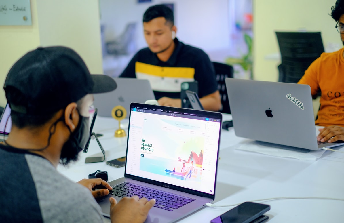
Figma is a popular design tool that allows designers to create user interfaces quickly and efficiently. It has features like collaborative editing that allow multiple people to work on the same project at once. WordPress, on the other hand, is a content management system that enables users to create websites without any coding knowledge. It offers thousands of templates and plugins, making it easy for anyone to build a website or blog.
Elementor is another website builder tool that provides drag-and-drop functionality allowing designers with little coding experience to easily develop their websites. It has a range of pre-built templates which can be customized according to one’s requirements.
Overall, having proficiency in these tools gives professionals an edge in creating stunning designs while keeping up with current technology trends.
Motion Graphics
Motion graphics is a powerful tool in visual communication that combines animation, graphic design, and sound to create engaging content. As part of this field, you will learn how to create compelling visuals that move and tell a story. The skills involved in motion graphics include video editing, typography, storytelling, and 3D modelling.
When studying graphic design and visual communication with a focus on motion graphics, you will learn about the principles of movement and timing. This includes understanding how different elements interact on screen and how they can convey meaning through their movement. Additionally, you will learn about the technical aspects of creating animations, such as keyframes, easing curves and rendering.
In conclusion, motion graphics is an exciting area within the broader field of graphic design that involves bringing static designs to life through animated movements. If you have an interest in animation or storytelling using visual media, this may be just what you are looking for!
Motion Graphics After Effects
After Effects is a powerful tool for video editing, motion graphics, and animation. In graphic design and visual communication, learning After Effects can be an essential skill to have in your toolkit. With this program, you can create engaging videos with stunning visuals that will captivate your audience.
One of the key benefits of using After Effects is its versatility. It lets you create everything from simple animations to complex visual effects. You can use it for anything from explainer videos to TV commercials, making it a valuable asset regardless of what type of project you’re working on.
What’s more, After Effects is constantly being updated with new features and tools that make it even more powerful. Whether you’re just starting out in graphic design or already have experience in the field, mastering After Effects is sure to take your work to the next level.
In the world of graphic design and visual communication, motion graphics are gaining more and more popularity. This is largely due to their versatility in conveying complex ideas in a simple and visually appealing way. Adobe After Effects is one of the most popular software programs used for creating motion graphics.
With After Effects, designers can create animations, title sequences, transitions, and other dynamic effects that can be added to videos or standalone projects. There are countless tutorials available online that cover everything from basic keyframe animation to advanced 3D modelling techniques. Some of the key skills that students can learn with After Effects include layer management, masking techniques, colour grading, camera tracking, and sound synchronization.
In addition to its creative potential, having knowledge of After Effects can also be a valuable asset in many different industries. From advertising agencies to film production companies to social media marketing firms – there’s no shortage of career opportunities for those who have mastered this powerful tool. By learning how to use motion graphics in After Effects effectively as part of your graphic design education or training program, you may open yourself up to endless possibilities when it comes time for employment!
Digital Illustration
Digital illustration plays a crucial role in graphic design and visual communication. It involves creating art using digital tools such as software like Adobe Illustrator, Procreate, or CorelDRAW. In graphic design, digital illustrations are used to create logos, product packaging designs, website layouts, and marketing materials. Digital illustrations enable designers to experiment with different styles and colour schemes until they find the perfect fit for their project.
In visual communication, digital illustration is used to convey complex ideas or information in an engaging way. For instance, infographics use digital illustrations to present data through charts and graphs that make it easy for the audience to understand. Moreover, digital illustration enables artists to create animations that tell stories or demonstrate how products work. As a result of their versatility and flexibility, digital illustrations have become an essential tool for all kinds of creatives working in diverse industries, from advertising agencies to animation studios.
Overall, learning how to create high-quality digital illustrations is an important skill for anyone interested in graphic design or visual communication. With the increasing demand for skilled illustrators who can work with various mediums, from print to web-based media platforms, mastering this craft can lead you on a path towards a successful career as a designer or illustrator.
Digital Painting
Digital painting is a crucial aspect of graphic design and visual communication. It involves using digital tools to create paintings, illustrations, and other forms of art. Unlike traditional painting, which uses physical brushes and paints on canvas, digital painting utilizes specialized software programs such as Adobe Photoshop or Corel Painter.
In graphic design and visual communication, students learn how to use these digital tools to create visually appealing designs that convey messages effectively. They also learn about the various techniques used in digital painting, such as layering, blending modes, brush types, and colour theory. Moreover, students are taught how to incorporate their artwork into various mediums like magazines, websites or social media platforms.
Digital painting is an essential skill for aspiring graphic designers as it allows them to bring their creative ideas to life with ease. By mastering the art of digital painting alongside other graphic design skills like typography and image editing techniques, students can produce professional-grade designs that meet client requirements in today’s fast-paced world of marketing communications.
What is a graphic designer portfolio?
A graphic designer portfolio is a collection of an artist’s best works that showcase their skills, experience and creativity to potential clients, recruiters or employers. It acts as a visual resume for designers applying for jobs or seeking clients. It typically includes a variety of design projects such as logos, branding elements, typography designs, web designs and other design samples.
In graphic design and visual communication courses, students learn the importance of creating a strong portfolio that captures their individual style while also showcasing their technical abilities. They are taught how to present their work in an organized and visually appealing way using various tools such as Adobe Creative Suite or online platforms like Behance or Dribbble. They also learn the value of tailoring their portfolio to specific industries they are interested in working with.
Ultimately, a well-designed graphic designer portfolio is essential for professionals looking to build credibility and establish themselves in the industry. By presenting their best work through an impressive digital or traditional physical format, designers can inspire confidence in potential clients and stand out from competitors.
Composition
In graphic design and visual communication, the composition is an essential skill that students learn. Composition refers to the arrangement of visual elements within a design or image. It involves understanding how different elements like colour, shape, line, and texture work together to convey a message or create an aesthetic appeal.
One of the key aspects of composition is creating balance in a design. A well-balanced composition ensures that no one element dominates over another and creates a sense of harmony throughout the entire piece. Students are taught techniques such as symmetry, asymmetry, and radial balance to achieve this.
Moreover, students also learn about the importance of hierarchy in composition. Hierarchy refers to the organization of information based on its level of importance. By using typography, size, colour contrast and other elements strategically, designers can guide viewers’ eyes through a layout or image while emphasizing key information points. These skills are crucial for effective communication through visual media and can be applied across various industries like advertising, marketing or even digital art creation.
Balance
One of the key concepts taught in graphic design and visual communication is balance. Balance refers to the distribution of elements within a composition, with the aim of creating an aesthetically pleasing and harmonious design. There are two types of balance: symmetrical and asymmetrical.
Symmetrical balance is achieved by placing identical or similar visual elements on either side of an imaginary central axis. This type of balance creates a sense of formality, stability, and orderliness in a design. Asymmetrical balance, on the other hand, refers to achieving equilibrium through the uneven distribution of elements. By playing with size, colour, texture or shape, designers can create dynamic compositions that grab attention while maintaining harmony.
In conclusion, mastering the principles of balance is essential for any aspiring graphic designer or visual communicator who wants to create effective designs that resonate with their intended audience. Whether you’re working on a logo design or developing marketing materials for your client’s brand awareness campaign – understanding how to achieve symmetry and asymmetry will go a long way towards making your work stand out from the rest.
Proximity
In graphic design and visual communication, the principle of proximity refers to the relationship between elements within a design. Essentially, it involves grouping related items together in order to create a more organized and cohesive layout. The purpose of using proximity is to make it easier for the viewer to understand the information being presented.
By grouping similar elements together, designers are able to reduce clutter on the page and emphasize important information. This helps viewers quickly identify key points and navigate through the content with ease. For example, in a poster featuring multiple speakers at an event, using proximity can help group each speaker’s name with their respective headshot and presentation topic.
Overall, understanding how proximity works are crucial for designing effective layouts that communicate clearly and efficiently. By utilizing this principle along with other design principles such as contrast, alignment, and repetition, designers can create visually appealing designs that effectively convey their message.
Alignment
Alignment is one of the most important principles of graphic design and visual communication. It refers to the way different elements in a design are arranged in relation to each other, creating a sense of order and structure that helps guide the viewer’s eye through the composition. Good alignment can create a powerful impact, making a design more visually appealing, legible, and effective.
When aligning elements in the design, it is important to consider both their horizontal and vertical placement. Horizontal alignment refers to arranging elements along an imaginary line or axis that runs across the composition. This can help create balance and harmony between different parts of the design. Vertical alignment, on the other hand, involves stacking or arranging elements so that they are aligned with one another vertically.
The use of grids is often helpful when working with alignment in graphic design. A grid is made up of intersecting horizontal and vertical lines that serve as guides for placing different elements within a layout or page. By using these guides for alignment, designers can create designs that feel cohesive and well-organized while also allowing for flexibility and creativity within their compositions.
Repetition
Repetition is a fundamental design principle that is taught in graphic design and visual communication. It involves using the same or similar elements multiple times within a design to create unity, consistency, and emphasis. Repetition can be achieved through various design elements such as colour, shape, texture, typography, and imagery.
One of the benefits of repetition is that it helps to establish a visual rhythm within a design. This rhythm creates an organized flow that guides the viewer’s eye through the various elements of a composition. Repetition can also help to reinforce important messages or concepts by emphasizing keywords or phrases throughout a piece.
However, it’s important to use repetition strategically and not overdo it, as too much repetition can become monotonous and boring for viewers. A skilled designer knows how to balance repetition with other principles like contrast and hierarchy to create effective designs that communicate their intended message clearly and creatively.
Contrast
Contrast is a fundamental design principle that plays a crucial role in visual communication. It’s the difference between elements in a composition, creating interest and hierarchy where necessary. Graphic designers use contrast to guide viewers’ eyes through a piece, establishing focal points and drawing attention to particular messages.
There are many forms of contrast, including colour, size, shape, texture, and typography. By using these different techniques together or separately, designers can create emphasis by making certain elements stand out from others. For example, using bold text against regular text or placing light colours on dark backgrounds creates visual tension and attracts the viewer’s eye.
In addition to creating visual interest and hierarchy within designs, contrast also helps ensure legibility and accessibility for all audiences. Designers must consider how the contrast between text and background affects readability for those with visual impairments or dyslexia. When designing for digital media specifically, it’s essential to pay attention to colour contrasts as they may be distorted depending on device settings.
High Demand
In today’s world, graphic design and visual communication are in high demand across various industries. With the rise of digital marketing, companies need designers to create visually appealing content for websites, social media platforms, and email marketing campaigns. Moreover, businesses require designers to create logos and brand identities that will make them easily recognizable.
In addition to digital marketing needs, graphic designers are also needed in print media. Magazines, newspapers and brochures all require layouts and designs that catch the reader’s attention while conveying important information effectively. These publications also provide an opportunity for designers to showcase their creativity with innovative typography and imagery.
Overall, studying graphic design and visual communication can lead to a wide range of career opportunities due to the high demand for these skills in numerous industries. From creating stunning website designs to producing engaging print media materials or working on branding projects for businesses of all sizes, a career as a designer is both challenging and rewarding.
White Space
One of the essential things that graphic designers learn is the value of white space. White space, otherwise known as negative space, is the area between design elements such as text or images. This empty space plays an important role in design by giving it breathing room and allowing it to be more legible and visually appealing. Designers use white space strategically to create balance and hierarchy within a composition.
When used correctly, white space can make a big difference in how people perceive your message. In many cases, less is more when it comes to design. By incorporating ample amounts of white space into your layout, you give users a chance to digest information without feeling overwhelmed by cluttered visuals or excessive text. Whether you’re designing a website or creating printed materials like brochures or business cards, keeping negative space in mind can help ensure your designs are effective and easy on the eyes.
Ultimately, graphic designers have learned that white space isn’t just about leaving areas blank; it’s about using what’s not there to enhance what is there. By mastering the art of negative space, designers can create compelling visual experiences that communicate effectively while capturing attention and inspiring action from their audiences.
Hierarchy
In graphic design and visual communication, hierarchy refers to the arrangement of elements in order of importance. Designers use different techniques to establish hierarchy, such as size, colour, contrast, typography, and positioning. The goal is to guide the viewer’s eye through the content in a logical and intuitive way.
A clear hierarchy helps users understand what information is most important and how it relates to other elements on the page. For example, in a website header or navigation menu, designers often use larger font sizes or bolder colours for the most important items. In a print ad or poster, they may use contrasting colours or images to make certain messages stand out.
However, establishing a hierarchy also requires careful consideration of balance and harmony between all elements in a design. Too much emphasis on one element can create confusion or distract from other important information. Therefore, designers must strike a delicate balance between creating an effective visual hierarchy while maintaining overall aesthetic appeal.
Photography & Artwork
In graphic design and visual communication, one of the essential skills is mastering photography and artwork. This involves understanding how to use images to convey a message or idea effectively. Photography and artwork can be used in advertising, social media posts, websites, packaging designs, and more.
In photography, you learn about composition, lighting techniques, colour theory, and editing tools. It’s important to understand how different elements work together to create a visually appealing image that captures attention. In addition to technical skills, it’s also crucial for photographers to have an eye for detail and creativity.
When it comes to artwork in graphic design and visual communication curriculum includes learning about various techniques such as sketching, painting or digital art. Mastery of colour theory is critical when creating art because it helps designers create dynamic compositions that draw the viewer’s eye while not being too overwhelming.
Overall in graphic design and visual communication courses, teaching students how to master visuals through photography or artwork is essential since creative visuals are what sell products or services backed by effective copywriting strategies.
Resolution
In graphic design and visual communication, the resolution is a crucial aspect that every designer should be familiar with. Resolution refers to the number of pixels or dots per inch (DPI) in an image. It determines the quality and clarity of an image, especially when it comes to printing.
Low-resolution images have fewer pixels, resulting in blurry and pixelated images when printed or enlarged. On the other hand, high-resolution images contain more pixels, producing sharp and clear prints. Therefore, designers need to ensure that their designs are created at the appropriate resolution for their intended use.
In addition to pixel density, the resolution also affects file sizes. Higher resolutions mean larger file sizes, which can impact website loading speeds and storage capacity. Thus, designers must strike a balance between achieving high-quality visuals while keeping file sizes manageable for optimal performance across various mediums.
Dpi
Dpi is an acronym for dots per inch. It refers to the number of dots that a printer can produce in a one-inch space. In graphic design and visual communication, dpi is essential because it determines the quality of printed materials. When designing print materials such as brochures, flyers, banners or billboards, it’s important to choose an appropriate dpi setting to ensure that the final product has sharp images and clear text.
For instance, if you’re creating a marketing brochure with high-quality images and detailed graphics, then 300 dpi should be used to ensure that all details are captured clearly. On the other hand, for larger prints like billboards or posters where people will view them from far away distance lower dpi can be used without affecting their quality.
In conclusion, understanding what DPI means and how it affects your designs in graphic design is crucial. Selecting the right DPI settings before printing ensures that you get high-quality prints which communicate your message effectively.
Ppi
One of the most important concepts in graphic design is PPI or Pixels Per Inch. This refers to the number of pixels that are present within an inch of a digital image. PPI is essential because it determines the resolution or clarity of an image, which can significantly impact its quality and overall visual appeal.
Understanding PPI is crucial for designers who work with images that will be used for print or digital media. For example, if you’re designing a brochure or poster that will be printed, you’ll need to make sure that your images have a resolution of at least 300 PPI to ensure they look sharp and clear when printed. On the other hand, if you’re designing graphics for a website, you’ll want to optimize your images for web use by reducing their file size and ensuring they have a resolution of around 72 PPI.
In addition to learning about PPI in graphic design courses, designers also learn about other important technical aspects such as colour theory, typography, layout principles and user experience design. With these fundamental skills in place, designers can create compelling visuals across various platforms while maintaining consistency and professionalism in their designs.
Bleed
Bleed is a crucial concept in graphic design and visual communication. It refers to the area outside of the final trim size of a printed piece that extends beyond the edge of the page. This extra space is necessary to ensure that any images or graphics that are intended to run off the edge of the page do not end up with a white border or unwanted margin when printed and trimmed.
In practical terms, this means that designers must create their artwork with an additional margin around its edges, which will then be trimmed off when printing, resulting in a seamless image extending all the way to the edge. However, it’s important to remember that different printers may require different amounts of bleed, so it’s essential to check your printer’s specific requirements before submitting your designs for print.
Bleed has become increasingly important as printing technology has advanced, allowing for more complex and visually interesting designs. Whether you’re working on a brochure or flyer, business card or magazine advertisement, understanding how bleed works can help you create more professional-looking pieces with crisp and clean edges.
Trim
Trimming is a crucial component in graphic design and visual communication. In the world of print, trimming refers to the process of cutting off excess paper around the edges of a finished product. This ensures that the final output is clean and uniform, giving it a professional look. It is important to take into account the specific dimensions required for each project, as trimming too much or too little can lead to noticeable mistakes.
Trimming also plays an essential role in creating digital content, specifically when working with images or videos. Cropping and resizing are common techniques used to trim down visuals to fit certain platforms or resolutions. These adjustments help maintain consistency across different media channels while enhancing visual appeal.
In summary, mastering trimming techniques is fundamental for any graphic designer or visual communicator looking to create high-quality work that meets industry standards. By understanding its importance in both print and digital media, designers can ensure their projects are polished and professional-looking from start to finish.