

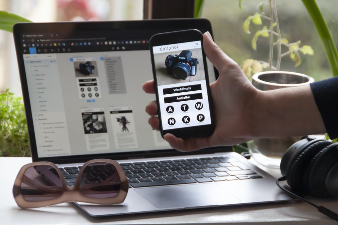
Top Resources that Help You Learn How to Build and Design Apps for Free – In this article, we will discuss how to build an application UI using UX principles. We will be looking at two different types of UIs- the first one is a user interface, and the second is an application logic UI.
The user interface is a simple overview of your app that the users can use to explore and interact with your app. It should be easy to understand and navigate and should be minimalist in design.
The application logic UI is much more complex and requires more design skills to create. It should be designed to manage the interactions between your app’s features and its users. It should also have a consistent look and feel across different devices so that users feel confident using it on any device.
Principles of UI design: How to design user interfaces?
One of the most important aspects of user interfaces (UIs) is design. When designing an interface, there are a few key principles to keep in mind:
1. Users should be able to control what they see.
2. The interface should be easy to use and navigate.
3. The user experience should be positive and pleasurable.
Design strategies for different types of user interfaces: Charting data, creating feedback loops, flexible layouts, etc.
There are many different types of user interfaces (UIs) one might use in an application. For example, a web application might have a login form with a password field, while a phone application might have a face unlock on the screen. In any given situation, the design of the UI would be key to making the user experience feel comfortable and inviting.
In this article, we’ll focus on designing user interfaces for data-driven applications. A data-Driven UI can be seen as an interface that is designed to allow users to interact with data stored in a database or another file system. The basic idea is that instead of dealing with complicated menus and buttons, users should simply point and click on associated fields to get the information they need.
One common type of data-driven UIs is a charting interface. A chart is a graphical representation of data that can be used to make fences between sets of values. Charting UIs can be used in both scientific and commercial applications. For example, you might create charts to show how customer sales compare to competitor sales over time or how product popularity changes over time.
Another common type of data-driven UI is a flexible layout interface. This type of interface allows for different layouts depending on the needs of the user.
User feedback as it pertains to user interfaces: From concept to finished product
User feedback is a valuable asset in any product development process. From concept to finished product, user feedback can help improve the usability of the product and make it more efficient and user-friendly. Here are some tips on how to collect user feedback effectively:
1. Be clear and concise when describing the problem you want to solve with the user interface. This will help users understand what they need to do to fix the issue.
2. Be proactive and early in your design process. User feedback will help you determine what needs to be changed before the final product is released. This will save time and Money!
3. Make sure all your user interface elements are functioning correctly before taking any measurements or making any changes. By doing this, you will ensure that users have a positive experience when using your product!
Types of users and their needs when designing user interfaces: Users who use computers for work, students, older adults, people with disabilities, etc.
There are a variety of users who need to be considered when designing user interfaces. For example, people who use computers for work may need different types of interfaces than someone who uses them for school or for older adults. In general, however, there are four main types of users: computer users, students, older adults, and people with disabilities.
Computer users: These are the most common type of user, and they need interfaces that are easy to use and understand. They should be able to get the information they need quickly and without having to go through a lot of steps.
Students: Students need interfaces that are easy to learn and use. They should also be able to find the information they need easily.
Older adults: Older adults might require interfaces that are easier to use than those for younger adults or those for people with disabilities. In addition, older adults might not be as familiar with technology as other users, so they may benefit from interfaces that are more intuitive or simple.
People with disabilities: People with disabilities might require different types of interfaces than others because they have certain physical limitations or conditions that make it difficult to do things the traditional way.
Graphic Design
If you’re like most people, you probably think of graphic design as designing the looks and feel of things. But in reality, graphic design is more than just designing graphics. Graphic design can also be used to create user interfaces (UI), which are the instructions that a user needs to follow to use a piece of software or interact with the world around them. In this blog post, we’ll look at some different ways that graphic designers can use their skills to create beautiful user interfaces.
In recent years, graphic design has become an important part of almost any website or application. Not only are graphics essential for creating visuals that represent a brand or product in a clear and concise way, but they can also help to create an overall design look and feel.
One popular type of graphic design isUI/UX. This refers to the user interface (UI) of websites and applications, which often play a significant role in how users interact with them. In this blog post, we’ll take a look at some basic tips on UI design and how you can use them to improve user experience on your website or application.
One of the most important aspects of graphic design is creating user interfaces that are comfortable and intuitive. This can be done through a variety of means, but one common approach is to use a Combo Box or DropDown List to present users with options. In this particular blog post, we’re going to take a look at how to create an easy-to-use application building & design UI for an online dating site.
What is UI design?
UI design is the process of designing user interfaces for computer applications. The goal of UI design is to create a visually appealing and efficient interface that will help users achieve their goals.
Different types of users might need different types of interfaces, so it is important to consider how the interface will be used before designing it. Different computer applications have different needs, so it is important to understand the target audience and what they need before starting the design process. Some common application areas are online banking, health care, manufacturing, and retail. Understanding these areas will give you a good understanding of what users might need in each case.
What is UX design?
User experience (UX) design is the practice of designing user interface elements and interactions that are pleasing, efficient, and practicable. User interface design can take on many different forms, but commonalities among them include incorporating natural language processing (NLP) technology into user interfaces to help users interact with applications more effectively, improving the interoperability of user interfaces across devices, and delivering a consistent user experience to all users.
Visual Communication
Designers and developers often face the same challenge when it comes to visual communication – how do they create colourful, engaging designs that will resonate with their users? There are a few essential factors to consider when designing an application’s user interface, but here are three of the most important: colour palette, font choice, and layout.
First, let’s take a look at some general tips for creating eye-catching visuals. To achieve a high level of impact, use dominant colours in your design, mix different hues together for variety and interest, and structure your designs to keep users moving around. To get started, start with a basic colour palette and work from there.
Next, make sure your fonts complement your visuals. Choose fonts that are stylish and modern looking; avoid Cheapo fonts or vintage styles that might not be as visually appealing. Additionally, try to find fonts that can be used in both light and dark applications alike. When it comes to font selection, keep in mind that users will see the most arthritic information on screens with large text sizes – so small types may not be noticed as much as on smaller screens. Finally, try to use patterns or shapes in your designs to help create a sense of order or hierarchy. By using these elements effectively, you can create an attractive overall user experience without overcomplicating things too much.
Visual communication is the presentation of information and ideas in a way that makes it easy for people to understand and receive. In order to create an effective visual message, designers need to be aware of several factors, including:
-The audience: How will the audience see the content? What are their needs? How will they interact with it?
-The tone: How should the content be interpreted? Is it serious, playful, or tongue-in-cheek?
-The design: What are the basic principles behind the design? Are there any specific components or elements that need to be usefully placed?
-The layout: How is the layout laid out so that everything is easily accessible and organised? Is there a consistent layout across different devices?
Visual Communication Vs Graphic Design
Visual Communication Vs Graphic Design – which is better for a website?
There is no definitive answer to this question, as both visual communication and graphic design can be incredibly successful in different circumstances. However, when it comes to website design, the more visually appealing and catchy designs are typically favoured over those with more complex or detailed layouts. This simple fact has a lot to do with the way people perceive websites – most people are more likely to focus on the visuals first rather than the content. As a result, visually appealing designs are often seen as more impressive and enticing than those that aren’t. Therefore, if you’re looking for a website that will be popular with online viewers, go with an eye-catching design. If you want to create something that will be attractiveness to desktop users, go for a more complicated layout.
Application of Graphic Design: Adobe Photoshop, Adobe Illustrator, Adobe InDesign
Adobe Photoshop, Adobe Illustrator, and Adobe InDesign are three of the most commonly used graphic design software programs. Each has its own strengths and weaknesses when it comes to creating beautiful applications and user interfaces. Here’s a look at the three in more detail:
Adobe Photoshop:
Adobe Photoshop is a powerful program that can be used to create beautiful photos, graphics, and illustrations. It is one of the most versatile graphic design tools around, capable of applying filters, compositing layers, editing textures and shapes, as well as creating logos and icons. Its ease of use provides a great starting point when learning graphical design.
Adobe Illustrator:
Illustrator is much different from Photoshop in terms of how it is designed. It was created as an AI system that allows you to create 3D objects with ease. This makes it perfect for creating designs that require a lot of space or complexity – such as websites or apps. However, it can also be hard to learn how to use Illustrator initially, so be prepared for some learning curve before starting work on your next project!
Adobe InDesign:
InDesign is designed specifically for designing web applications and user interfaces. It offers a variety of features unavailable in other graphic design programs, such as filters, composition layers, texturing abilities, etc.
Figma, Adobe XD, WordPress, Elementor.
There are a lot of different design and application-building tools available on the market today. Figma is a well-known design and application builder that is used by many professional designers and developers. Adobe XD is another popular tool that is used in conjunction with Figma to build custom UI designs. Elementor is another popular tool that can be used for creating various web applications.
Figma is a company that makes user interface design software. Adobe XD is an application building and design platform used by Adobe Photoshop, Illustrator, Inkscape and other graphic designers. Elementor is a WordPress theme builder that offers themes for a wide range of platforms, including Android, iOS, Windows Phone and Blackberry.
In this blog post, we’ll take a look at Figma and Adobe XD in more detail. We’ll also compare Elementor and WordPress for web development purposes. Finally, we’ll give some tips on how to get the most out of these applications.
How to convert a website to an app
There are a few ways to convert a website into an app. One way is to use a web development platform like WordPress or Laravel. Another way is to use an app development platform like Appcelerator or CocoaPods. The third way is to use a mobile development platform such as Android or iOS. There are many different platforms and ways to do this, so it’s up to you which one you choose.
A website can be converted into an app using any of the three methods. If you choose the web development method, make sure your website is ready for app development by creating a new project and following the steps in the project creation wizard. Once your website is ready for app development, you can install the requisite app development tools on your computer and begin developing your app.
Application Building
An average application has 100-300 different screens, depending on the company’s size and focus. At any given time, the user interface must be designed to fit as many of these screens as possible while still being accessible and intuitive.
One common approach is an app grid system that divides the screen into corresponding zones. The user can then drag and drop items into these zones to create a custom user interface.
Other approaches include using tabs or panes to group related screens together or creating dedicated menus for specific actions or data entry. The final decision about which approach is best depends on the specific needs of your company and the preferences of your users.
Adobe XD: Building Apps Without Coding Knowledge
Adobe XD is a powerful development environment for building apps without coding knowledge. It makes it easy to create beautiful, user-friendly applications that look great and work flawlessly. With Adobe XD, you can do everything from developing simple web applications to creating complex app designs.
E-Commerce Platform
E-commerce platforms are becoming more and more popular as they offer a wide range of benefits for businesses. From making it easy to find and shop for a variety of products to delivering the best customer experience, these platforms are perfect for online stores of all sizes.
In order to build an effective e-commerce platform, it is important to understand the different types of users who will be using it, as well as the needs and wants of each individual market. In this blog post, we’ll take a look at some common application-building & design UI UX patterns that can be used in any e-commerce platform.
When designing a user interface for an e-commerce platform, there are a few key considerations that should be made:
1) The user’s needs – Once you know what the users want and need from their experience on your platform, you can start designing the interface accordingly. This includes developing menus and interfaces that allow users easy access to the information they need while also providing enough controls for users to customise their experience.
2) The desired user experience – Once you have a good understanding of what the user wants, it’s time to start creating features that match those needs. This means Saunders User Experience Patterns (Saunders UX patterns) can be helpful in helping create an effective e-commerce platform interface.
What are the benefits of visual communication on social media?
There are many benefits to using visual communication on social media, from building an application or design to improving the user experience. Here are a few examples:
1. User-friendliness
With users viewing posts and photos in a variety of styles and formats, it can be difficult to know who is responsible for a particular post or photo. Having clear and concise images can make it easier to identify who is behind the content and who is representing the company or product. This also makes it easier for customers to connect with the brand, as they can see what type of person or products are being offered.
2. Brand presence
As social media platforms continue to become more popular, businesses need to ensure that their brands are visible and recognised. By using high-quality images and videos, businesses can show off their latest products and services in an attractive way – no matter how small the community may be. Additionally, by showing off brand standards such as logo placement and shot choices, customers can start to feel more confident about trusting the brand with their online information.
3. pushed content
One of the great benefits of visual communication on social media is that it can help you push out valuable content quickly and easily – without having any downtime! With so much available on the internet today (and with so many people looking for good content), you can often get ahead of your competition by posting fresh updates regularly instead of relying on stale old material.
How can I use visuals for marketing purposes?
UX stands for User Experience, and it’s the first and most important aspect of any product or website. If your users don’t have a good experience when using your product, you’ll lose customers in no time.
One way to improve user experience is by using visuals to create engaging and compelling content. You can use colourful graphics, photos, screenshots, animations and videos to tell your story and attract users.
But how do you choose the right visuals for your marketing? There are a few factors you need to take into account:
1) What type of audience are you targeting? Are you trying to capture potential customers who are already familiar with your product or who will be interested in it after reading your content? Or are you trying to attract new customers who haven’t heard of your company yet? The audience you want to target will dictate which visuals work best for them.
2) How much attention do you want users to pay to your content? Is it something that should be seen regularly, or is it more occasional? Will users be reading articles every day or only when they feel like they need to know what’s going on? How much focus should each image have? And finally, is there a specific moment that needs emphasising – like an important launch event or a key moment in the story arc? These moments will require different visuals than others.
There are a number of ways to use visuals for marketing purposes. One way is to use them in advertisements and other forms of commercial advertising. Another way is to use them as part of the design of websites and applications. A third way is to use them in marketing materials such as product descriptions, press releases, and webinars.
What are the best types of visuals?
As a software engineer, you might be asked what the best types of visuals for various applications are.
There are many factors to consider when making this decision – such as the target audience, budget and what type of presentation you want your users to see.
There are many types of visuals, but some of the best include images, videos, logos, 3D graphics, and illustrations. These visuals can be used in a variety of applications to create a unique and memorable experience for your users.
How do visuals make products more appealing?
There are many ways to make a product more appealing. Sometimes, the simplest way is to use visuals that are visually appealing. Other times, you may need to add design elements that will make the product more appealing. In any case, it is important to consider the impact of visuals on an application’s user interface.
There are many factors that go into making a product more appealing. One of the most important is how visuals make the product feel. When users see a good-looking product, they’re more likely to want to use it. This can be done through design, layout, and even colour choice.
How does visual communication differ from text-based communication?
Visual communication is often seen as the weakest link in a web or mobile application. It often lacks detail and clarity, which can make it difficult to understand and use. This can lead to frustration and lost time, which is costly in the long run.
There are a few key differences between visual and text-based communication. First, visuals often contain more information than text. This can help users better understand what they are looking at, which can increase immersion and user satisfaction. Additionally, visuals tend to be easier to read than text-based communications. This means that even if users have trouble comprehending them, they will still be able to use them effectively.
In conclusion, visual communication is important for both web and mobile applications. It provides clear instructions and a wealth of information that can improve user experience and save time.
What are the benefits of using a visual communicator?
Visual communication is a great way to communicate with customers and employees. It can help you build an effective application user interface, improve customer service, and create more efficient processes.
Some of the benefits of using a visual communicator include:
1. Increased understanding and productivity: When users see the same information in different formats, they are able to better understand it and work smarter. This can lead to faster decision-making, improved communication, and increased efficiency.
2. Improved team morale: A well-designed user interface allows employees to feel appreciated and appreciated by their employers. This will keep them motivated and on board with your company culture.
3. Increased brand awareness: By displaying relevant information in an aesthetically pleasing way, you can increase brand awareness for your company while also increasing customer trustworthiness. This can help increase the likelihood of success in any given market scenario.
There are many benefits of using a visual communicator in application building and design. A visual communicator can help to streamline communication between developers, designers, and users, helping to improve the overall user experience. Additionally, a visual communicator can help to simplify tasks and make them easier to perform.









