

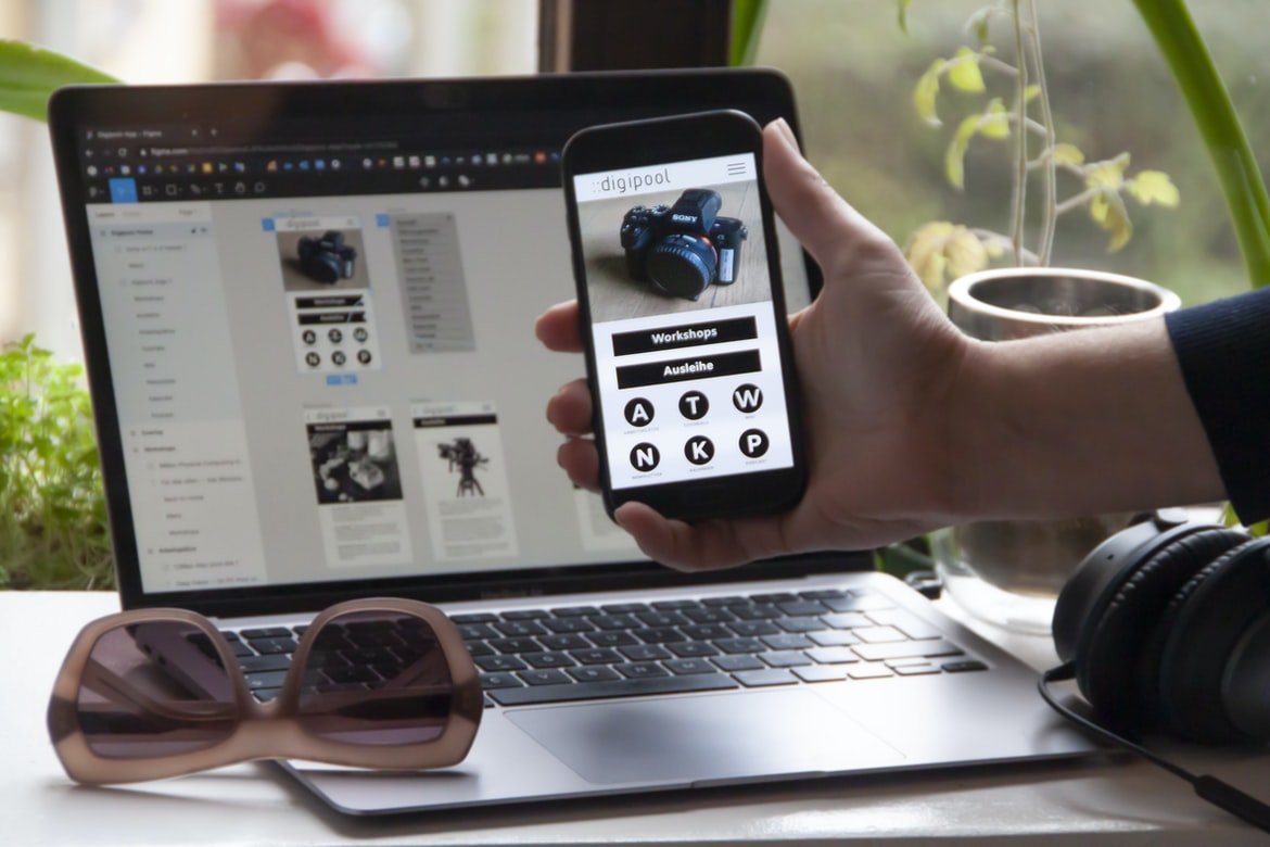
What is user experience? What is user interface design? How do they differ?
User experience and user interface design are two essential aspects of web design. User experience is all about making sure that users have an enjoyable experience on your website. This can be done by ensuring that the layout, colours, and functionality are comfortable and easy to use. User interface design, on the other hand, focuses on how a site’s menus, buttons, and other graphical elements look and feel. It can also include thinking about how people might interact with your site’s content.
The two disciplines have some important differences. For example, user interface design is often focused on creating a sleek and simple look for a site, while user experience focuses more on making sure that users feel comfortable using the site. Additionally, user interface design often includes considerations for accessibility (making sure that the site is usable by people with disabilities), while user experience typically does not.
The psychology of user experience: Why people use products and how to make them happy.
User experience (UX) is the totality of a user’s interaction and experience with a product or service. It includes everything from the initial encounter with a product to continued use, including interactions with users’ peers and experts. UX research covers many different aspects of how users perceive and interact with products, ranging from how they learn about and use a product to what factors affect their satisfaction with it.
Many companies focus on improving the user interface (UI) when designing new products but neglect UX. UI is important, but if a product doesn’t provide an engaging experience for users, they will not stay long or recommend it to others. A good user experience creates positive emotions like satisfaction and delight that encourage users to return and refer friends.
The design of user interfaces: How to create a pleasant, intuitive and efficient experience.
User interfaces are designed to make the user experience as pleasant, intuitive and efficient as possible. Here are tips for designing an intuitive user interface.
1. Keep it simple. The interface should be easy to understand and use, without clutter or unnecessary features.
2. Use typography and layout wisely. The typeface, size, and placement of text elements can affect how users feel about your UI. Make sure all text is legible at a distance and that there’s enough contrast between different types of text to make them easily distinguishable.
3. Pay attention to colour and temperature! Bright colours may be appealing from a visual standpoint, but they could also be overwhelming or confusing for users with sensitive eyes or skin tones. Consider using warmer colours instead to create a more inviting environment.
User experience guidelines: Tips on how to make your apps, websites and products more user-friendly.
User experience guidelines: Tips on how to make your apps, websites and products more user-friendly. User interface (UI) is the look and feel of a product or website. It is the first thing a user sees, and it sets the tone for the rest of the user experience. UI design can be divided into two categories: visual design and interaction design. Visual design concerns how a product looks, while interaction design deals with how it works. Here are some tips on creating better user interfaces:
1. Use self-explanatory icons and labels: Avoid using obscure or hard-to-understand icons or labels. Make everything as easy to understand as possible for users. It’s also helpful to include explanatory text when necessary.
2. Focus on usability: Design for the majority of users, not just for the most technically adept. As a result, people will be able to use your products or websites easily and effectively. 3. Try to keep it simple: Simplicity is not necessarily a bad thing.
Five tips for creating better user interfaces: Improve usability with these simple techniques.
User interfaces can be improved by implementing these five simple techniques.
1. Use icons instead of text to represent different actions or tasks. This will make it quicker and easier for the user to understand what they need to do.
2. Keep all elements of the interface accessible at all times, regardless of the user’s location on the screen. This will ensure that users can easily find what they are looking for, no matter where they are in the interface.
3. Make sure all buttons and other controls are easy to understand and use. All too often, users find complicated menus or controls hidden away from where they are looking.
4. Use clear and concise labels for all buttons and other controls so that users know exactly what each one does without having to look for a description.
5. Limit the amount of information that is displayed on each screen so that users have enough information to be able to accomplish their goals and make informed decisions. 6. Use clear and concise instructions on how to complete each task or action. 7.
WordPress for Designers
WordPress is a popular content management system (CMS) used by designers and developers to create websites and web applications. WordPress is free and open-source software released under the GPL, making it accessible to anyone with an internet connection. WordPress has a user interface that is easy to learn for beginners yet powerful enough for experienced users. This makes WordPress a great choice for designers who want to create graphics-heavy websites or web applications.
WordPress’s popularity as a CMS makes it an ideal platform for designers who want to create graphics-heavy websites or web applications. With its easy-to-use user interface, WordPress makes creating website graphics fast and simple. Additionally, WordPress’s wide range of features makes it perfect for creating any type of website or web application.
WordPress Elementor for Designers
WordPress Elementor is a popular tool for designers who need to create custom designs for WordPress websites. The program has a user interface that is similar to Adobe Photoshop, making it relatively easy for designers to learn. However, there are several features of Elementor that make it an ideal tool for user experience (UX) design.
First, the tool’s layers system makes it easy for designers to create complex designs. For example, they can use layers to create separate panels or pages that can be customized in different ways. This makes it easy for designers to customize their designs without having to start from scratch each time.
Second, the drag-and-drop interface allows designers to move elements around the screen easily. This makes it easy for them to change the layout of their designs without having to re-create all of the elements from scratch.
Figma
Figma is a user interface design tool that has surged in popularity in recent years. While it is not the only user interface design tool available, its unique approach and capabilities have made it a favoured platform by many designers. In this article, we will compare the two most popular user interface design tools: Figma and Adobe Photoshop.
Adobe XD
Adobe XD is a powerful vector drawing program that has been growing in popularity in the design community for its ease of use and wide range of features. In this article, we will explore the different aspects of user experience and user interface design when using Adobe XD.
XD is a vector drawing program that allows users to create high-quality graphics quickly and easily. Its user interface is simple to use, with menus located at the top of the window, making it easy for new users to find what they are looking for. Additionally, XD has a wide range of features that allow users to create complex graphics easily.
One important aspect of user experience is how well the software understands the user’s preferences and requirements. When designing an application, it is important to take into account how people will use it and make sure that the features are easy to access and navigate.
Visual Communication
Today, more and more companies are looking for ways to improve their visual communication. This is especially true in industries such as finance, healthcare, and marketing. There are a number of reasons for this. First, users, today have more access to information than ever before. They can find it on the internet, on their phones, and even on paperless handheld devices. As a result, companies need to be able to communicate with their customers in a way that is both engaging and visually appealing. Second, users, today are used to interacting with information in graphical formats. This means that companies need to think about how they want their product or service to look and feel before they start developing it. Finally, user experience (UX) has become increasingly important in the last few years. Companies want their products and services to be easy to use from the first time someone tries them out.
What is Visual communication in graphic design?
Visual communication is the process of sending a message through images. It can be used in any field, such as graphic design, advertising, and product development. Visual communication can be divided into two categories: user experience and user interface. User experience focuses on how users interact with a product or service, while user interface concerns the look and feel of the products themselves. Both are important in creating effective visual communication.
User interface design is important for two reasons: it helps users find what they’re looking for quickly, and it looks good no matter what device is being used to view it. Poorly designed interfaces can make using a product difficult or confusing, regardless of how well it works technically. A good example is the Windows Start menu—while it’s functional, its look has been unchanged for years, making it difficult for new users to adapt to the system.
Application of Graphic Design: Adobe Photoshop, Adobe Illustrator, Adobe InDesign
The application of graphic design has come a long way since its inception. It has been used to create everything from advertisements and logos to magazine covers and even tattoos. But which software is best for the task at hand? Adobe Photoshop, Adobe Illustrator, and Adobe InDesign are all popular graphic design software programs that can be used for a variety of tasks. However, when it comes to user experience vs user interface, Photoshop reigns supreme.
Adobe Photoshop has been around for many years, and it is one of the most popular graphic design software programs on the market. It is available on both PC and Mac platforms, and its user interface is very easy to understand. Additionally, Photoshop has a wide range of features that can be accessed via its menus or toolbar buttons.
Adobe Photoshop
Adobe Photoshop is one of the most popular graphic design software programs on the market. It has a wide range of features that can help designers create beautiful and professional-looking documents. However, some people feel that Adobe Photoshop’s user interface (UI) is outdated and difficult to use.
In a recent study, user experience (UX) experts from Adobe and Google asked people to compare the two UIs. The results showed that users found the Google UI easier to use than Adobe Photoshop’s UI. The experts say that this is because Google designed its UI for mobile devices first, while Adobe focused on desktops and laptops.
Some people think that Adobe should update its UI to match more modern design trends. Others believe that users will adapt to new designs over time, so there isn’t really a need to make drastic changes right now.
Adobe Illustrator
Adobe Illustrator is a popular vector graphic design program that has been used by professionals for years. It has a user interface that is easy to use, but some users experience difficulty using it. In this study, the user experience vs user interface graphic design comparison was conducted to find out which one is better. The results showed that user interface graphics are easier to use and provide a more efficient workflow.
Adobe InDesign
Adobe InDesign is software that allows users to create publications, such as brochures, magazines, and catalogues. The software has been around since 2000 and has since become one of the most popular graphic design programs on the market. There are a number of reasons for this popularity. One reason is that InDesign is very versatile and can be used for a variety of different types of publications. Additionally, InDesign has an impressive user interface which makes it easy for beginners to use the program. However, despite its popularity, there are a number of drawbacks to using InDesign. One drawback is that the program can be complex and difficult to learn for beginners. Additionally, InDesign can take a long time to render certain types of pages.
Web Design
A well-designed website can transform the way that people interact with your business. User experience is more important than user interface when it comes to web design, but graphic design can play a big role in creating a pleasing and effective user interface. Here are tips for creating a great user experience on your website:
1. Keep things simple. Use stripped-down designs and clean lines to help users focus on the information they need. Don’t overload them with too much visual noise.
2. Don’t make them scroll forever. Make your content easy to find and navigate, so users don’t feel like they have to scroll endlessly just to see what you have to say.
3. Test, test, test! Make sure that all of your page elements work as expected before you go live with your site.
Design websites
Design websites should focus on creating a pleasant user experience rather than simply designing a pretty interface. A study recently released by User Interface Design (UID) magazine found that user experience is more important than user interface graphic design when it comes to website usability. The study looked at ten popular websites and evaluated their levels of usability according to five different criteria: ease of use, accuracy, completeness, timeliness and relevance. The results showed that the websites with better user experiences were more likely to be ranked higher in search engine results. While the graphical design is important, it should not be the only factor that decides whether or not a website is usable.
Typography
Typography is an important factor in creating a user interface. Graphic designers must consider the different types of fonts, spacing, and other elements when designing a website or application. A well-designed typography can make an interface more appealing to users and help improve user experience.
Theory
The article discusses the theory of user experience and how it relates to graphic design. User experience is about creating a comfortable and pleasurable user interface for users. Graphic designers should take into account the user experience when designing their interfaces, as this will create a better overall user experience.
Colour Theory
The psychology of colour has intrigued people for centuries. Our perceptions of colour are based on our experiences and the colours around us. Colour theory is the study of how people perceive colour and how design can use colour to create a desired effect. There are three primary colours: red, green, and blue. They are combined in various ways to create all the other colours in the spectrum.
Different cultures have different associations with certain colours. For example, in China, black is associated with mourning, while white is associated with purity. This may affect how a design looks to someone from that culture. It’s important to consider these details when creating a graphic design project.
Colour can also be used to communicate emotions or ideas. For example, a green logo might be associated with healthy plants and growth, while a red logo might be associated with passion and excitement.
Graphic design is in demand.
Graphic design is in high demand due to its ability to communicate a message and evoke an emotional response. It can be used for a variety of applications, such as web design, product packaging, and advertisements. In order to create effective Graphic Design, it is important to understand user experience (UX) and user interface (UI) design.
Wireframes
There is a growing trend of using wireframes as the foundation for user interface and user experience design. While graphic design focuses on creating beautiful visuals, wireframing helps to create a solid understanding of how users will interact with an interface or product. It can also help to avoid common usability issues and ensure that the final product is easy to use.
Here are some tips for creating effective wireframes:
1. Start with the goal in mind. What do you want the end product to look like? What functionality do you need to include? Once you have a clear vision for your project, start designing from there.
2. Take your time. Don’t rush through your designs; take the time necessary to make sure each element is perfect. This will help ensure that your final product looks professional and sleek AF.
UX/UI Design Strategies
User experience (UX) design is all about creating an enjoyable and satisfying user experience for your users. User interface (UI) design is all about creating a visually appealing and functional user interface. Designers use different strategies to achieve these goals. In this article, we’ll explore some of the most common UX UI design strategies.
UX/UI Design Principles
There are many different design principles that can be used when creating a user interface or user experience. Some of the most important principles to consider are simplicity, feedback, feedback visibility, consistency, and modularity.
Simplicity is often cited as one of the most important principles to follow when designing a user interface. It is essential that any elements of the UI are easy to understand and use. This will help users feel confident in using the interface and reduce the chances of them becoming frustrated or confused.
Feedback is another key principle to consider when designing a user interface. Any actions users take on the UI should be immediately apparent to them. This way, they can ensure they are taking the correct action and receive immediate feedback on their progress. Feedback should also be visible in a way that is easily understood by all users, regardless of their level of experience.
UX/UI Design Techniques
There is a growing trend in the design world moving away from strictly graphical user interfaces (GUIs) towards user experience (UX) designs. This shift is due to the recognition that GUIs can be overwhelming and hard to use, especially for newcomers. In order to create a more accessible and user-friendly interface, it’s important to take into account both the user experience and the graphic design components of the project. Here are some tips for designing better UX UI graphics:
1. Keep your design simple. Too much detail can make it difficult for users to understand and navigate your interface. Stick to basic shapes, colours, and fonts, and avoid complex layouts or animations.
2. Use good typography. A well-designed font can help your users read your text easily and smoothly, eliminating the need for them to pause or reread information multiple times.
User experience is more than just a pretty face.
User experience is more than just a pretty face. It goes beyond the design of a user interface and includes the entire process of designing and creating a product or service. By understanding user experience, businesses can create products that are easy to use and satisfying for customers.
User experience is important not only for customers but also for employees. Employees who understand and appreciate user experience are likely to be more productive and satisfied with their jobs. In addition, good user experience can lead to higher customer satisfaction ratings and increased revenue.
There are several ways to improve user experience. First, businesses can focus on simplifying the design process. Second, they can ensure that all aspects of the product (from branding to functionality) are consistent with one another. Finally, companies should always keep in mind the needs of their target audience when developing products or services. 1. User experience is more than just a pretty face. It’s the whole package, from the design of the interface to how users interact with it.
2. A well-designed user interface will make your users happier, faster, and more productive.
3. The best way to improve user experience is to focus on the whole user experience, not just the graphics.
What are the different stages of user interface design?
User interface design is a process that begins with understanding the needs of the users and ends with creating a visual representation of those needs. There are different stages involved in this process, and each one has a different goal. The five stages are research, Prototype, Design, Build and Validation.
First, the team must do some research to understand what the users want. This can be done by conducting interviews or surveys. After this is complete, they may create a prototype to show the user what their idea looks like in practice. This may be a rough drawing or an actual application.
After the prototype is created, it’s time for design. This involves creating an overall look for the user interface and designing all of its components. Special attention should be paid to how everything works together and how users will interact with it.
How do you know when it is time to move on to the next stage of design?
There is no single answer to this question, as it depends on the individual and their specific design goals. However, some general tips that may help include: when you feel like you’re hitting a dead end or your design aren’t progressing, when you find yourself repeating yourself; and when your users are not responding in the way that you would hope. If any of these indicators are present, it may be time to move on to a different stage of design.
Why is it important to have a clear vision for a design before starting the process?
Design is all about creating a vision for the end result and then putting all of your efforts into making that vision a reality. If you don’t have a clear vision in mind, it will be hard to create a design that meets the needs of your users. A good way to start developing a clear vision is by thinking about what you want your design to achieve. You can use principles of user experience (UX) and user interface (UI) design to help you get started. Once you have an idea of what you want, it’s important to start sketching out how it will look. This will help you figure out where necessary changes might need to be made later on in the process. Once you have a rough idea of how your design will look, it’s time to start prototyping it. This will allow you to test out different ideas and see which ones work best.
What are the different types of UI and UX design tools that designers use?
There are many different types of UI and UX design tools that designers use. Some of the most common include wireframing tools, prototyping platforms, and user research tools. Each tool has its own strengths and weaknesses, so it’s important for designers to choose the right one for the specific task at hand.
One of the most popular user experience (UX) design tools is Axure RP. This software is used to create high-quality wireframes and prototypes. Wireframing with Axure RP can be quick and easy, but it doesn’t offer a lot of customization options. Prototyping with Axure RP is more versatile but can also be time-consuming.
User research tools like Qualtrics allow designers to conduct surveys and interviews with users to get feedback on their designs. This type of tool can be especially valuable when designing new products or services.
What are UI UX mistakes?
1. User experience (UX) is all about creating a great user interface that is easy to use and meets the needs of your users. However, there are many mistakes that can be made when designing an interface.
2. One common mistake is making the interface too complicated or overwhelming for users. Instead, make sure to keep it simple and organized so that users can easily find what they need.
3. Another mistake is not taking into account the user’s context when designing the interface. For example, if you are designing a website for a business, make sure to include features that will help customers order products or make payments.
4. Finally, be sure to test your UI design before finalizing it- this will help ensure that it meets user expectations and looks professional.
What are UI UX tips to avoid those mistakes?
1. There are a number of ways to improve the user experience without resorting to graphic design.
2. Make sure your information is easy to find and understand.
3. Use colour wisely, and avoid overwhelming users with too many choices.
4. Keep buttons small and simple, and label them clearly.
5. Use fonts that are legible on a variety of devices, and make sure they’re styled properly.
6. Avoid clutter, and keep everything organized neatly on the screen.
7. Test your designs before you go live, so you can ensure they work as intended.
What is the difference between UI and UX?
UX and UI are two different design disciplines that focus on the user experience. UX designers focus on the entire user experience, from the initial interaction with a product to the final steps of using it. UI designers focus on the look and feel of products, including their buttons, icons, and graphics.
UI designers often work with developers to create custom designs or modifications to existing products. UX designers may work independently or with a team of other professionals. Both disciplines have their own unique strengths and weaknesses, but together they can create a successful user experience for any product.
What are some common UI UX mistakes?
There are a few common user interfaces (UI) UX mistakes that can have a negative impact on the usability and overall experience of a product. Here are the most common:
1. Using Poorly Chosen Fonts and Colors: This is one of the most basic mistakes made with UI design – choosing fonts and colours that don’t coordinate well together can make a product look unprofessional and outdated. Not to mention, it can be difficult for users to read text on a background that’s too bright or too dark.
2. Incorporating Too Many Navigation Elements: While it’s important to provide users with clear and concise navigation options, overuse of these elements can make it difficult for users to find what they’re looking for. Not to mention, adding too many unnecessary clicks can lead to frustrating user experiences.
3. Using Incorrect Fonts: It’s important to use the correct fonts for the content you’re designing. If you choose a font that doesn’t match your brand, users will know this is a mistake.
What are some features of a good UI UX?
There are many features that go into a good User Interface (UI) UX. UI design should be intuitive, engaging, and easy to use. It should also be visually appealing so that users feel positive about using the interface. Some of the features that make a good UI UX include:
-Usability: The UI should be easy to use and understand.
-Design: The design of the UI should be attractive and inviting.
-Functionality: The UI should be functional and easy to use.
How can I implement an effective UI UX testing process?
Poor user interface design can cause frustrating experiences for users. User experience (UX) testing helps ensure that the user interface meets the desired goals and is easy to use. Here are some tips for implementing an effective UX testing process.
1. Define the key goals of the UX test. The goals of a UX test may include gathering feedback on how well the user interface meets specific requirements, identifying areas where improvements can be made, or verifying that the finished product meets customer expectations.
2. Identify potential user scenarios. A scenario is a hypothetical situation in which a user interacts with the product under test. Scenarios should be tailored to reflect real-world use cases, but they should also be as simple as possible so that they can be easily repeated and analyzed.
3. Create test plans and prototypes.
1. Good user experience and good graphical design go hand-in-hand. But how do you know which one to prioritize when creating a new product?
2. There are a few things to consider when creating test plans and prototypes: 1) the target audience, 2) the goals of the product, 3) what kind of feedback you need from users, 4) the feasibility of your proposed solution, 5) how much time and money you want to spend on testing, and 6) your design philosophy.
By following these steps, you can create a well-rounded product that meets the needs of both users and designers alike.









