Typography and design 2022
Typography plays one of the biggest roles in graphic design. It is the art or technique of displaying words or text in an appealing, digestible, and readable way. This is an art form for a reason as typefaces can be arranged in so many ways that it can seem overwhelming for any designer at first.
Type is useful as it helps to set the mood and tone for a design piece. The tone and mood can be loud, or it could be soft, it could be bold, or it could be subtle. Typography can create a sense of elegance, grace or create a sense of urgency.
Typefaces are groups of fonts that share similar styles or characteristics. See the example below for instance Calibri as set out here;
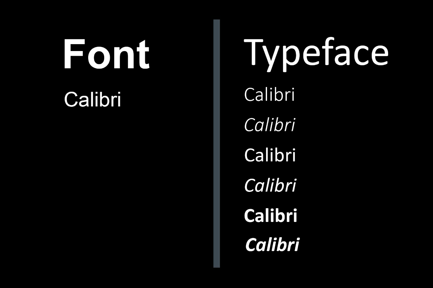
This popular typeface consists of different fonts, and these fonts consist of different sizes and weights, but they are all part of the same Calibri typeface. Font is a term that can be heard often, and it refers to one of many fonts that make up a whole typeface or family of typefaces.
Fonts can be broken down further into a collection of glyphs which represent an individual character number or punctuation mark.
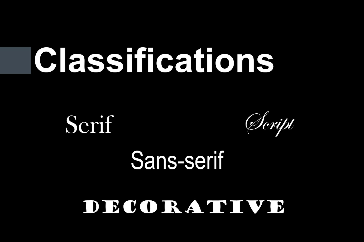
Typefaces are split up into several main classifications:
Understanding of design.
Serif fonts
Serif are fonts with a small line or stroke regularly attached to the end of a larger stroke in a letter or symbol within a font or family of fonts. These lines are easy to read and therefore they are quite common in books and small printed text. They make it easy for the eye to make up the character of the font because of these little tails called serifs.
Testimonials:
Sans serif fonts
Sans-serif is one that does not have extending features called “serifs” at the end of strokes. Sans-serif fonts tend to have less stroke width variation than serif fonts. They are often used to convey simplicity and modernity or minimalism.
Sans-serif fonts have become the most prevalent for the display of text on computer screens. On lower-resolution digital displays, fine details like serifs may disappear or appear too big. The term originates from the French vocabulary sans, meaning “without” and “serif” of uncertain origin, possibly from the Dutch word schreef meaning “line” or pen-stroke. In printed media, they are more commonly used for display use and less for body text.
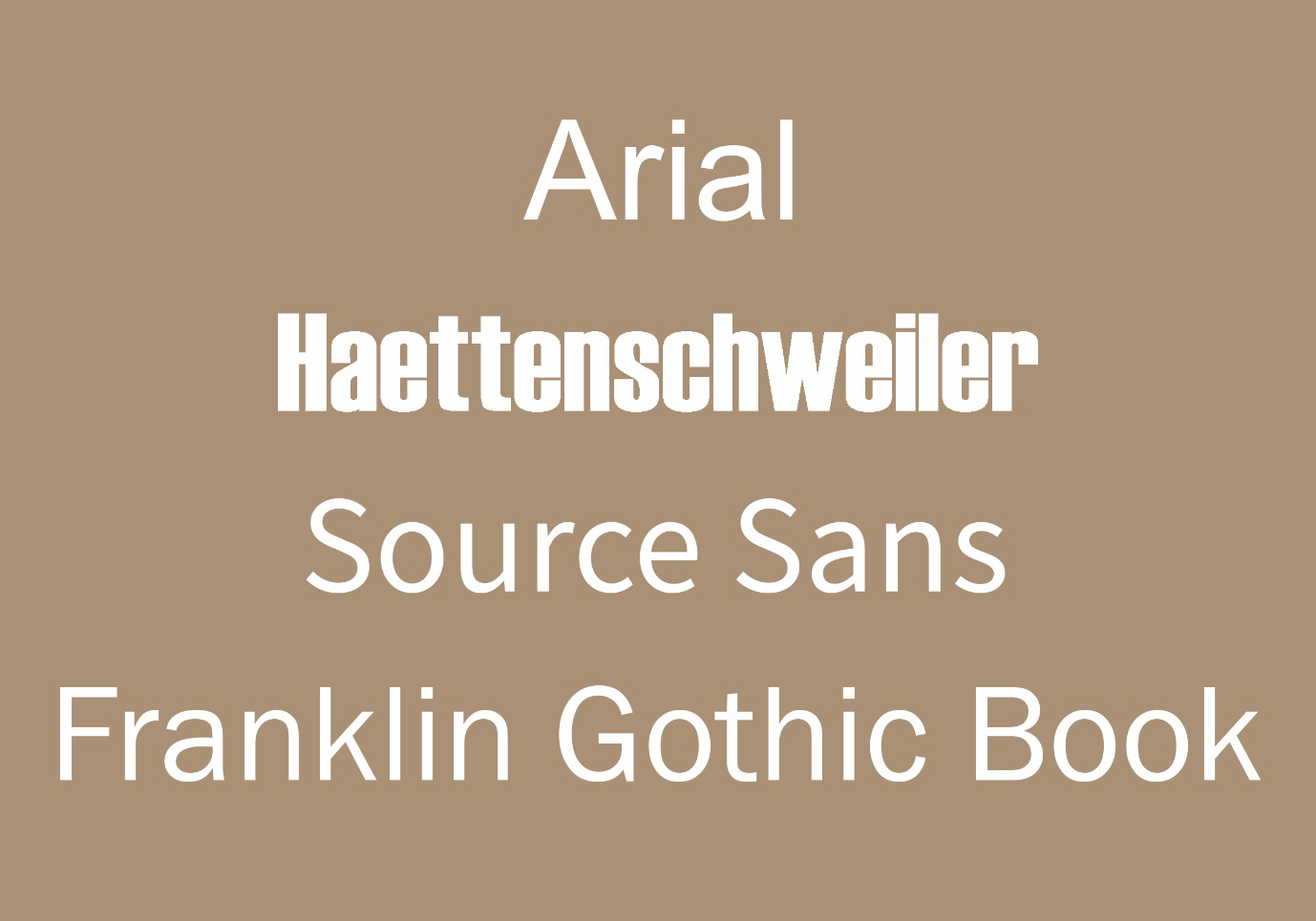
Prior to the time when the term “sans-serif” became common in English typography, a number of other terms had been used. One of these outmoded terms for sans serif was gothic, which is still used in East Asian typography and sometimes seen in font names like News Gothic, Highway Gothic, Franklin Gothic or Trade Gothic.
Sans-serif fonts are sometimes, especially in older documents, used as a device for emphasis, due to their typically blacker type colour.
Script fonts
You can define script fonts as a font that mimics cursed handwriting. It is a typeface with a personal touch like calligraphy and handwriting fonts. There are two main types of script fonts. Formal script fonts and casual script fonts. Formal script fonts are fancy scripts that conjure the incredible handwriting of masters.
They are extremely easy to recognize mostly because they have over the top curls and flourishes that extend from the serif. Casual script fonts, on the other hand, resemble calligraphy only with fewer swashes and curves. You can use them for more casual design jobs to give your designs a casual and relaxed feel.
Hand lettering fonts
hand lettering is the art of drawing letters and can take on many shapes and sizes, from traditional-looking letters to intricate, detailed, and not-so-obvious looking ones. This can be done in any style, on any material, with any media.
Decorative fonts
The principal aim of decorative font, while displaying something on-screen or with the help of any printing device, can be accurately and unambiguously derived from its name. It serves to decorate, elaborate, and enhance a text. With the help of decorative fonts, any informal passage can become more reader-friendly: it will quickly capture the attention of the readers through its rare design and make a text easier to understand.
This letters usually feels more like graphics instead of type. These typefaces are so detailed that they can even stand alone as a statement without the need for photos or other design elements because of their detail. However, it is advisable to take precaution not to overuse it as this typeface can be overwhelming if not used correctly.
The anatomy of typography
Typography has a special place in the world of design, and it can dramatically affect the way design feels. It can make a design look busy or clean, or it might even be the design itself. Through understanding the anatomy and structure of typography it goes a long way in deepening your understanding of design.
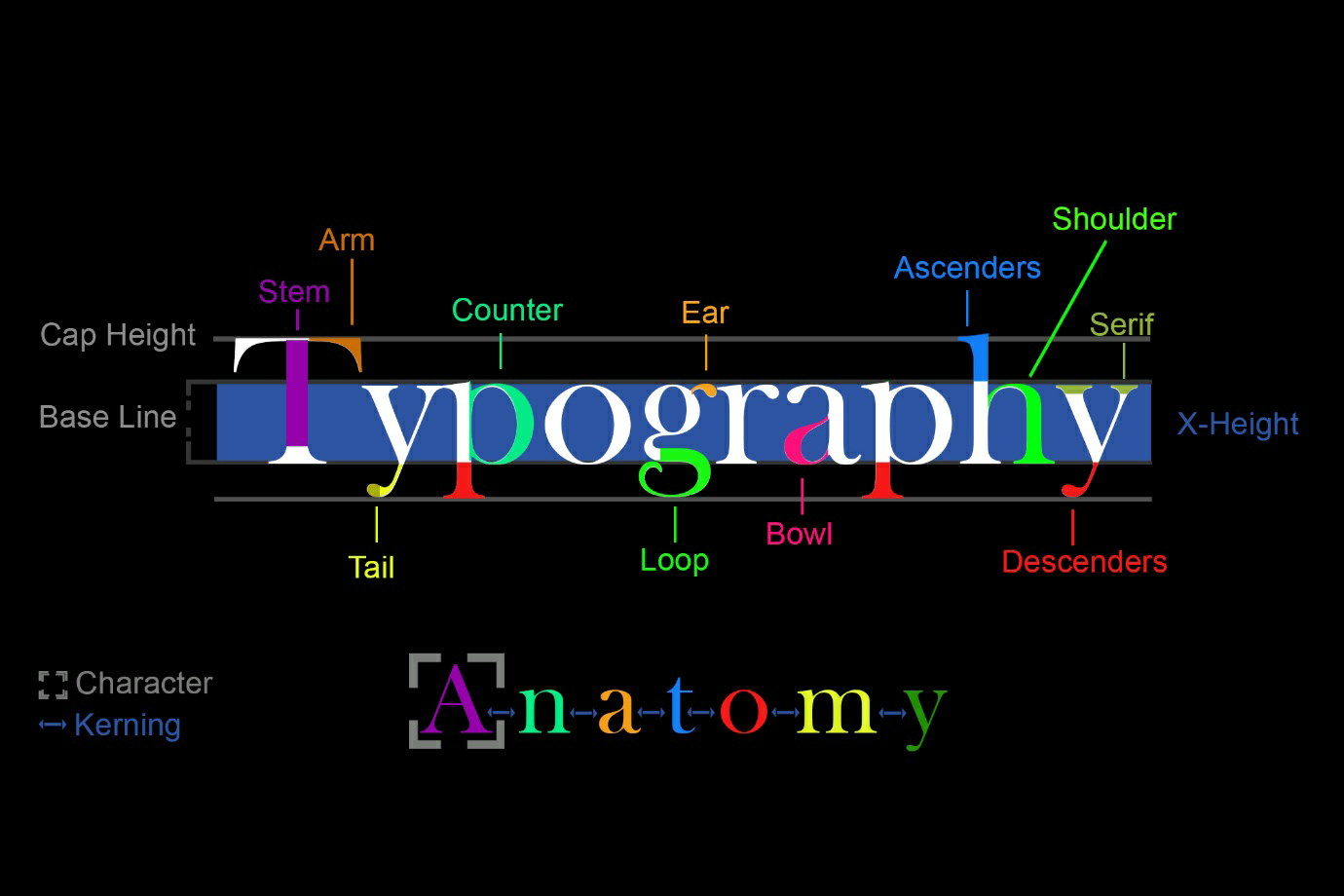
How do you tell one typeface from another? If you are trying to distinguish Helvetica from Times Roman, the difference is obvious. In other cases, however – especially between text designs having similar characteristics – the differences can be subtle and difficult for the less–experienced eye to see. One important step in training your eye to notice the details that set one design apart from another is to examine the anatomy of the characters that make up our alphabet.
As in any profession, type designers have a specialized vocabulary to talk about the different parts of letters. There are 100’s of terms for describing typography anatomy and we not going to learn them all. Equally you do not need to know them all, but it is important for you to familiarse yourself with this terminology as this will make it easier to communicate describing typefaces and their characteristics. It will also help educate your eye to recognise the underlying structure of various designs and the differences among them.
Arm/leg – An upper or lower (horizontal or diagonal) stroke that is attached on one end and free on the other.
Ascender – The part of a lowercase character (b, d, f, h, k, l, t) that extends above the x-height.
Bar – The horizontal stroke in characters such as A, H, R, e, and f.
Bowl – A curved stroke which creates an enclosed space within a character (the space is then called a counter).
Cap Height – The height of capital letters from the baseline to the top of caps, most accurately measured on a character with a flat bottom (E, H, I, etc.).
Counter – The partially or fully enclosed space within a character.
Descender – The lower part of a character (g, j, p, q, y, and sometimes J) that descends below the baseline.
Ascenders – The upper part of a character.
Ear – The small stroke that projects from the top of the lowercase g.
Loop – The lower portion of the lowercase g.
Serif – The projections extending off the main strokes of the characters of serif typefaces. Serifs come in two styles: bracketed and unbracketed. Brackets are the supportive curves which connect the serif to the stroke. Unbracketed serifs are attached sharply, and usually at 90-degree angles.
Shoulder – The curved stroke of the h, m, n.
Stem – A straight vertical stroke (or the main straight diagonal stroke in a letter which has no verticals).
Tail – The descender of a Q or short diagonal stroke of an R.
Terminal – The end of a stroke not terminated with a serif.
X-height – The height of the lowercase letters, specifically the lowercase x, not including ascenders and descenders.
Base Line – Is the lines in between where most characters/letters sit.
Now that you know some basic terminology terms, let’s go over some other practical terms that you must know in the world of graphic design. Many of these terms and phrases are thrown around on client’s emails and professional feedback you might receive.
Character – A single element, such as a letter, numeral or mark of punctuation. The emerging term to describe these typographic elements is a glyph, which is more descriptive when discussing non-Roman alphabet characters.
Kerning – The space between each character. You might have noticed that each type has a natural kerning added to it, you can manually reduce or expand each character space to make an impact on the way type looks.
Leading – The space in between sentences. The space in between sentences and larger paragraphs can really change the look and feel of a block of type. Larger spaces in between sentences can look remarkably clean while tighter spaces can look overcrowded. When you are learning intermediate or advanced design techniques you will need to know how to manually space and balance logos, headlines, and custom lettering.
Typestyles
Now that you understand the basics of type and the anatomy of the font on this page I will give you some insight on some frequently used typefaces so you can put together a font collection to help you pick fonts much easier for your design projects. You do not need 100s of fonts for your projects, in fact, you only need to have a selection of 20 to 30 handpicked commonly used that you can use on projects. This not only will help you be consistent, but it will also help you pick those fonts out for your next project a lot easier.
Serif Type Styles
To understand this category, we have to travel way back in time to the first uses of serif fonts. There are 4 main categories of serif fonts and these are listed in order and when they were first used in history.
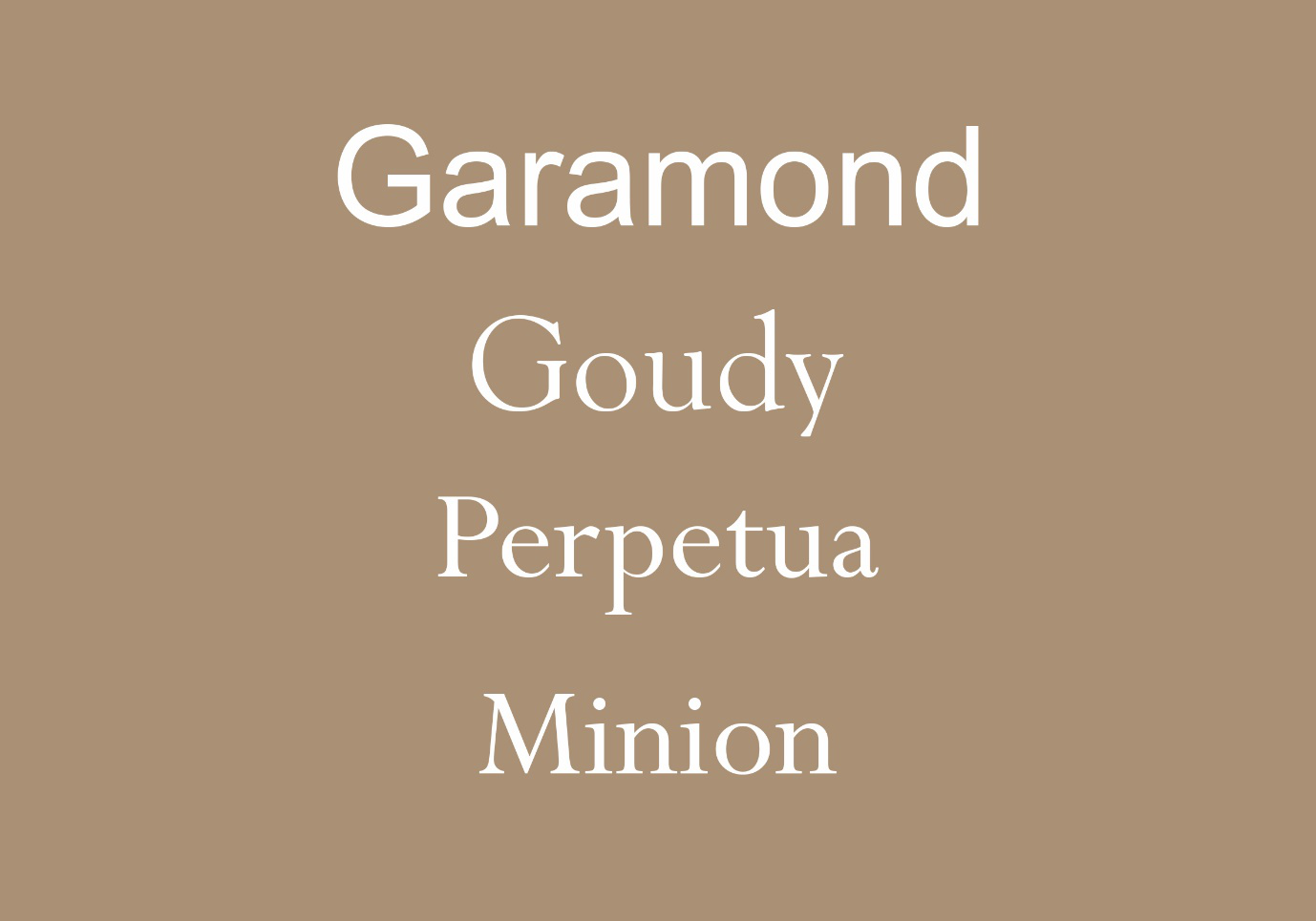
Old style
The old-style was used a long time ago when printing was on its early days. Originally created between the late 15th and mid 18 centuries when publishers realised that this font type was very easy to read in printed form because there is not a lot of difference in contrast in the thickness of the lines or strokes. Some great examples of old-style fonts are. Garamond, Goudy old style, Perpetua, and Minion Pro.
Transitional Serifs
This font types were the next evolutionary step of serifs.
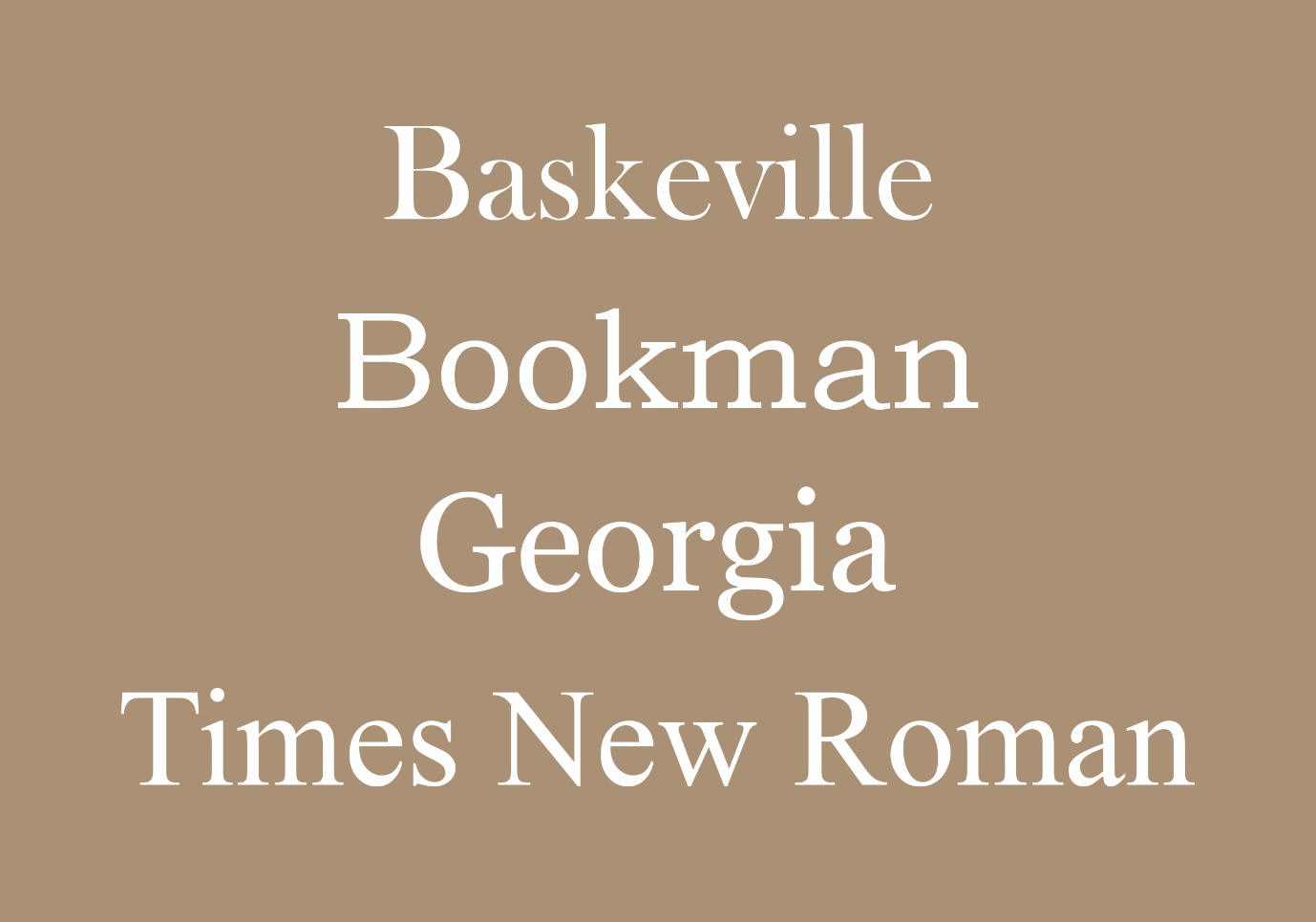
English printer and typographer John Baskerville established this style in the mid-18th century. These typefaces represent the transition between old style and modern style, and it has the characteristics of old style and neoclassical. The contrast or the difference between the thickness of the lines and the characters are more dramatic with transitional serifs. Instead of harsh endings transitional styles tend to end with ball terminals. Ball terminals are the rounded ends of the type stems. Some common styles on this category includes. Baskerville, Bookman, Georgia, and Times New Roman.
Neoclassical & Didone Serifs
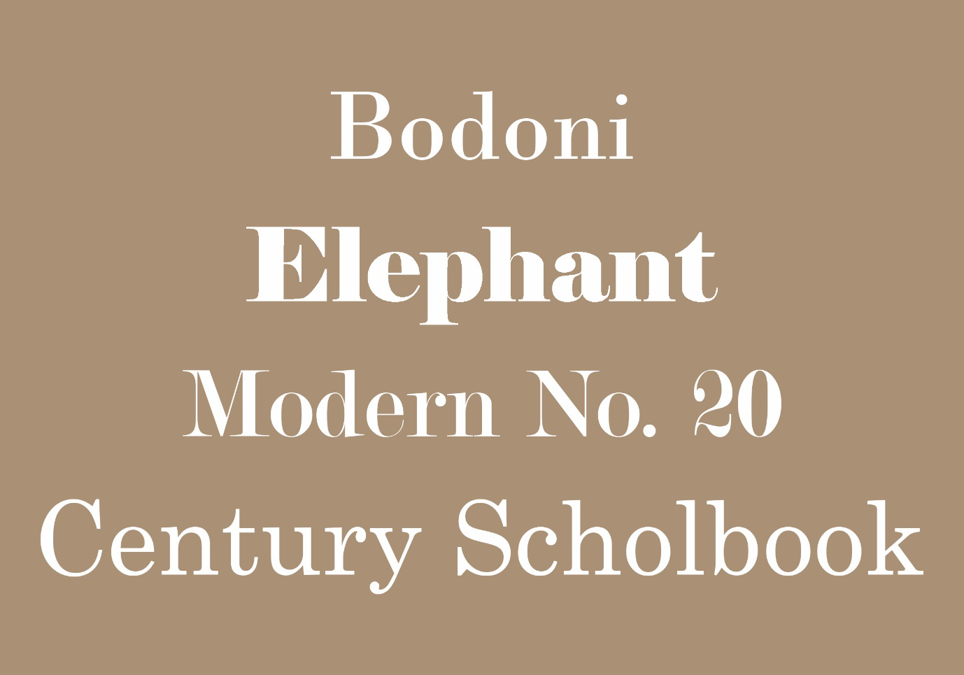
Neoclassical & Didone or the modern serif is the next step in its history and are characterized by even more dramatic contrast between the thickness and thinnest of the lines in the typeface.
These are typefaces created within the late 18th century. Some common Didone typefaces are Didot and Bodoni. These typefaces are highly stylised and are commonly found in high end fashion brands such as Vogue and major organisations such as CBS.
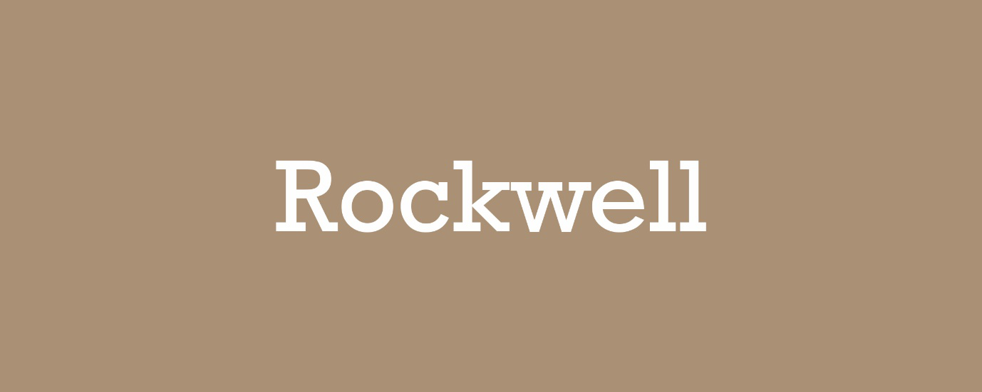
Slab Serifs
Slab serif typefaces became popular in the 19th century for advertising display. Vastly different from its ancestors their type face was design to demand one’s attention on poster designs, they have very tick bold lines with almost zero contrast, chunky, tick and bold they certainly grab attention. An immensely popular typeface on this category is Rockwell.
Sans Serif Type Styles
Sans-serif fonts have a special place in the world of design. And in the past 25 years, serif fonts have taken a back seat to sans-serif fonts. Sans serif fonts tend to have a more modern, clean appearance, but they can sometimes lack the elegance or charm needed in a situation. If you are looking for a modern clean look then a sans-serif might be a font type you want to consider. They can convey a sense of modernism and minimalism at the same time.
Serif fonts originated at a much later date than its serif predecessor and that’s because they use of digital and computer screens required a cleaner and simpler font. Because back in the day when computers had a low resolution the small details of serif were lost, and that’s where the need for a simpler serif font was required.
There are four basic Sans-serif categories. Below is a list of these categories including the most common typefaces for each category.
Grotesques Typefaces
Grotesques are the earliest category and include fonts like Franklin Gothic and Akzidenz Grotesk. These typefaces often have letterforms that are very similar to serif typefaces, minus the serifs.

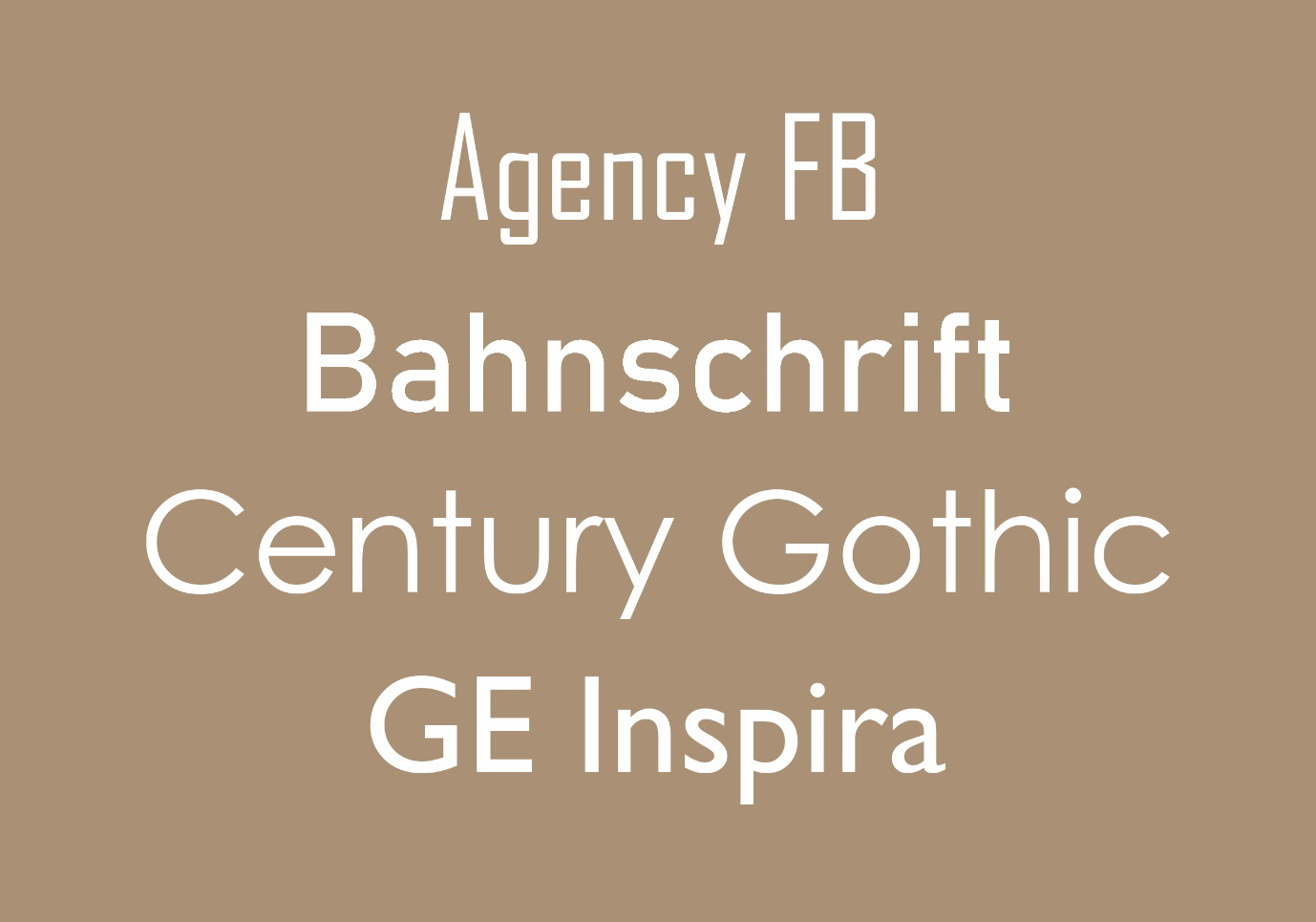
Neo-Grotesque typefaces
Neo-Grotesque typefaces include some of the most common typefaces: MS Sans Serif, Arial, Helvetica and Univers are all neo-grotesque sans serif type fonts. They have a relatively plain appearance when compared to the grotesques.
Humanist typefaces
Humanist typefaces include Gill Sans, Calibri, Candara, and Consolas. These are more calligraphic than other sans-serif typefaces and are also the most legible (hence the popularity of some of them for website body copy). They are more calligraphic than other sans-serifs, meaning they have a greater variation in line widths.
Geometric sans-serifs typefaces
Geometric sans-serifs typefaces are more closely based on geometric shapes. Generally, the “O”s in geometrics will appear circular, and the letter “a” is almost always simple, just a circle with a tail. They are the least commonly used for body copy, and are also the most modern sans-serifs, as a general rule of thumb.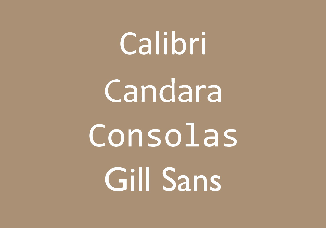
Script typefaces
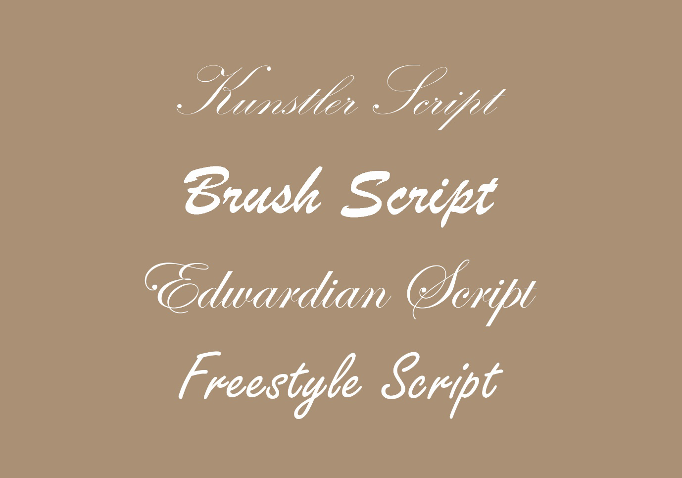
Script typefaces are based upon handwriting and offer very fluid letterforms. There are two basic classifications: formal and casual. Formal scripts are often reminiscent of the handwritten letterforms common in the 17th and 18th centuries. Some scripts are based directly on the handwriting of masters like George Snell and George Bickham. There are modern creations, too, including Kuenstler Script.
They are common for very elegant and elevated typographical designs and are unsuitable for body copy.
Casual scripts more closely resemble modern handwriting and date back to the mid-twentieth century. They are much less formal, often with stronger strokes and a more brush-like appearance. Casual scripts include Mistral and Brush Script.
Indesign making text look fun, unique, interactive is all part of the goal, and Understanding and mastering typefaces are something that takes time to master, so play around with different types and practice as much as you can so you can start having a feel of how and when to apply the right typeface. On the next page, we will have an insight into how important Kerning and Leading is and how you can apply to your own advantage to make an impact on your designs.
 Kerning and Leading
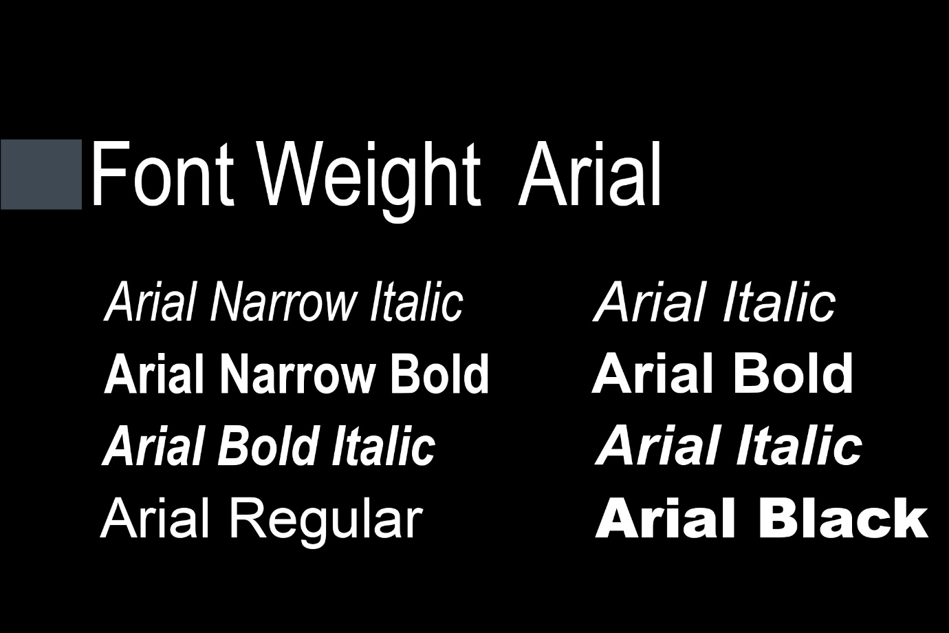
Many typefaces have different font styles and weights. Some typefaces have a wide variety of weight choices whereas some fonts only have a few. I like using a font like Arial because it offers a full suite of weight choices.
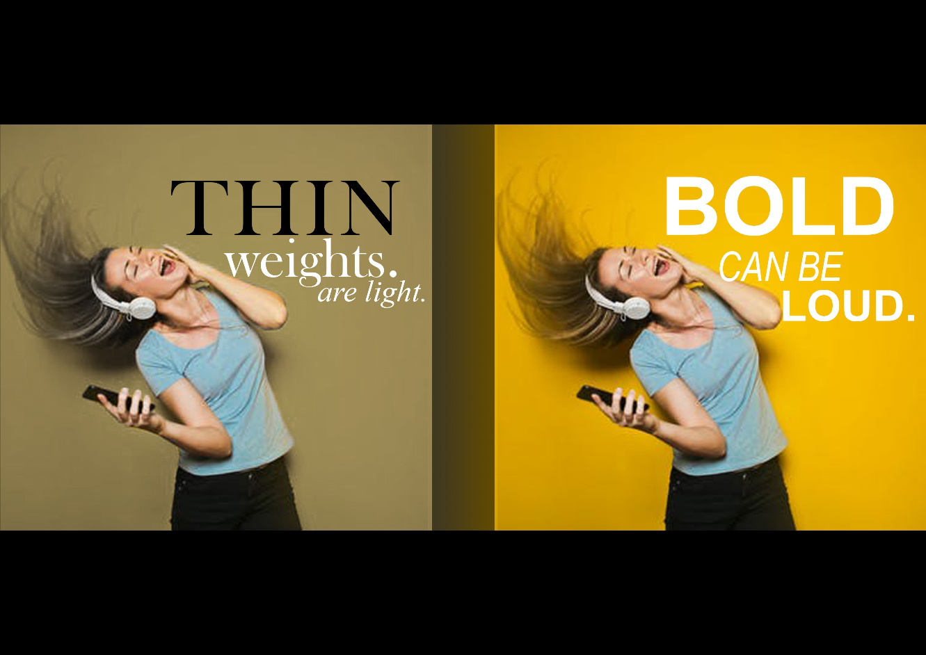
Font weights impact a design by emphasising the appearance of a font by making it bold or making it light. Bold weights are strong, have a high impact and grab your attention, they almost convey a sense of yelling or talking in a loud voice that can help you highlight what is more important to the viewer.
Call to actions are usual in a bold weight as it is very important to highlight it to the viewer.
Lighter weights especially the lightest can feel streamline and modern, they can be a way to highlight something by being soft and settle.
Lighter or thin weights cannot be too small, usually no smaller than 8pt as lighter fonts tend to be harder to read at a certain size level. There are lightweights, Bold weights, and everything in between which is your regular and semibold weights. Regular weights are perfect for body copy, using a bold weight for body copy can make it seem loud and distracting especially if there is a large block of text.
Let us now talk about spacing InDesign. Spacing can have a great impact on how type is not only perceived but creates the tone for the design peace. wide or tight spacing is the big decision a designer needs to make when working with type and headlines. Wider spaces in between a few words or single word, for example, can elevate the type to make it seem more elegant and high-end.
While wide spacing on a longer phrase of a paragraph can seem little overwhelming tighter spaces can make a design have a sense of urgency it could also help make a strong type seem cohesive and connected, wider spacing in lowercase letters almost never works well.
I suggest if you are going to do a headline or phrase with wider spacing to make sure you use uppercase, as uppercase letters stand a little stronger than lower case as they are more balanced and heavier in structure. As we reviewed before kerning is a term used for the manual spacing between characters. Kerning is very important as not all characters in a font will have a perfect spacing by default, sometimes an a and a w will need to have the spacing adjusted just a hair to make them feel more connected, just small tweaks on the spacing can make a phrase or word feel polished and unique than just the default spacing.
We also reviewed before that the space between sentences is called leading. You can see how having wide spacing or leading in between the sentences can affect the overall look or feel of a block of copy. Wider spacing in the smaller block of copy can help the Block of text expand to a larger part of the design if there is plenty of white space to cover of course. tight spacing can help a block of text feel more together and read more as one unit.

Of course, with anything InDesign there is a thing as too much or too little so it is advisable to pay attention to your leading, it can make or break your design. A good rule to follow is to use tighter spacing on short two or three Lines on headings or headlines. Wide spacing between only two or three sentences can make the second or third line feel kind of disconnected and not appealing to the eye.
When it comes to alignment in typography you have many weapons in your armoury, but nothing beats the power of left alignment and anchoring text in providing a strong balance in your Design especially with longer headlines and phrases. Left alignment can make the longer text more stable and grounded in filling. As with everything else you will need to practice and train your eyes to find the best opportunities when comes to kerning, leading, and aligning.
A great way to go about this is to start paying attention to this detail on the designs you see, and how they connect well together.