Office
Phone-alt
Envelope
Free
lessons
What is branding?
In more recent times the word “brand” has been commonly used as a trendy thing, especially in the design industry, so many people have forgotten its true essence. According to the Investopeida an online Business Dictionary, a brand is an “identifying symbol, mark, logo, name, word, and/or sentence that companies use to distinguish their product from others. A combination of one or more of those elements can be utilized to create a brand identity.” In this way is mark that is unique in some way through its design, sign, symbol, word, or combination of these. Organisations use this image that identifies a product and distinguishes it from its competitors. In other words, a brand is a visual representation that people correlate with a company or a product.

When a business or organisation deploys a specialist design team to help them create a brand to be presented as its public image, it must first determine its brand identity, or how it wants to be viewed. This is where the business puts themselves into their client’s shoes.

For example, a company logo often incorporates the message, slogan, or product that the company offers. The goal is to make the brand memorable and appealing to the consumer. The company usually consults a design firm or design team to come up with ideas for the visual aspects of a brand, such as the logo or symbol.
https://youtu.be/CGENndlD2K4
A strong brand name is one that consumers equate with a high degree of reputation and consistency. However, powerful branding depends not only on the aesthetic features of the brand elements, but also on the details of the message and the emotional appeal behind it. Think subliminal messages and psychology. To create a proper brand identity, designers need to get a deeper insight into business objectives, as well as into market research and its target audience.
Here, we have divided the branding process into six essential phases that designers need to go through on the way to brand creation.
Phase 1. Establish the company’s objectives
It is important to find out the company’s objectives in terms of their aims. It is not a graphic designer who dictates the company’s objectives or defines its personality but are simply and creatively involved in the intricate foundation of the entire branding process. So that the desired outcomes can be realised, the organisation must establish goals and principles at the beginning point so that the team working on branding will see the path ahead. They do not necessarily need to be defined and used for the entire cycle of brand existence. Targets can be modified later in the creative process, but it is vital to have some guidelines at the beginning.
Furthermore, before designers can begin working on the visual elements of the branding process, they need to identify the characteristics that the company or product wants to present. Designing a brand without this knowledge is like drawing a portrait of a photograph with the photo being cut into half. It is the same with branding. If the clients did not provide the designer with a thorough overview description or an overview of their organisation half communicated, it is wise to ask for it. For example, designers can ask clients to make a list of 5 to 10 keywords describing their business, or at least what they want a company to look like.
Practice shows that not all clients have prepared this information well enough and conveyed this to graphic designers which is sometimes where client dissatisfaction can stem from.
It is all too often that a client fails to think about specific requirements and just ask for an enticing visual appearance that will bring success to their company. There is nothing special about it. Clients often see designers like they would artists creating beautiful pictures, but it is unfair to expect designers to know all the peculiarities and the workflow of the business in question.
Client management can be quite helpful in understanding the behaviour of users and their possible design reactions. In addition, the principles of psychology can help designers establish effective communication with clients. There are many clients who are not certain about their desires and preferences, and that is when psychology helps. If the graphic designer considers the best questions to present, it would be simpler to build a roadmap focused on the client’s wishes.
Stage 2. Market research and user research

When the objectives are set and the personality of the company appears to be clear, the designers go to the research work. This move is important for all sorts of designer jobs, be it a logo or a smartphone device. Work allows one to immerse ourselves in the world of the potential brand and to recognize the peculiarities that that affect its performance.
The first is consumer analysis. Designers are digging out information about the market and potential competitors. It is good to learn from someone is experience, whether it is good or bad. Having the necessary data experts can create a unique and efficient logo and create a brand identity that will stand out from the competition.
Designers and clients’ preferences should be set aside to meet the needs of the target audience. A company has to create a strong impact on its prospective customers or consumers in order to win their interest. User research helps to deepen the preferences and psychological peculiarities of the target audience.
Design is not pure art. If you rely exceptionally on the sense of beauty and talent, there is a risk that the task will fail. Testing needs less time than completing the work.
Stage 3. Layout of logo
Some people often get the logo wrong for a brand, but it is only one stage in the branding process. It would be wrong, however, to underestimate the role of logo design. It is the basic mark of brand identity, the most prominent symbol of brand image, and the foundation of an effective marketing strategy that allows it to be linked to the target audience.
One of the facets of the study is the analysis of the logos of innovative firms. It helps to avoid unnecessary duplication with other logos in the sector and to establish an initial brand identity.
When all the key information is gathered, designers switch to a more imaginative stage — the innovative cycle itself. By means of various experiments, they choose the direction of the style and the colour palette that will work best for the brand.

After the logo is finished, the designers start the test part. The argument is that not anything that appears fine on a video screen would be the same in a particular setting with a number of surfaces. That is why it is vital to test the logo in all possible situations and placements to make sure there is no unpleasant surprise.
Logo production plays a significant role in branding, and creators are encouraged to pay particular attention to their creative process. A well thought-out design is worth putting in resources.
Step 4. Name Graphic Features
The design of the logo is not the only visual representation of the brand. Certainly, the main focus will always be on the emblem, but there are a few more aspects that deserve attention, such as mascots and typography.

Companies often look for ways to customize a brand, and designers have a solution. Mascots are original concept characters designed to reflect the company in a very symbolic way. They can be produced as part of a logo or as part of an individual brand item. These characters may create a link with the consumer as nothing else. The mascot acts as a contact and engagement mechanism with users that manages to communicate the message in an uncommon way. People begin to see a mascot as a major representative of a company that introduces a product or service to them. Efficient mascot guarantees brand recognition and memorability and easily draws the attention of users.
Typography is another visual element responsible for brand identity. Many logos are created by typography or contain fonts, but typography does not end here. Banners, business cards, correspondence applied by a company should also include signs of identity of a brand. You can create fonts that talk for your company, too. Designers often create custom fonts that make companies unique even in such small details. However, this is not the only alternative. Experts may choose a combination of standard fonts that best suits a particular brand. It would make it easy for consumers to identify a brand because of its continuity in all aspect.
Step 5. Form of corporate brand

When the emblem is primed, the colour scheme is selected, and other graphic elements are set, it is time to combine them in a harmonious organisational theme. It is needed when a designer works on branding for service-providing businesses. Depending on the form of organisation, different qualities may become a branded object. There are some common brand items used by different companies:

Business address; It is a must-have element in business contact nowadays, and it is important to make sure a business card is a name.
Company correspondence often requires a structured type of conversation. In order to prove that a company is a trustworthy collaborator and service provider, designers need to focus on the communications layout. Letterheads and envelopes must contain elements of the identity of the brand showing the professional level.
Billboards, flags; They are a vital component of branding and promotion, and clients also want designers to collaborate on a new concept for outdoor ads and site banners.

Branding of cars; Companies that deliver the goods need an effective decoration of the vehicle. Brand branding elements on business cars or vans are an effective way to improve the outside climate.

T-shirt and hats; Clothes with brand marks bring the spirit of the team to a company so that employers often take care of these attributes. Branded T-shirts and hats can be a good alternative to uniforms if required or can be used as gifts.
Step 6. Link to research

The research has been completed. The graphic content has been finished. The last job for the planner is to insure that all materials are correctly utilised by customers. A style guide is a manual that contains guidance for how to use the graphics produced for a company correctly and incorrectly. Traditionally, the style guide includes an explanation of the idea behind the logo as well as a presentation of a corporate colour palette that can be used for different purposes. It may be good to show examples of incorrect use in order to avoid poor visual performance.
Branding with Graphic Design
Branding is underestimated and exploited by individuals within and outside the business. Some may believe it is a fresh emblem. Others, this is an advertisement. And as an organisation with “Brand” in its very name, we spend a fair amount of time educating about what this word means.
Today, we are diving into a key distinction: the difference between graphic design and branding. That may seem simple, but you would be shocked how many ventures have been stymied by this lack of explanation. Understanding this distinction is a crucial first step towards creating a visual identity that is both beautiful and strategically informed.
Role of graphic design in branding:
When you think of what makes a company, it is normal to start with visual cues: logos, headers, business cards, websites. In fact, these elements are only a very basic skeleton of what makes a strong brand.
Great designers are the stewards of the brand identification, taking special care to insure that any item – colours, forms, typography, and even, the logo – is convincing and consistent in all environments. When done correctly, the graphic design ensures that everything is coherent and in the right place, like a proper working skeleton.
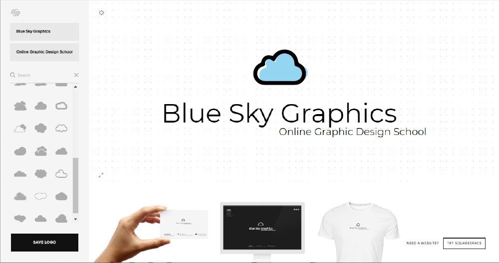
But, of course, a business cannot run on its own. Branding is the entire fleshed out body to keep the metaphor going. Not just one’s bodies and clothing, but one’s values, actions and attitude. It is all about how your customer support answers the phone to the stock photograph in your sales deck. Branding is any step made by a corporate entity, and the craft of branding renders the effort as intentional and harmonious as possible.
Graphical design and branding are inextricably linked. Aesthetics means nothing without a solid strategy, and a solid strategy means nothing if it cannot be expressed. We always have to balance these two forces as an agency. Often it implies deciding between something lovely and something purposeful. In an ideal universe, you would have the best of all worlds, but at the end of the day, every choice needs to be taken to add value to the brand.
Aesthetic vs. Function
How are you going to handle such tough conversations? This can be difficult, particularly as much as 80 percent of entrepreneurs feel that graphic design and branding are the same thing. While creative decisions will always be subjective, it is important to remember that branding goes far beyond the visual. It handles the entire experience of the customer on all levels, senses and dimensions. No matter how technical or granular, no element is ever “only a mark” or “only a logo.” It is a nuanced, interconnected system that is involved in an active conversation with your audience.
Simply put, graphic design feeds your brand, and your brand feeds your business. If your visual elements compete with each other, you will never win a competition for the attention of your customer.
https://youtu.be/mmhQnE4Cyoc
What is the identity of the brand, and how do you create the identity of the brand?
Basically, it is the identity of the brand applied. Brand identity design is a real process of creating a logo, colour palette, typography, etc.
With these definitions in mind, the following is an overview of the 7 key design elements that you need to create a strong, consistent and attractive brand identity.
1. Specific aim of the company and positioning

The first step of creating a brand image is to decide what your aim and role is. The purpose of the brand is the main reason for your existence. Brand positioning is the name of who your product is and why your product is a better option than your competitors. Defining this can notify your approach as you build a logo, settle on a paint palette, etc. A process called Purpose, Position and Personality is useful in answering these questions.
Brand positioning is the process of making the purpose workable. By identifying your target client and separating yourself from the market, you set the groundwork for your company to accomplish your aim.
2. Powerful business study
The aim and positioning of a brand can be guided, at least in part, through market and consumer analysis. Work is essential to understanding the cultural conflict mentioned in the previous segment. There is a variety of web material to aid newcomers in market analysis.
One of the best ways to conduct market research is simply to talk to people. Phone interviews provide for thorough conversations and a valuable perspective on the human aspect in research — an attribute that is important if you choose to create an authentic connection to your clients.
Besides phone interviews, electronic polling methods like Survey Monkey are a simple way to collect a lot of knowledge, and policy data may also be an effective weapon.
Effective market analysis will also help you decide who your key client is, a phrase that I use here to suggest a somewhat different meaning than “target consumers,” which was stated earlier. Your customer person goes beyond just defining what the customer’s problem is and details some of the professional and personal characteristics of your customer’s focus. Defining such characteristics can allow you to realize what kind of attitude the company will provide to cater to consumers.
https://youtu.be/0mieoQ0L_yU
3. Pleasant relations with the client
Company identity is a really critical aspect to remember. This is going to happen with any aspect of your brand name if you have this correctly. Brand identity has a huge effect on the sound and expression used in the publicity materials and other communications. If an identity is not developed, consumers may get mixed signals and have difficulty relating to your brand.
If you are having a rough time getting going, here’s an exercise to try: the celebrities are the most reflective of your brand? Is there an actor or actress, a singer or a public official who shares the same characteristics as your brand? This could be a decent starting point for nailing down the various facets of the brand’s personality.
If you have imagined the type of individual your brand will be and mentioned a couple of the qualities they have, it is easy to get your brand’s personality down to a simple sentence.
4. Make sure the design is unforgettable

What one came first — the emblem or the brand? This is impossible to predict, since logos and labels are continuously being modified and changed, but in general, a simple identity will come first, accompanied by a logo that suits, reflects and strengthens the identity.
Your logo is central to the concept of the brand image. It is the part of your brand identity that people will be most exposed to. It has to be matched with all the other aspects in your corporate image, as well as the wider emotional impact in your company.
What do you think of a logo you saw as a child? I bet you noticed it earlier, and you immediately thought about nostalgia, magic, laughter, or something like that. The playful script is full of creativity and fun, and that jives have established with the Disney brand as a whole.
Go for a basic look to improve the odds of making an unforgettable logo that attracts a deep emotional reaction. Take a look at the logos of the world’s top three brands.
They are easy and easily identifiable. Only the Coca-Cola branding, the most complicated of the three, is only a simple line of text in a single script, with no visual features accompanying it.
When the logo is clear, open canvas consumers will fill in with the good interactions they have with the company. The clearer the emblem, the better it is to switch across mediums such as internet ads and more conventional print advertisements, such as flyers or brochures.
The last aspect to remember when creating a company logo is all the ways it could be viewed. A logo needs to be flexible enough to look great on a big billboard or a tiny social media icon. Simplicity is also helpful here.
5. Attractive palette of shades

The colour palette is linked to the logo style. It is also supposed to be simple, with only 1 to 3 primary colours (though Google got away with 4). Understanding a little about the feelings expressed by other colours will help you pick the correct ones.
A ton of colour psychology is subconscious, because blue communicates calmness and red and yellow reflects excitement and strength. Depending on the colour or shade you use, that emotion can be adjusted. A tint is a colour mixed with white, which makes it lighter, and a shade is a colour mixed with black, which makes it darker. A lighter shade of blue conveys tranquillity, while a darker shade of blue also conveys confidence, an influence that many banks use with their colour schemes.
As stated earlier, labels can have just a few primary colours, but you may still select secondary colours to be included with the primary colours in some of the products. Selecting a couple more colours will make the products remain fun while always on the item.
6. Technical typography

Stressing over choosing the right font may cause some to respond to you as a “typography geek,” but you can get ahead when you select a font that fits in accordance with your logo and colours.
The fountains are solid. Even when taken out of context, the most common fonts are familiar. You are going to want a single primary typeface to drive the brand design, so it will fit perfectly for the logo so colour palette. It should also be simple, just like your logo and colour palette.
7. On-brand graphical support
![]()
Since we live in a multimedia world, the final step in creating a brand identity is an extended visual language that supports graphics, design assets, icons and photographs.
Because of Google’s close attention to its extended visual language, when you see a Google icon, you know it is a Google icon.
Creating a brand guide that addresses multiple elements of brand design will help to streamline the production of advertising materials in the future. It means that any email message, social media post or advertising booklet complies with the same common requirements.
https://youtu.be/jQ2K8ncq6DU
Why are logos important to us?
Today, the logo is not just a market mark for the branding of a brand, but instead aims to create a clear association for the goods or services.
The logo performs several positions in today’s corporate world. You should give the correct company message to the target market. A beautifully made emblem has the ability to transform individuals into lifelong customers. There are several ways in which a well-designed logo will reflect the brand and the business.
It is important to note that when we look at it, we do not read it first. We see colour before anything else, and if that is enough to keep our attention, we are going to read it. The logo is therefore a small but essential element in the image of the brand, irrespective of the company.
As designers, it is the task of distilling the essence and most likely lasting colour of the brand, since visual appearance plays a critical role in connecting the experience and the brand to our brain.
Simple to recall

Simplicity helps recognition, especially when so many brands compete for our attention. You want to give audiences a chance to remember a mark after a brief look, so it is not possible for an overly complicated interface. A trademark must be conceptualised – with a straightforward ‘storey’ – and, in most instances, uncomplicated. That is how it needs to function in a multitude of sizes and operations, from the website symbol in the window bar to the signage structure.
Big Identity
It is rare to see a logo in isolation, on its own, without a website or business card backdrop, or a drink menu or a system icon. This is why a marketing message has to include a range of clear points that explain how a company is viewed by prospective buyers. You may want to help move back, take a quick glance, see where you are and what you are surrounded by.

As far as design is concerned, every possible item on which the customer logo could appear is a larger picture. But also remember how identification functions when the emblem is not seen, and although it is important, the icon can only have an identification so far. One approach to accomplish consistent graphics is to build a personalised typeface that is not only included in the emblem but is often seen in the advertisement headlines.
Offer users power over the GUI
This means that users should still be able to track what they do rapidly. This allows consumers to test the product without constant fear of failure — facilitating the discovery of different options, as the consumer recognizes that mistakes can be easily corrected. On the contrary, if the user is overly vigilant and moves, this leads to a slower discovery and an anxious experience that nobody wants.
Perhaps the most common GUIs where users have the option ‘Undo / Redo’ are text and graphics editors. ‘Undo’ allows users to make adjustments when writing text or making graphics, and step by step, through the improvements that have been made. ‘Redo’ would allow users to erase the undo, meaning that they can go forward with their improvements as long as they go back a few levels.
‘Undo’ can be extremely helpful if users choose the device feature incorrectly. In this scenario, the undo feature serves as a “emergency escape” that enables users to leave an unwelcome state. A good example of this is a Gmail reminder message with a cancel alternative whenever users accidentally delete a file.
Make it measurable

The beauty of a perfect logo design is that it can be easily scaled. Bear in mind that the logo will feature a variety of commercials. It is expected to look like a great logo in all the newspapers. This ensures that the emblem would appear impressive when shot up to a bigger scale on a billboard. It is supposed to be part of the billboard design.
Even if the logo lacks its sense of balance and any of the design elements seem weird on a billboard, the logo is a poor one. Similarly, if a logo were to be displayed on a smaller backdrop, such as an advertisement image or a marker, the details of the logo would still be correct.
Blue Sky Graphics is providing one of the best online graphic design courses, web and UX UI design courses in the UK, so get involved and sign up today!
Find more interesting topics

