Office
Phone-alt
Envelope
Free
lessons
Graphic design dictionary
Graphic designers have a vocabulary of their own and at Blue Sky Graphics online school we use this industry-standard key vocab to our students and from day one. From “ablation” and “aperture” to “vertex” and “saturation” if you are starting in graphic design, or you need a quick refresher course, we promise to make it easy for you. Our graphic design teachers are among some of the absolute best and these key terms are what every graphic designer should know. And for all those non-graphic designers we hope these words might help paint a picture (pardon the pun).
Creative wishes,
Team Blue Sky Graphics
Testimonials:
A

Airbrush
Airbrush is a drawing technique and a spray propellant using compressed air that to sprays a liquid, like paint, and ink. Think graffiti too. Often used in illustration and photo retouching.

Alignment
Alignment is the adjustment of a specific arrangement or position in lines of a text or an image — left, right or centred.
Art Director
An Art Director is a senior ranking position within a graphic design agency or studio who commonly oversees projects and teams and usually with over seven years’ experience but can vary according to the organisation that makes the graphic design.
Ablation
Ablation is the elimination of material from the surface of an object by use of both vapour and chipping, or other erosive methods. Ablation technology is used in printer houses with some proofing devices and plate setters to create proofs or plates by vaporizing or blasting away a part of the emulsion which usually gets done by a thermal laser.
Absorptance
Absorptance is a term used to describe the way in which reflections of light is absorbed by a surface area to the total light striking the surface-expressed as a percentage. In general physics terms, a person can see colours because a portion of the light strikes the surface and it is absorbed and a portion is reflected to the eyes. An example of this in the printing business is the colour red which on paper is accomplished because the magenta and yellow dots absorb the green and blue light individually with the result being that red light is reflected from the paper. The tone of each colour depends on the absorbed amount of a specific colour, shade, or darkness of the colour.
Additive colour mixing
Additive colour mixing is essentially a colour system in which red, green, and blue are mixed to form other colours. Cinema, tv and computer screens all use additive colour mixing.
Adobe
Adobe is a US-based software company officially known as Adobe Systems, the company is regarded as the industry standard for graphic design and for its multimedia and creativity software products. Popular products include Dreamweaver, Photoshop, Illustrator, and InDesign as well as the Adobe Creative Cloud.

Adobe Air
Adobe Air is a technology that allows the use of web standards such as Adobe Flash or HTML to make applications that run on Macs or Windows operating devices.
Analogous
Analogous colour schemes use colours that are next to each other on the colour wheel. They usually match well and create natural changing and comfortable matches.
Aperture
Aperture describes the white space at the end of an open counter in typography.
Ascender
An ascender is an upward vertical stroke which you will find on the part of a lowercase letter that extends above a typeface’s X-Height.
B
Balance
There are three ways to achieve a balance which are symmetrically, asymmetrically, and radially. Balance is all about even distribution and involves the placement of elements on the page so that the text and graphic elements are equally distributed.
Brand Identity Designer
As a brand identity designer, the role involves overseeing helping businesses and organizations develop consistent branding throughout their projects and collaterals. They develop new and innovative ways to express what the brand stands for through imagery including logo, typography, colour palettes, and the like.

Behance
Behance is a portal by Adobe that showcases for online portfolios by creative professionals across industries.

Blur
Blur makes images more ambiguous or less distinct and is a tool to fade out information or graphics. Using a blur can be a fantastic way to make text stand out when overlaid onto an illustration.
<html>
<body>
Body Copy
Body copy is essentially the main part of the text in a design or publication or website content.
</body>
</html>

Baseline
Baseline in typography describes the baseline which is an imaginary line that text sits on like a ruler line. Common typographic measurements also the place that x-height and other important parts of a font are measured from. There is also parts of fonts that don’t sit on the baseline, but we’ll get to them late.
Brand
A brand refers to a compilation of ideologies, identities, concepts, visions, and feelings that encapsulate a business’s values and philosophy. A brand, therefore, is a mix of all the fine conceptual details that make up the business and from the content the brand promotes the words used, the values upheld, the way staff conduct their day to day chores and their outlook.

Brandmark
Brandmark is a type of logo design where an icon is used in place of the company name, think of the Nike tick logo or the Natwest bank logo. Brandmarks are commonly accompanied by a logotype, but not always.
C
Creative Director
As a creative director, this person is often required to manage groups of creatives. Common duties include changing presentations, arranging advertisement campaigns, supervising brand campaigns, and shaping brand standards. Since this involves strategic planning, it is often assigned to senior graphic designers who already have experience in the field.
Cool effect colours
Cool effect colours are the ones that make you think of colder temperatures, like pastel greens, blues, or purples, etc. These colours tend to create a cool, calm, and refreshing atmosphere. You can add cooler tones to an picture or photograph by increasing the blue tones in your image.
Composition
The composition is the array of design elements that form a whole image. A good composition will have the purpose of achieving the person looking being guided across the design.
In visual art, you might hear this referred to as “form.” In graphic design, it is often called layout. The composition is made up of several various visual design elements, including repetition, contrast, balance, proximity, alignment, and white space.
Contrast
Contrast is the arrangement of opposite elements on a page—in other words when two things on a page are different. This can be light vs. dark colours, smooth vs. rough textures, text colour vs. background colour. Contrast can be used to create areas of visual interest or even drama within a design. Contrast occurs when two elements on a page are different. For example, it could be different colours between the text and the background colour or dark vs. light colours.

CMYK
CMYK is a colour model that is used for printing purposes. CMYK colours start as white and then get darker as more colours are mixed. The four colours the name stands for, Cyan, Magenta, Yellow and Key (Black), are the four colours most widely used in printing.
Crop
A crop is a tool that allows the graphic designer to cut out or crop unnecessary parts of an image to highlight a certain subject improve framing or alter the image’s aspect ratio.
D
Descender
A descender is a term used in type and part of a letter that extends below the baseline.
Die Cut
The process of cutting areas of your printed design in various shapes in order to create unique effects. Die cuts are produced after printing and are classed as a finishing process.
DPI
DPI or dots per inch is a factor when considering the image quality of a printer. Generally speaking for high-quality printing a minimum of 200dpi is recommended. Each pixel of the image is created by a series of tiny dots and the higher the DPI, the better the tonality of the image.
E
https://youtu.be/mmhQnE4Cyoc
Embossing
Embossing and it’s equivalent debossing are final processes that involve creating dimensional relief images into a piece of paper or card.
EPS
EPS stands for Encapsulated Postscript which is a file format that is resizable and commonly used for vector designs and with print elements such as logos, brochures and business cards.
F
File formats
File formats are a standard way that IT or computer-generated information is encoded for storage in a computer file. It identifies how bits are used to encode information in digital storage. Some file formats are “open formats,” which signifies they are openly available and can be used by any software developers. Other file formats are copyrighted or “closed formats,” meaning they can only be opened by specific applications. Examples of file formats are JPEG, PDF, AI, EPS, GIF, JPEG, PDF, PNG, PSD as well as TIFF.
Fonts
There are 4 types of categories of fonts:
- Serifs are the small lines and hooks at the end of the strokes in some letters.
- Sans (means without in French). A sans serif font has no serifs.
- Script fonts use a flowing, cursive stroke.
- Slab serif is distinguished by dense and chunky serifs.
G

Gradient
The gradient is a gradual change from one colour to another (for example, red gradually becoming to black).
https://youtu.be/uqiTgSy7EKY
Graphic design
Graphic design is basically the result of visual concepts to create good communication with an ideology or an agenda. In this way companies usually have an objective when they make a graphic design marketing banner. Graphic designers are essentially storytellers that can take complex data and present it in a pure, digestible way. Graphic design is the art or profession of visual communication that combines images, words, and ideas to convey information to an audience, especially to produce a specific effect. It can be used by companies to promote and sell products through advertising, by websites to convey complicated information in a clear way through infographics, or by businesses to develop an identity through branding, among other things.
For a more detailed explanation of graphic design have a look at What is Graphic Design?
Grid
A grid is a sequence of intersecting vertical, horizontal, angular, or curved lines used to organize graphic elements on a page, as well as in relation to one another.
H
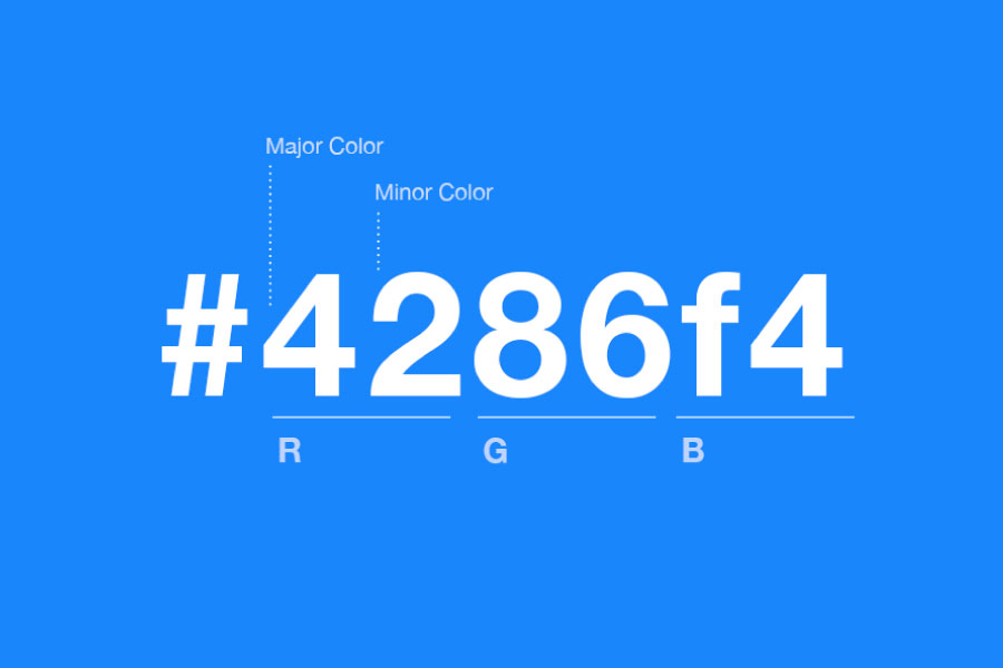
Hex
Hex is a code and although most graphic designers will usually find their colours using the RGB or CMYK, hex is still an important term to know. The six-digit code used to represent a colour are found alongside RGB and CMYK in a lot of design applications but are most often used in HTML and CSS.
I
https://youtu.be/Xy0oNyF0vxo
Icon
Icons are something we all see almost every day (just look at your mobile phone) and they are images used to represent objects or actions.
Italics
Italics are forward-slanting characters.
Intensity
Intensity is the degree of purity or brilliance of a colour.
J
🙁 we cannot think of any J but if you can write to us: info(at)blueskygraphics.co.uk 🙂
K

Kerning
Kern is the space between two individual letters or characters, and the process of altering this space between letters or characters. Kerning can increase the legibility of a word or even an entire block of text. Kerning helps to create proportionate and balanced typography and, in turn, better-looking typography. Kerning, tracking, and leading usually overlap in the graphic design process.
L
Layout Artist
A layout artist is a graphic designer that puts together typography, images, illustrations, photographs, or drawings to create a visual design. People in this position tend to work with advertising firms, publications, and PR companies to create page layouts that are pleasing to the end-user or reader.
https://youtu.be/hR_cBq4pozc
Logo
It is a design that is used by an organization for its advertising collateral, letterheads and stationery as an emblem by which the organisation can easily be recognised. A good logo shows what a company does and what the brand values.
Logo Designer
Logo designers help businesses build brand recognition through a unique-designed image that acts as the identity visage of the company. A good logo is often catchy and captures the essence of a company helps customers remember the brand for years to come.
M
Multimedia Designer
A multimedia designer is often required to be competent with various pieces of mediums when making their designs including software and hardware. Generally, this involves combining animation with design to create campaigns and marketing collaterals for commercials, music videos, video games, movies, as well as general digital.
Monochrome
Monochrome is a shade of colour that is used to describe designs or photographs in one colour or different shades of the one particular colour (think 1920’s black and lighter black canvasses or old computer screens). Early computer monitors that displayed white or green text on a black background are categorized as monochrome although monochrome is not just greyscale monochrome can be made up of any one colour like red, blue, yellow etc.
https://youtu.be/-ILPEal-nLY
N

Negative space
Negative space in art, generally, negative space is the vicinity of the area around and between the subject of an image. Negative space maybe most noticeable when the space around a subject, and not the subject itself forms an interesting or artistically relevant shape, and such space is occasionally used to artistic effect as the “real” matter of an image.
O
Opacity
Opacity is a tool that enables graphic designers to make an element of a design transparent. The lower the opacity, the more transparent an element is and by contrast, full opacity would be a solid colour with little or no transparency.
P
Palette
A colour palette comprises of colours that can be utilized for any illustration or design work that represents an idea or company identity. The chosen colours should be designed to work harmoniously with each other.
Photo Editor
Photo editing is a crucial task for graphic designers and non-graphic designers although it can seem daunting using software like Photoshop or applications Illustrator, and other design systems can help manipulate images. At Blue Sky Graphics we teach photo editing software. Those working as photo editors are often required to manipulate, enhance and change images, creating compositions, designing high-resolution graphics among many other tricks.
![]()
Pixel
A pixel is an exceedingly small area of a screen (the word comes from “picture element”). Pixels are the smallest basic unit of programmable colour on a computer or described even as the smallest portion of a display that a computer is capable of displaying or even printing.
PPI
PPI stands for “pixels per inch,” which is a measure of pixel concentration used by electronic image devices. Often when considering the purchase of cameras, TVs or monitors customer will check the PPI quality.
PDF
A PDF is a Portable Document Format developed by Adobe and many companies use PDF as attachments for sending documents. These files can be universally downloaded and viewed by any computer. PDFs are most suitable for sharing previews of work and are completely viewable.
Q
(we cannot think of any Q but if you can write to us: infoATblueskygraphics.co.uk)
R
Raster
Raster images are made up of a set grid of pixels, but they can also be called bitmap graphics which is a type of digital image that uses tiny rectangular pixels, or picture elements, arranged in a grid formation to represent an image. This means when you adjust the size of stretch a raster image it can get a little fuzzy and lose some lucidity.

Rule of Thirds
Rule of Thirds is a principle that if you divide your image with two vertical and two horizontal lines, the areas where your lines intersect will become focal points of your design. It is useful way of lining up the subject of an image and making it as aesthetically pleasing as possible (think perfect symmetry).
Resolution
The term resolution refers to the number of units, measured in either DPI or PPI, that occupy a linear inch an image. Resolution is used to denote the quality of an image on a computer device or on print.
Repetition
To maintain a cohesive look, designers repeat elements throughout a graphic design for consistency reasons.
S
Scale
Scale refers to the size of an object in relationship to another object. Two elements of the same size are being equal. Whereas elements with a clear variation in size tend to be different. When putting together a design, think about how you can use a scale to assist you to illustrate the meaning behind your image. Scales facilitates the change of the size of an object while keeping its shape and proportions intact. Large scale can create drama and moods of tension, and smaller-scale can create fine detail and moods of ease.
Space
Space is the canvass that the graphic designer is expected to use. Space is important as it could be negative space (see above) or it could be a design consideration that recognises the importance of empty places in design.
Stock art
Stock photos and art are licensed images created by a third party and unprofessional quick design solutions like Canva will have lots of stock photos and art that can be used by anyone.
Using stock images saves on the cost of having a professional photoshoot.
Saturation
Saturation refers to the intensity or purity of a colour. The more saturated a colour is (as the colour increases saturation) the purer or brighter it appears. Whereas desaturated colours appear a little washed-out and pale.
T
Typography
Typography refers to the aesthetics of fonts but more importantly to the artistic arrangement and order of type in a readable and visually appealing way. Typography is therefore about the design and usage of different fonts in a way that helps to communicate ideas better visually and if used correctly, typography can convey a certain mood or feeling. All graphic designers will deal with typography at some stage of their professionals careers—whether they are developing new fonts at a type foundry, making own typefaces, or heading up a project on the latest marketing campaigns.

Texture
The texture is used in graphic design vocabulary to describe the visual appearance of a design. Texture can refer to the actual tactile surface of a design (bumpy, smooth, flat) or the visual tactility of your design and can be added to a print design through printing on different paper stocks or materials.
By layering textured images and graphics over your design, you can often create a visual appearance of tactility that mirrors actual texture.
Typeface
The typeface is a process of design whereby a set of characters are presented in their totality to resemble a specific style. This could include uppercase and lowercase characters, numerals, mathematical icons, punctuation, and symbols for example.
U

Underdrawings
Underdrawings refer to any drawing done prior to further layered work. Think of it as a large outdoor mural and then think of a preparatory drawing done on a painting ground before painting it is a is applied, like an imprimatur. Graphic design graffiti artists may underdraw first before applying their art.

User interface / User experience (UX/UI)
User interface and user experience is the design goals of applications for computers, mobile devices, and other devices to increase good usability with end-user experience.
V
Vector
Vector images a made up of points, lines, and curves. A mathematical algorithm is used so that all the shapes within a vector are calculated using a mathematical equation which means the image can scale in size without losing any quality. Unlike rasters, vectors will not get fuzzy when they are scaled in size.
Vertex
The bottom point where two strokes are joined.
W
Warm colours
Warm colours unlike cool effect colours (see above) are those which suggest a sense of warmth, such as red, yellow, and orange and including brownish greys. All Warm colours tend to lie in the red-yellow half of the colour circle.
Web Designer
Web designers play a key role in web development. The role of a web designer usually includes making the website look great by creating the pages, layout, and graphics for web pages.

White Space
White space, despite its seemingly ambiguous name, does not need to be white. It is the space, which can be any colour, pattern, or texture, among various elements in a design that are important in creating a winning design. Usually, it helps a graphic text or image appear less crowded through separation. Think of white space as giving a design visual breathing room, like some sort of design meditation. It can also be called negative space which is slightly less deceptive.
X

X-Height
The X-height is the height of the lowercase letters that do not contain ascenders or descenders, such as the letter a, letter c and letter e.
Y
(we cannot think of any Y but if you can write to us: infoATblueskygraphics.co.uk)
Z
(we cannot think of any Z but if you can write to us: infoATblueskygraphics.co.uk)
Remember these terms and soon you will be a professional in no time! Many graphic designers do not see design as a job, but a lifestyle with cool creative vocabulary. There are many ways areas of graphic design that lead to many enjoyable job roles.
At Blue Sky Graphics we estimate that with the competitive rise in online businesses and the digitalization of the world more graphic designers will be needed than ever before so get learning these words. It is also encouraging news to know it has been predicted that the rate of freelancers in the graphic design field will increase dramatically within the next 2-3 years.
At Blue Sky Graphics we offer courses online and have been teaching students since 2005 and we LOVE it!
As a leading online graphic design training school, we are passionate about graphic design and have been since 2005. Our online classes specialise in delivering professional and industry-aligned graphic design courses with a portfolio you can call your own! We are proud to welcome students from all over the world making us a truly international community.
Enrolment for our 0110 Graphic Design Course delivered through live online one-to-one e-learning is available at selected dates through the year subject to availability. This features real-time virtual classrooms, live one-to-one classes, art activities, workbooks and live all day tutor support and structured daily learning plans that encourage learners to engage in creative exercise and look after their mental wellbeing through stimulating learning environments.
Find more interesting topics


